Previously the magazine was mostly a collection of written and visual rants with a street appeal for hardened activists. I saw it as an opportunity to explore how to reach and message a broader readership while exploring publishing, laying out page design and preparing artwork for lithographic printing.

CROW!magnus
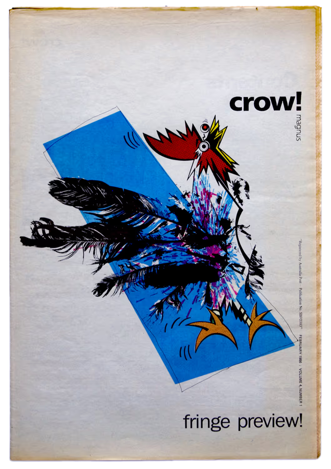
My initial cover design for student magazine features a meaningful premonition of the future masthead
Explore more of my publication, cover and brand designs
I don’t recall whether the chicken or the egg came first. But I had previously been commissioned to design the cover pictured above for one issue and laid out some pages on another edition. From these experiences the student union president recruited me to work alongside their new editor, art directing and managing the production of the magazine for the following year, my final design school year. I agreed with one proviso:
That my job title would be 'Propagandarist'.
He agreed. I seized the moment by reinventing the magazine’s persona, moving things along from their macho gun-toting revolutionary raven called Crow Magnus, to less discriminatory opportunities. Instead, by exploring new possibilities through bird metaphors, crow!magnus was hatched with new meaning, and a purpose to ‘make some noise and be heard’. This was expressed in the banner type I had developed as part of my cover design the previous year.
CROW!magnus
Orientation issue cover of student magazine features my design and art direction with cover illustration by Michael Berry
Discover my story of crow!magnus or explore more of my publication and cover designs
My bravest decision at the time was breaking away from the established mentality of newspaper covers being printed in black with a spot colour. When assessing the web offset printing process of the day, I recognised that full colour process printing was an affordable option. And it offered other significant graphic opportunities. I was already changing the cover page stock to be whiter and bulkier than the newsprint of the remaining pages and the imposition process inevitably saw the colour cover printing also apply to the back page and centre-spread.
crow!magnus was getting ready to launch as a different publication. When I commissioned students from the design school and its illustration stream to create covers by applying bird themes to the topic of each issue, things really began taking flight!
CROW!magnus
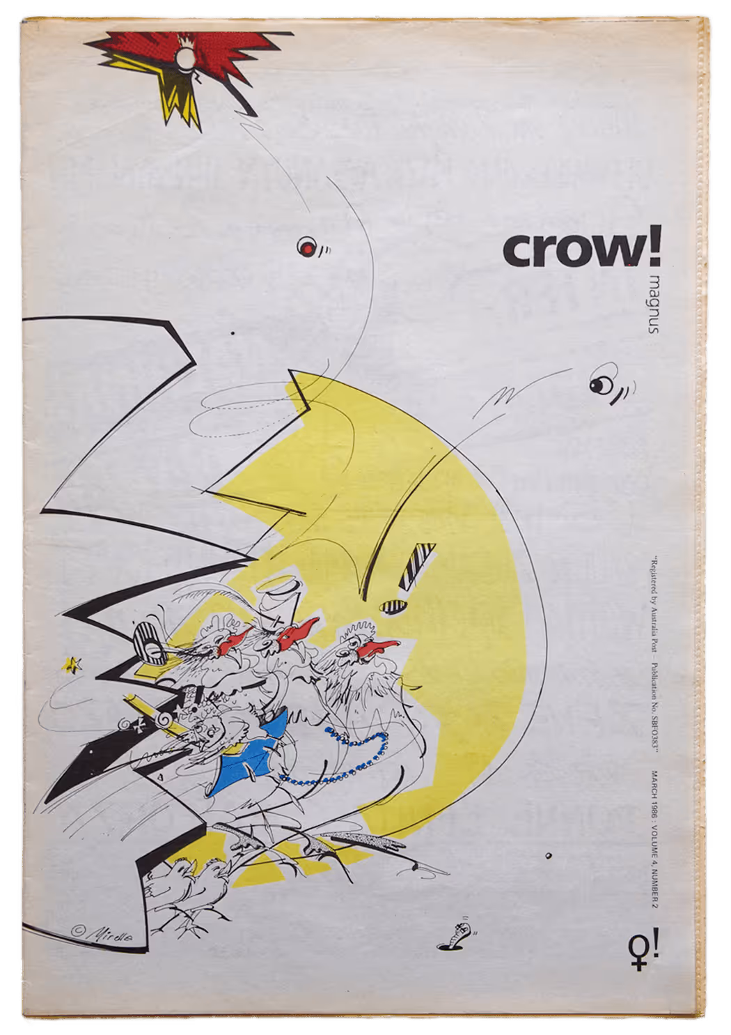
Women's issue cover of student magazine features my design and art direction with cover illustration by Mirella Bordignon
Discover my story of crow!magnus or explore more of my publication and cover designs
CROW!magnus
Cover of student magazine noting an issue with the ANZUS Alliance features my design and art direction with cover illustration by Stuart McLachlan
Discover my story of crow!magnus or explore more of my publication and cover designs
CROW!magnus
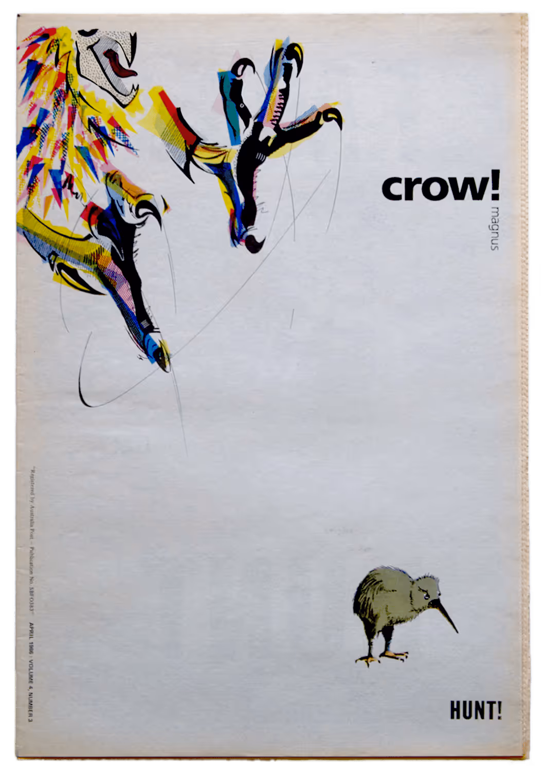
Education issue cover of student magazine features my design and art direction
Discover my story of crow!magnus or explore more of my publication and cover designs
CROW!magnus
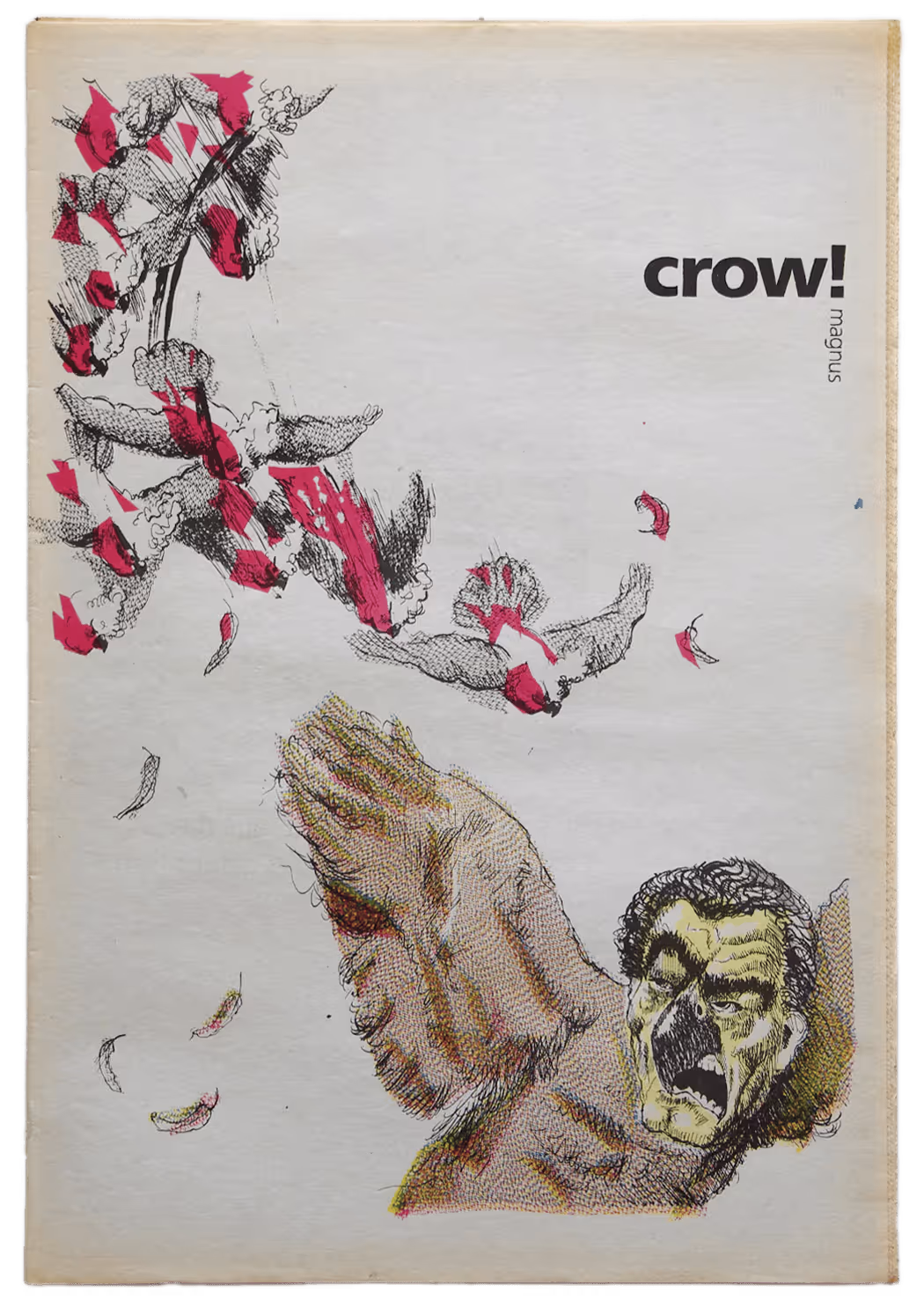
Lobby issue cover of student magazine following activities at the Labor Party National Conference features my design and art direction with cover illustration by Jim Tsinganos
Discover my story of crow!magnus or explore more of my publication and cover designs

CROW!magnus
Peace issue cover of student magazine features my design and art direction with cover illustration by Janet Reid
Discover my story of crow!magnus or explore more of my publication and cover designs
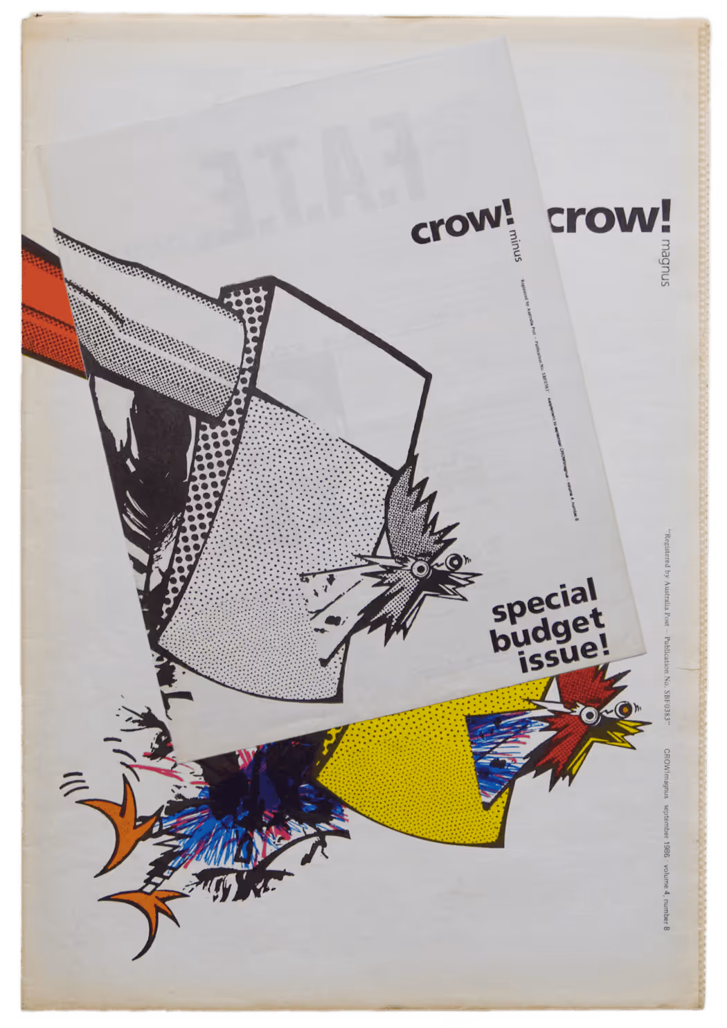
CROW!magnus
Budget supplement and Budget issue covers of student magazine feature my design and art direction mashup of previous cover illustration by Michael Berry
Discover my story of crow!magnus or explore more of my publication and cover designs
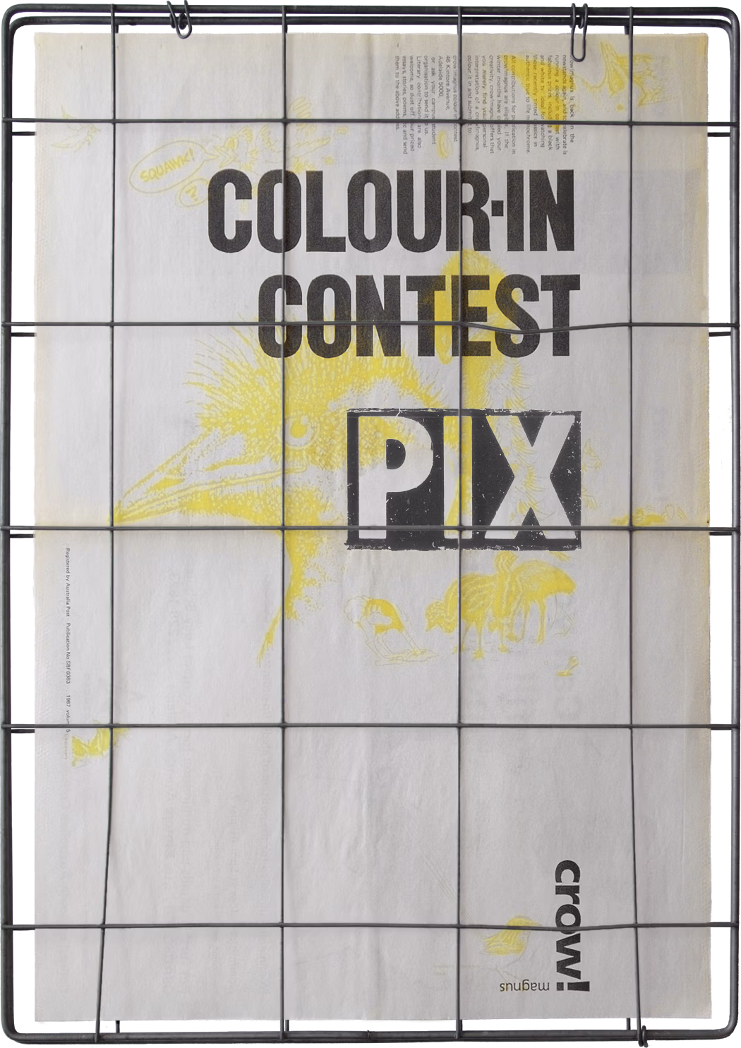
CROW!magnus
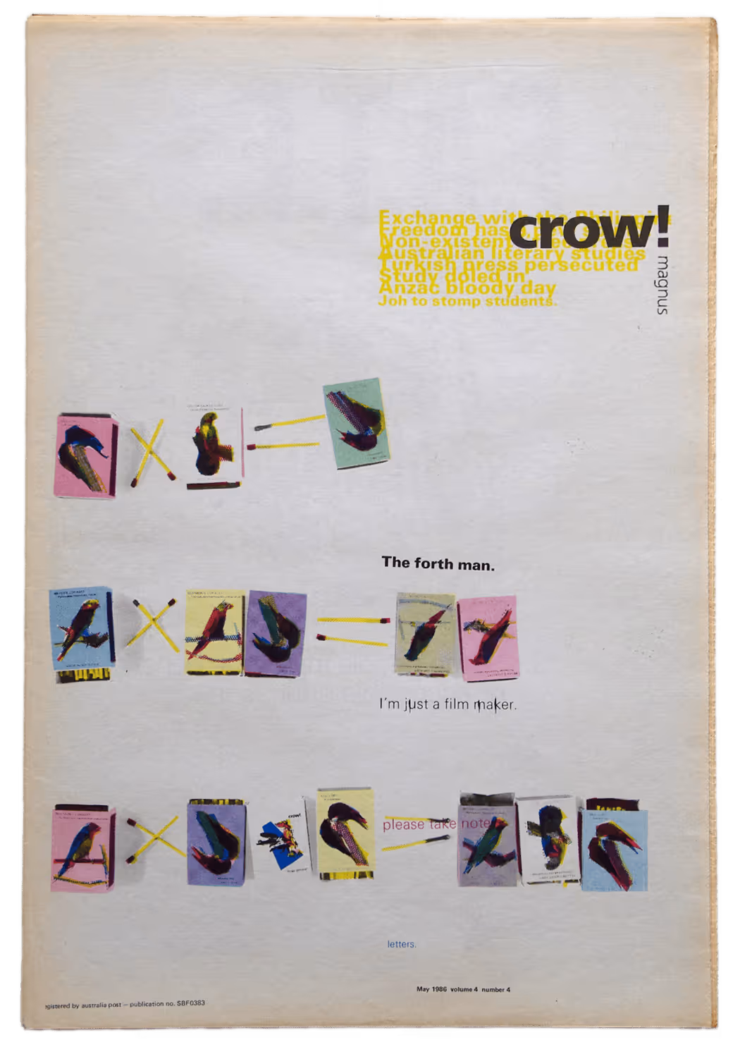
Nihilism issue cover of student magazine was an encore edition featuring my design and art direction. A year or so of shenanigans after setting the magazine style, the editor and I were brought back to get the publication on track again.
Discover my story of crow!magnus or explore more of my publication and cover designs
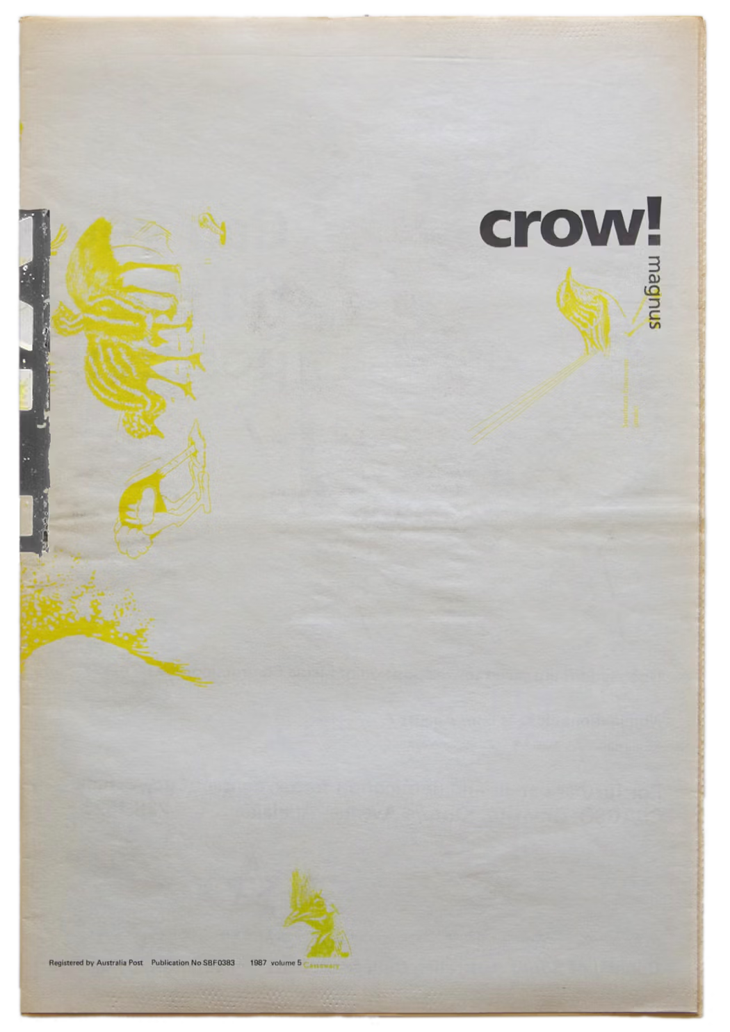
CROW!magnus
News header sheet that folds out of the Nihilism issue cover of student magazine features my design and art direction. A year or so of shenanigans after setting the magazine style, the editor and I were brought back to get the publication on track again.
Discover my work on crow!magnus or explore more of my periodical, poster, publication and cover designs
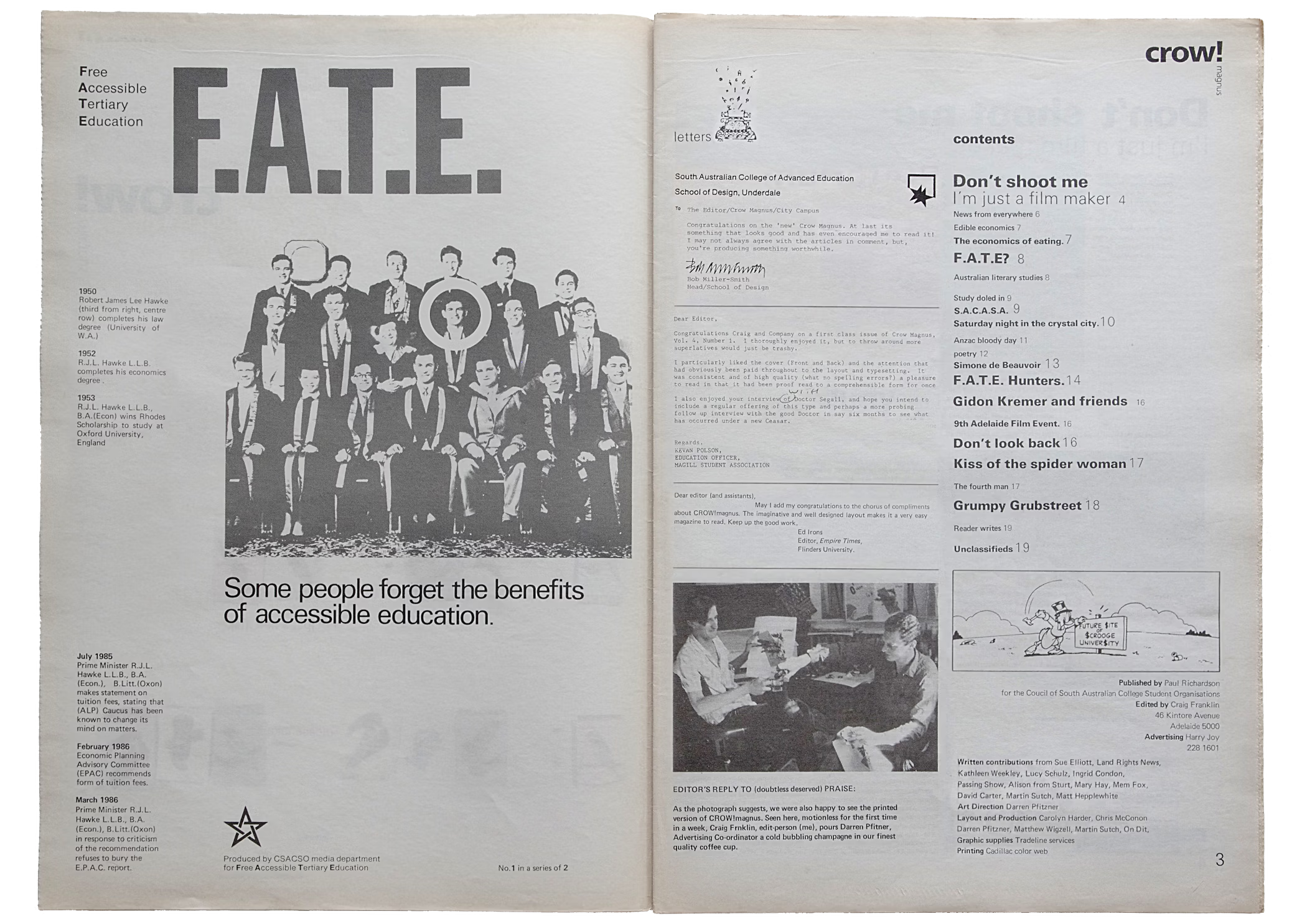
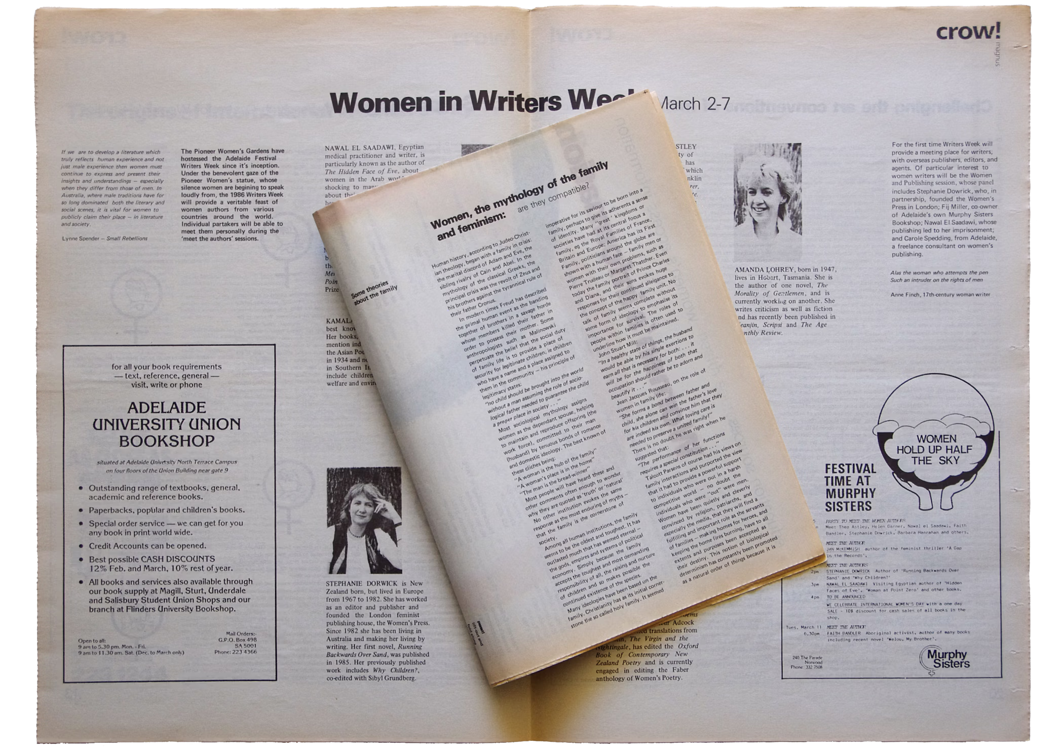
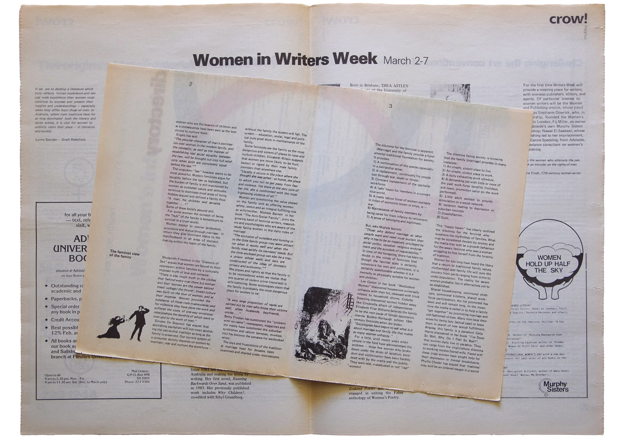
Following the crow!magnus banner type style of bold and light Frutiger, the house style evolved using Univers (from available type families on the inhouse electric golfball typewriter) as the ‘publication voice’. As variation, the Times family was used whenever an ‘other voice’ was needed, which occurred regularly when publishing interviews.
The editor and I defined our roles as either the words or the pictures department. This was based around the electric typewriter, with its selected typefaces available in a couple weights and sizes with italics. The editor’s responsibility was feeding and formatting his words into the eight-thousand-character memory of the typewriter. Once proofed and corrected, the memory would be cleared for more typing while the approved galley was mine to compile into printed pages. From this arrangement I explored my newly forming graphic design knowledge through experiments with publication composition, page and advertisement design, and hand separated full colour printing.
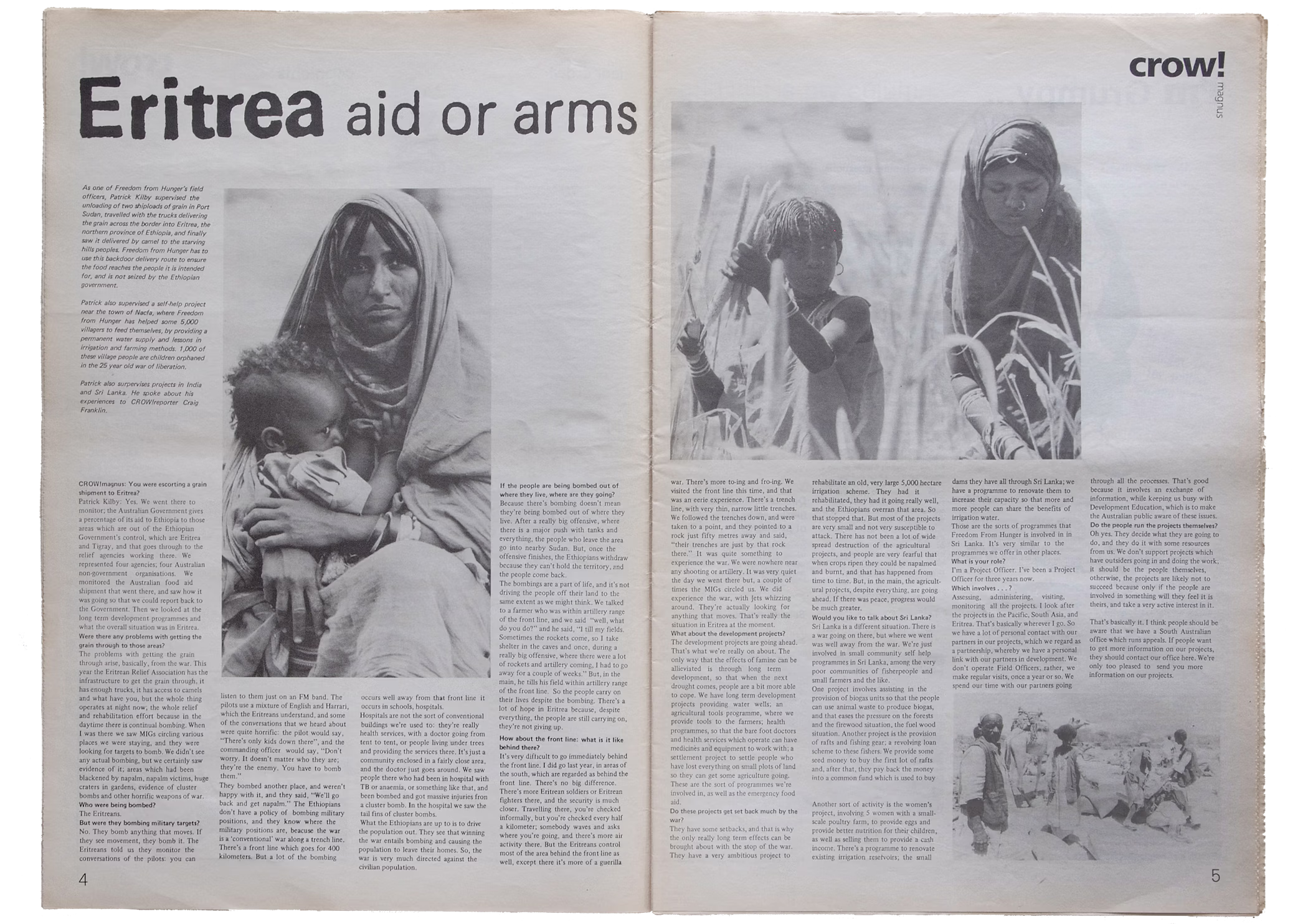
CROW!magnus
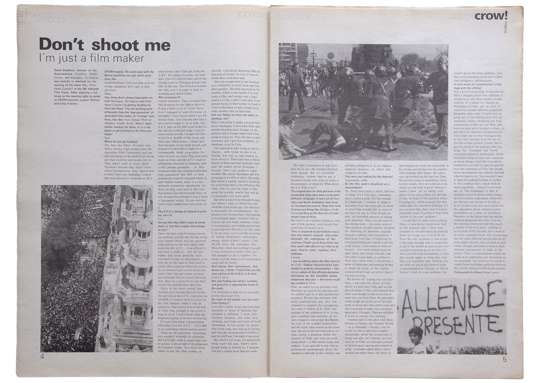
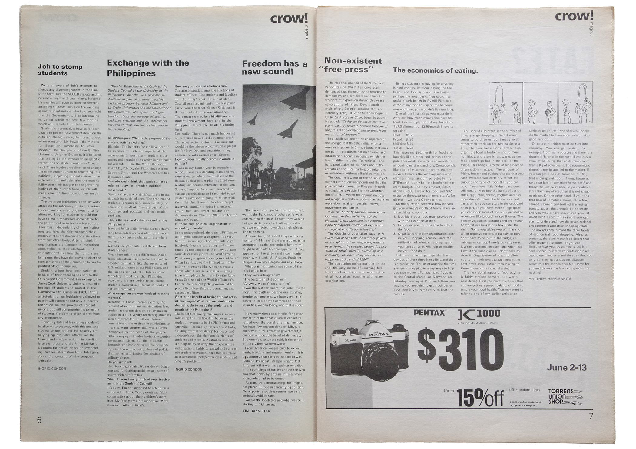
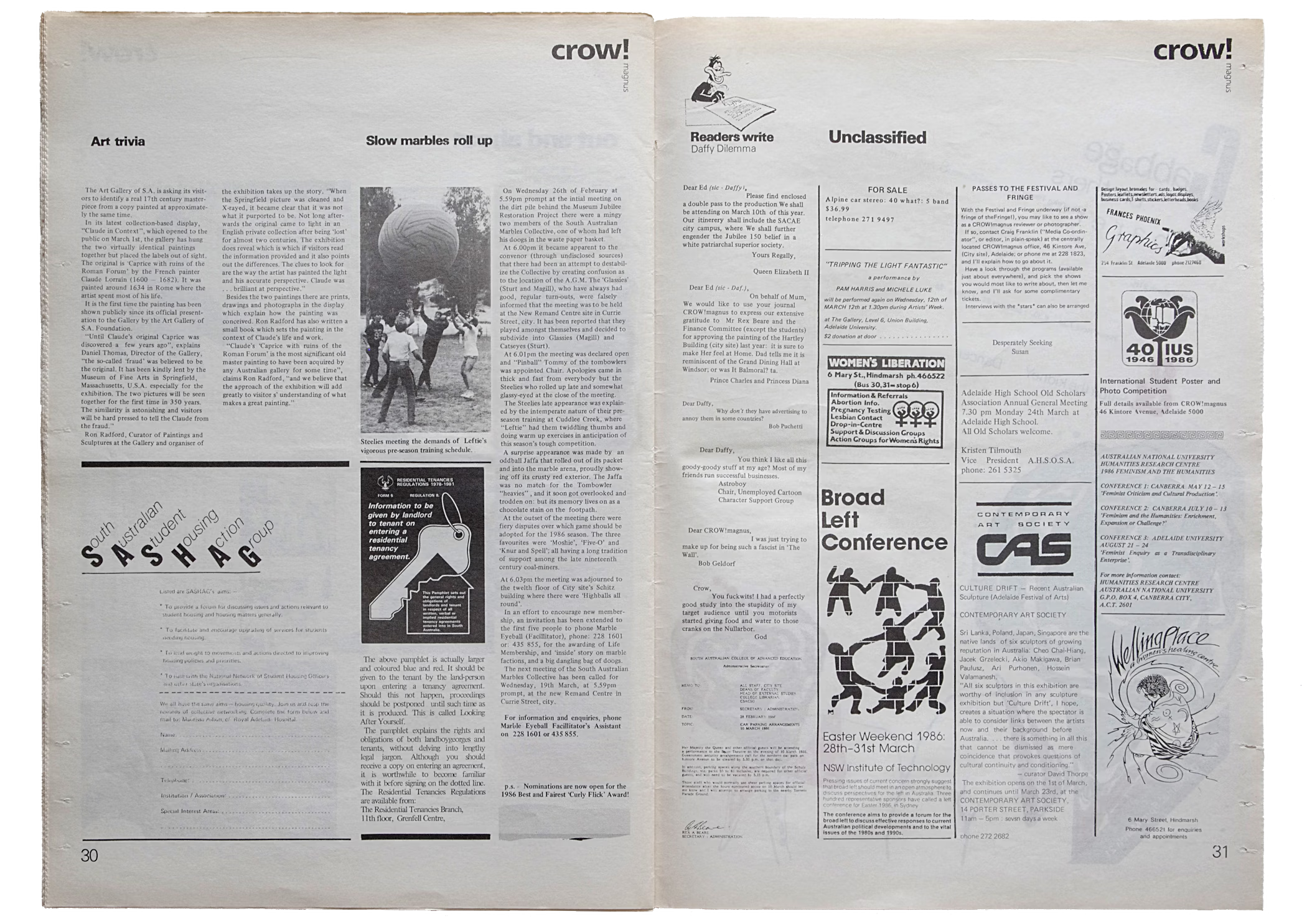
Student magazine spread featuring my design, art direction and production management with additional design by Janet Reid, Chris McConnon and Matthew Wigzell among others
Explore more of my publication and cover designs
CROW!magnus
Student magazine spread featuring my design, art direction and production management with additional design by Janet Reid, Chris McConnon and Matthew Wigzell among others
Explore more of my publication and cover designs
CROW!magnus
Student magazine spread featuring my design, art direction and production management with additional design by Janet Reid, Chris McConnon and Matthew Wigzell among others
Explore more of my publication and cover designs
CROW!magnus
Student magazine spread featuring my design, art direction and production management with additional design by Janet Reid, Chris McConnon and Matthew Wigzell among others
Explore more of my publication and cover designs

CROW!magnus
Student magazine spread featuring my design, art direction and production management with additional design by Janet Reid, Chris McConnon and Matthew Wigzell among others
Explore more of my publication and cover designs
CROW!magnus
Student magazine spread featuring my design, art direction and production management with additional design by Janet Reid, Chris McConnon and Matthew Wigzell among others
Explore more of my publication and cover designs
A humble honourarium per issue afforded a small amount for the cover illustrator and smaller amounts for any fellow design school students gaining rudimentary experience laying out magazine pages and gaining printed examples for their portfolio.
At times we were illustrating using nib pens and brushes, other times it was paste-ups with Rotring pens and markers, lightboxes, Liquid Paper, drafting benches and rub-down Letraset type, tones and textures in varying states of decay. Boxes of gluesticks were always at hand for adhering various type, photos and whatever random materials might be associated with a story.
Feature photographs were specified and supplied as screened bromides and at times headings were provided as phototypesetting or created using the typewriter and photocopier. Otherwise everything that went to print was prepared at that time, by the hand of the person in the student union office laying out the page.
CROW!magnus
Student magazine literary supplement features my design, art direction and production management with additional design by Janet Reid, Chris McConnon and Matthew Wigzell among others
Explore more of my publication and cover designs
CROW!magnus
Student magazine literary supplement features my design, art direction and production management with additional design by Janet Reid, Chris McConnon and Matthew Wigzell among others
Explore more of my publication and cover designs
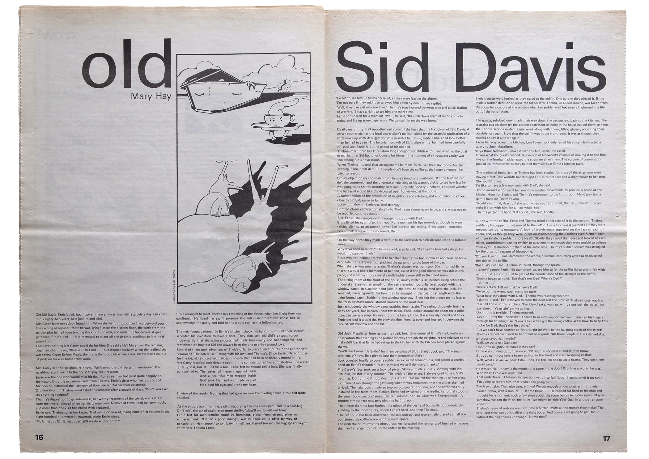
CROW!magnus
Student magazine literary supplement features my design, art direction and production management with additional design by Janet Reid, Chris McConnon and Matthew Wigzell among others
Explore more of my publication and cover designs
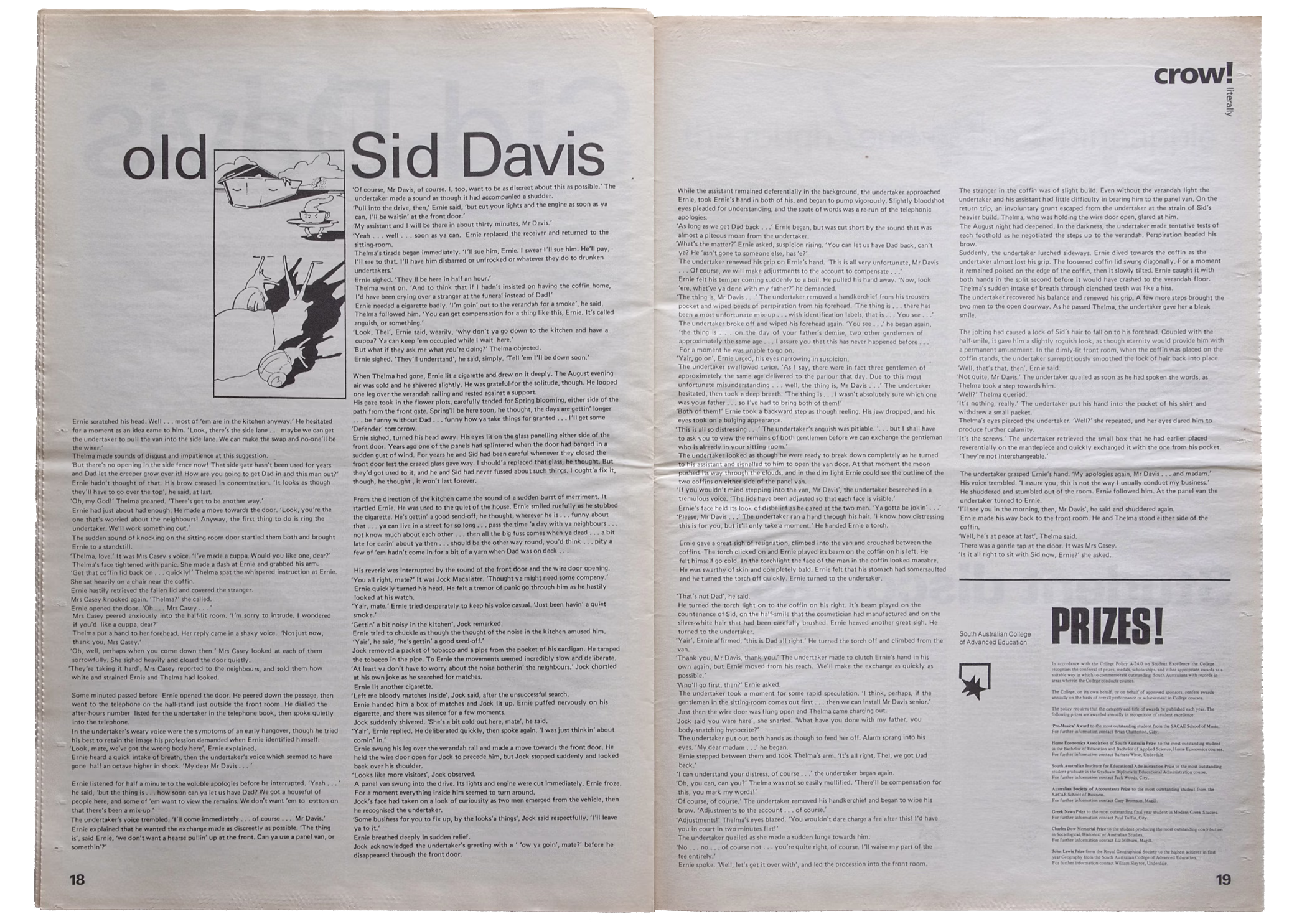
CROW!magnus
Student magazine literary liftout features my design, art direction and production management with additional design by Janet Reid, Chris McConnon and Matthew Wigzell among others
Explore more of my publication and cover designs
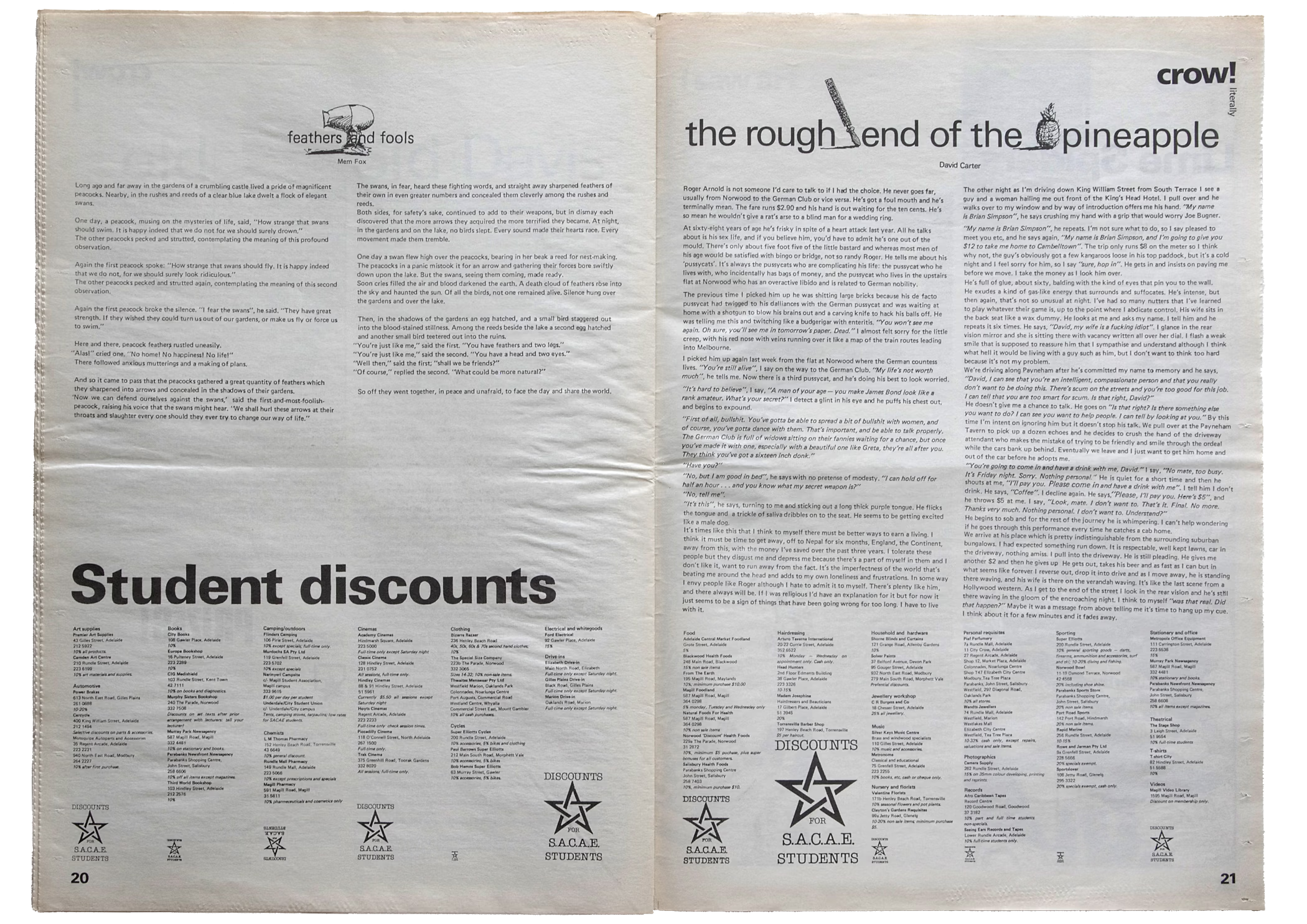
CROW!magnus
Student magazine literary liftout features my design, art direction and production management with additional design by Janet Reid, Chris McConnon and Matthew Wigzell among others
Explore more of my publication and cover designs
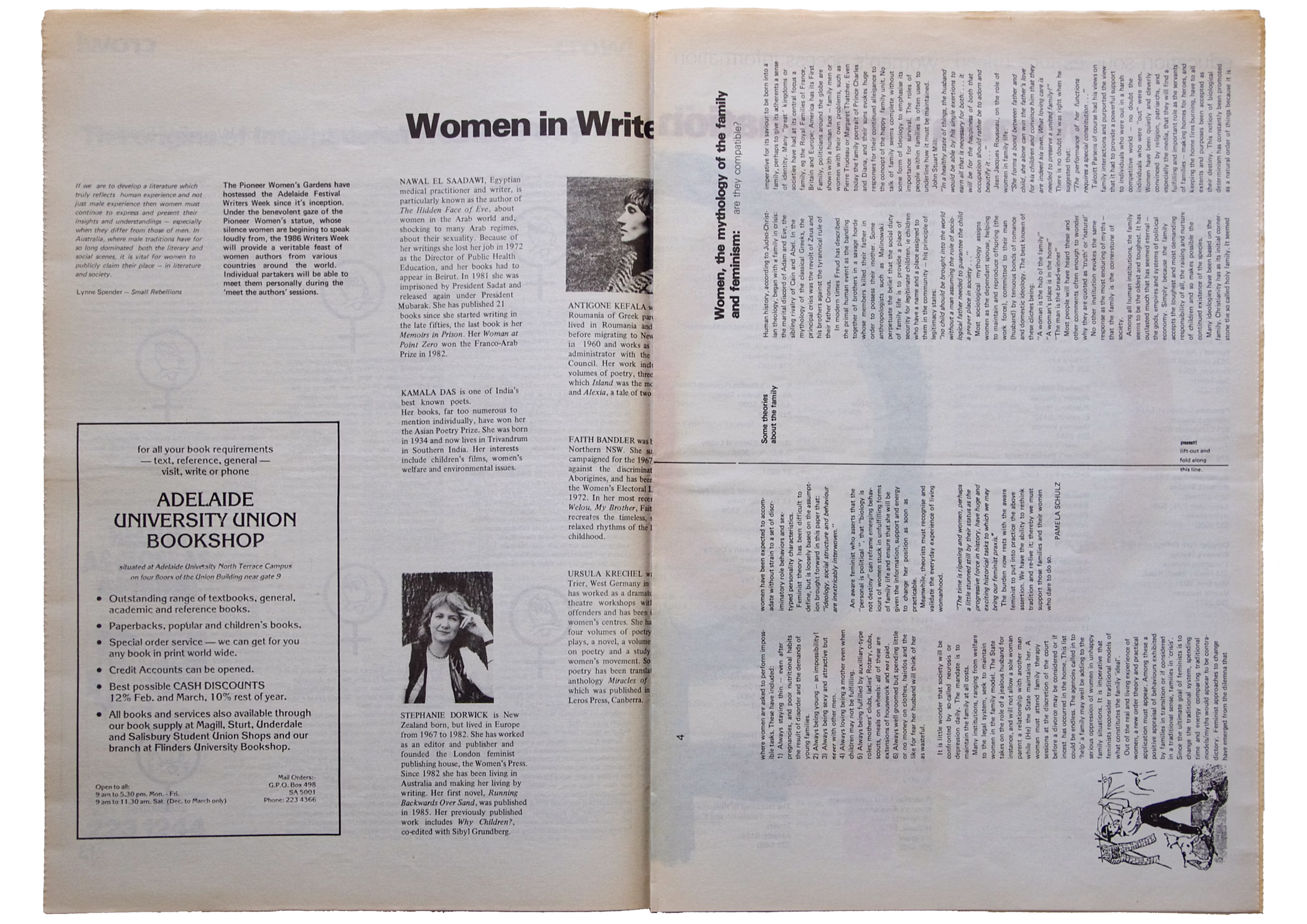
CROW!magnus
Student magazine literary liftout features my design, art direction and production management with additional design by Janet Reid, Chris McConnon and Matthew Wigzell among others
Explore more of my publication and cover designs
Cover illustrations were usually supplied for the black plate and we would discuss how I could hand separate and collage the cyan, yellow and magenta plates to best colour the image. Similar separations would occur for the centre spread and back page advertisements.
CROW!magnus
Detail from Education issue cover of student magazine features my design, art direction and hand separated colour treatment
Discover my story of crow!magnus or explore more of my publication and cover designs
CROW!magnus
Detail from Lobby issue cover of student magazine features my design, art direction and hand separated colour treatment with cover illustration by Jim Tsinganos
Discover my story of crow!magnus or explore more of my publication and cover designs
CROW!magnus
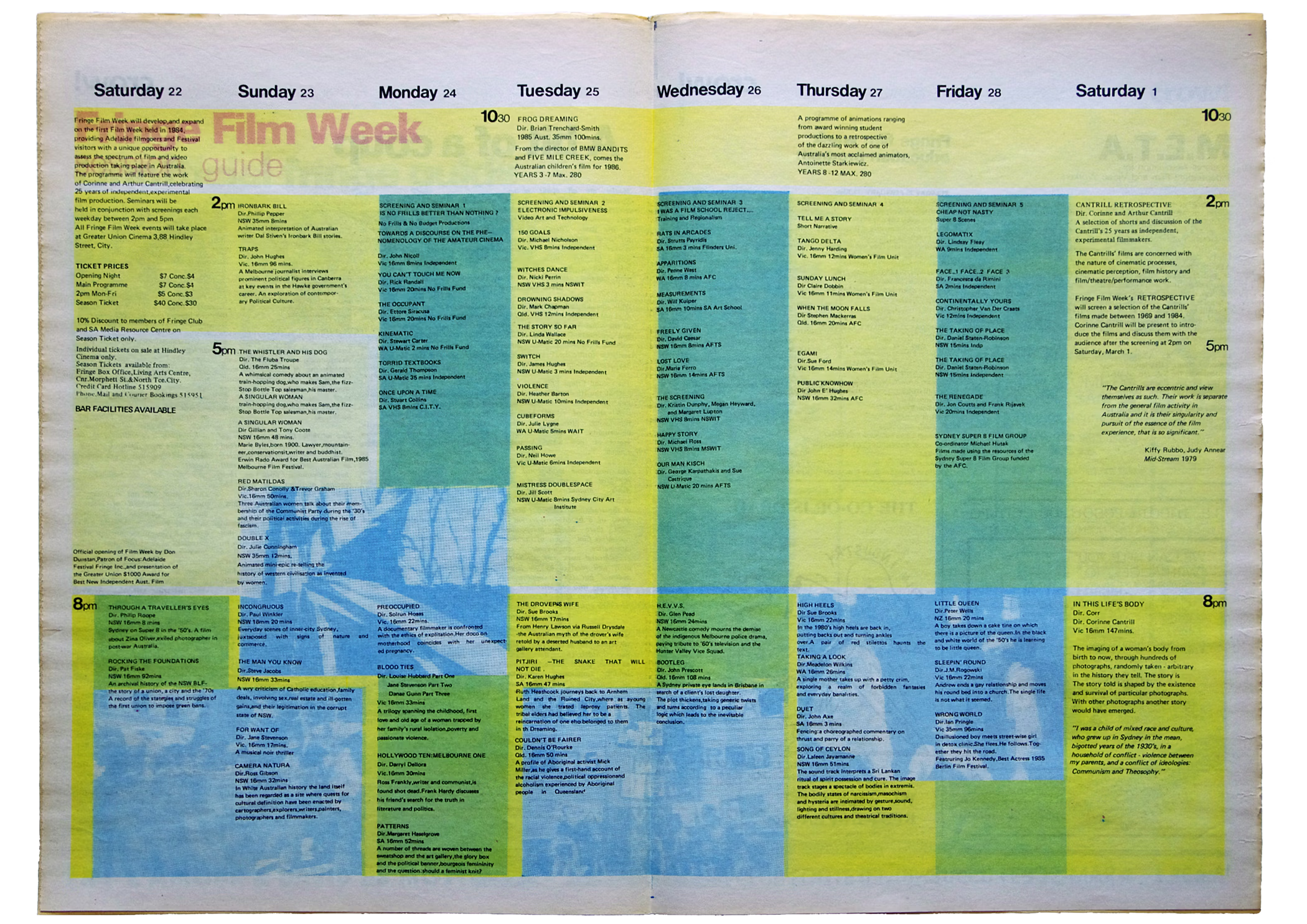
Fringe Film Week colour liftout program in student magazine features my design, art direction and hand separated colour treatment
Discover my story of crow!magnus or explore more of my publication and cover designs
CROW!magnus
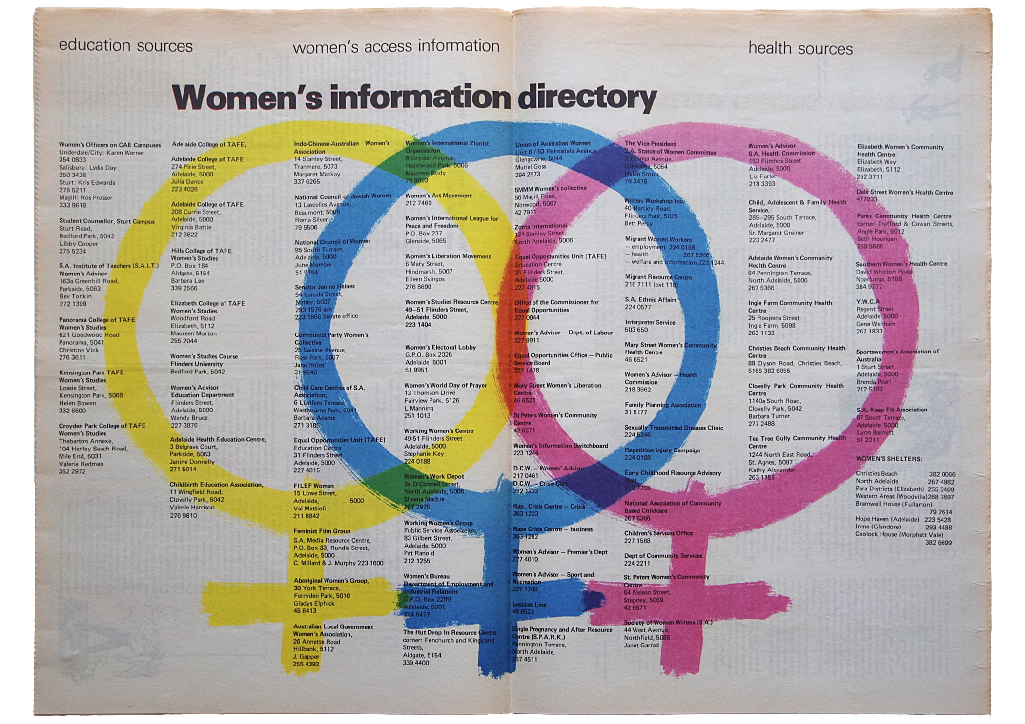
Women's Information Directory colour liftout in student magazine features my design, art direction and hand separated colour treatment
Discover my story of crow!magnus or explore more of my publication and cover designs
CROW!magnus
Back cover advertisement from student magazine created by Janet Reid with my art direction and production management
Discover my story of crow!magnus or explore more of my publication design
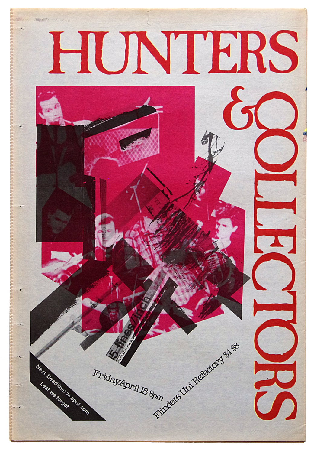
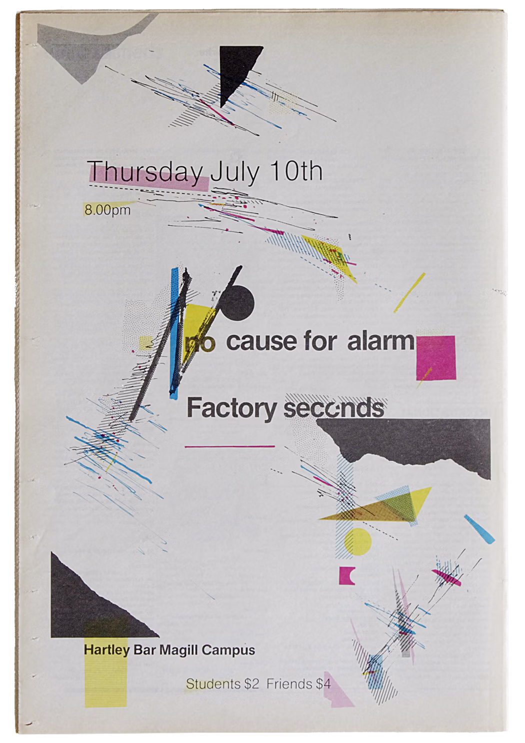
CROW!magnus
Back cover advertisement from student magazine created from band poster features my art direction and hand separated colour treatment
Discover my story of crow!magnus or explore more of my publication design
The hand separations I performed for full colour printing were exploratory—using rudimentary materials pragmatically. My tertiary education only provided demonstrations of the expensive, technical and heftily equipped reprographic process. Although never recognised by the design school, these activities were a practical extension to my design education at the time. The opportunity I had created empowered my little bit of knowledge to dangerously explore colour separations physically.
As such, it was important to see the process through all its reprographic and printing steps before editions became public.Throughout the year I would skip class, slip across town to approve the reprographics and platemaking or to press check the magazine reeling out of a web offset press. In these moments, large rolls of paper would feed into one end of the machinery with pages running along individual lines, and on the fly the entire publication would be 'printed inline' through the press and appear collated, folded, trimmed and bundled ready for delivery at the other end of the factory.
It was the mid-eighties and this was my precursor to desktop publishing.
· • · • ·
Among these activities I finished my final design school year. Over the following summer I cut my teeth as a 'timelord', and by that I mean designing diaries and planners for student unions and associate organisations while furthering my design, production and time management skills. A couple of years later I was writing and presenting prerequisite courses for desktop publishing at the state’s School of Printing and Graphic Arts.
Discover my subsequent publication design.