alternate universe
alternate universe
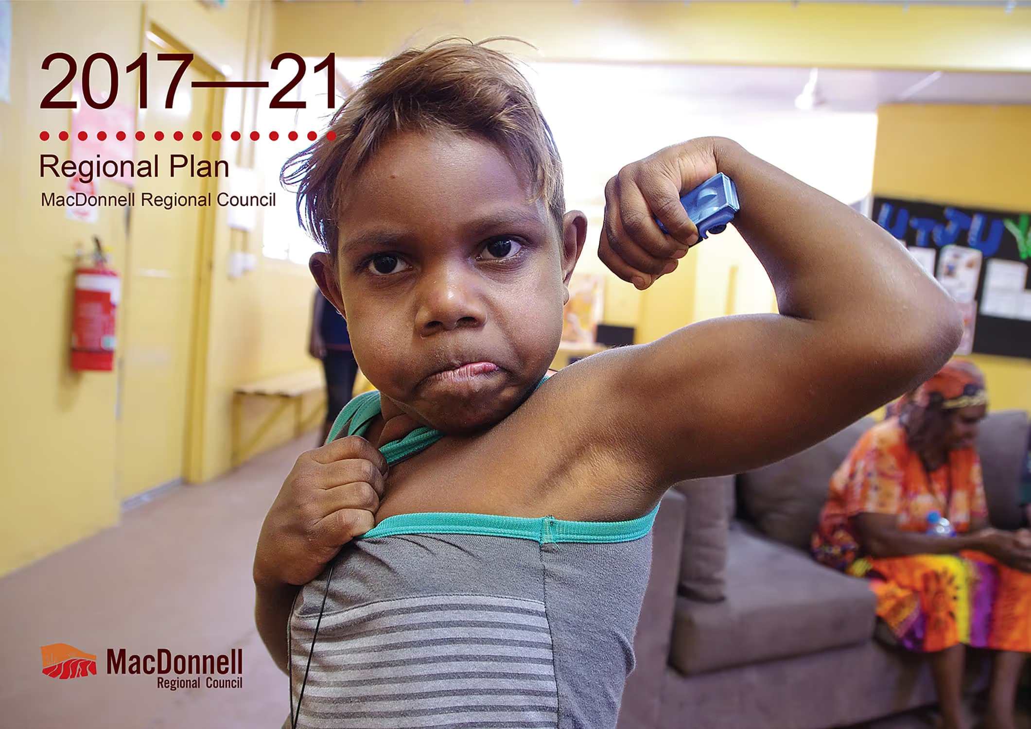
Shooting a day-long event in Utju (Areyonga), I gradually became aware of a young boy and his friend playing with their cars. Always off to one side, their games moved with our activities, from place to place around the community. Eventually, Jayden picked his moment and asked me to take his photo. That’s when he pulled out his guns.
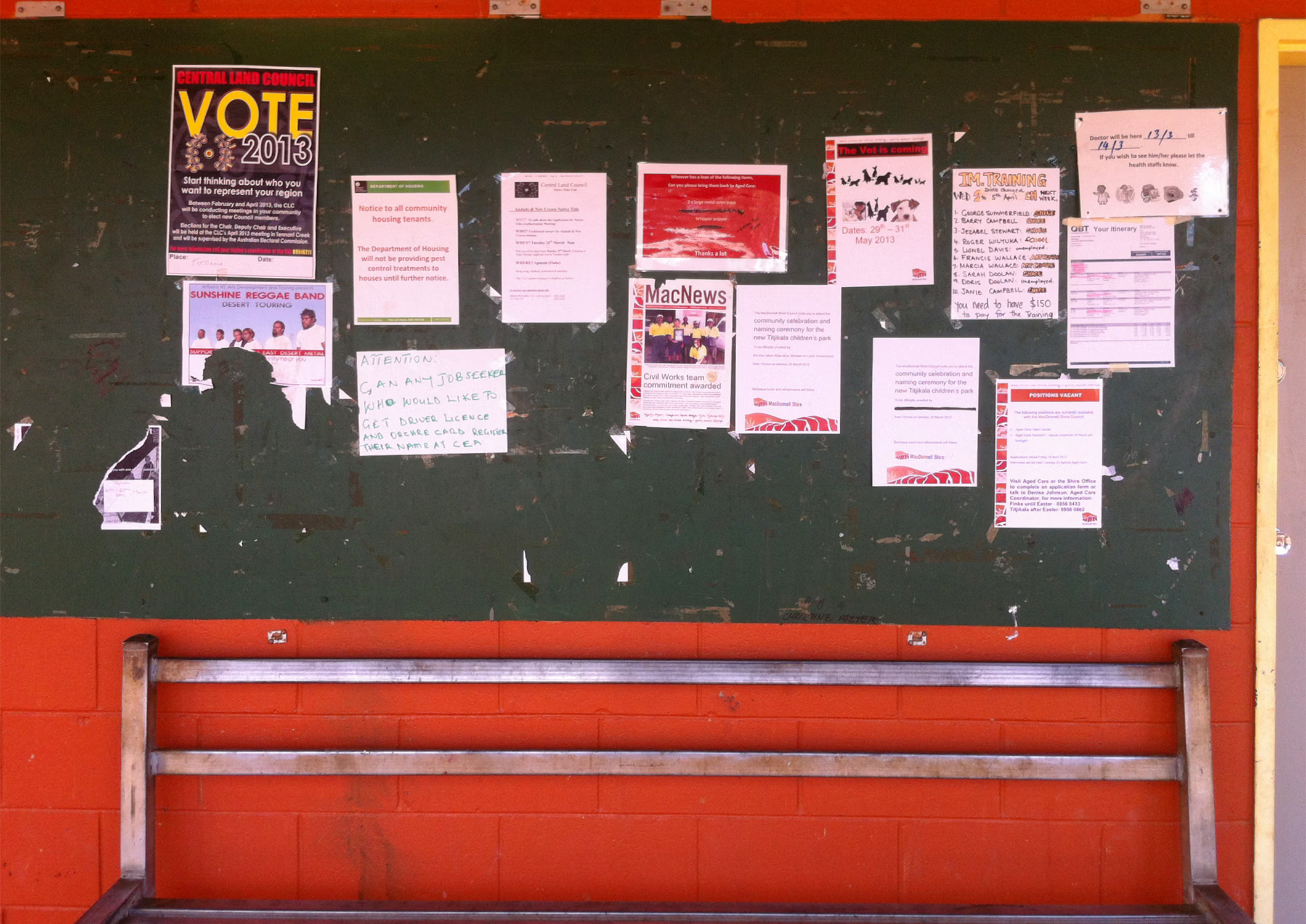
English is a second, third or subsequent language for many MacDonnell Regional Council staff and their constituents. For important council documents I was compelled to break down complexities, from government speak to basic English, and present information in a clear visual style. This process was central to each Regional Plan and proved very helpful for managers, several hundred community staff members—oh, and government officials.
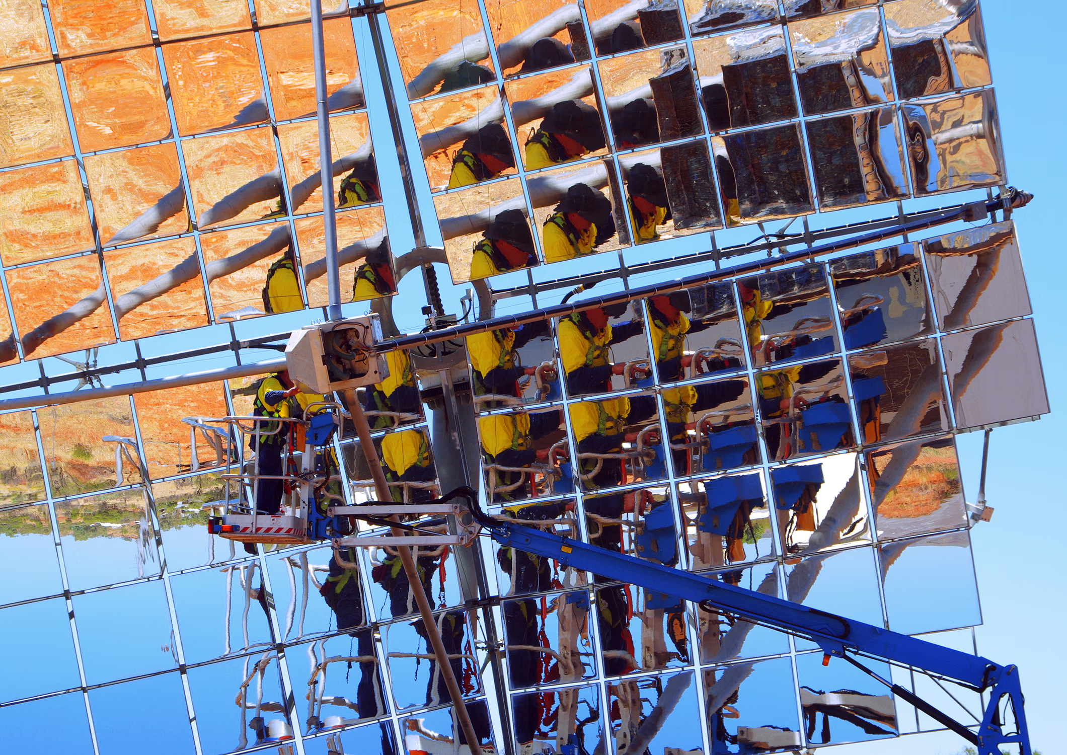
My approach to communications and design for the council is seen at its simplest and best on this report cover. The visual elements are communicative with my photography speaking strongly of council's values, branding is applied sparingly and typography is paired back to its most efficient. Planning documents formed a nexus of many corporate streams and the cover image of this one was warmly embraced by staff and constituents as a prime metaphor of the council’s direction. I produced many communications and branding projects for this organisation, but the broad and positive reception this project received suggests it hit most people in the feels.
Discover more of my work with MacDonnell Regional Council from their reports or by browsing the corporate and identity pages.
· • · • ·
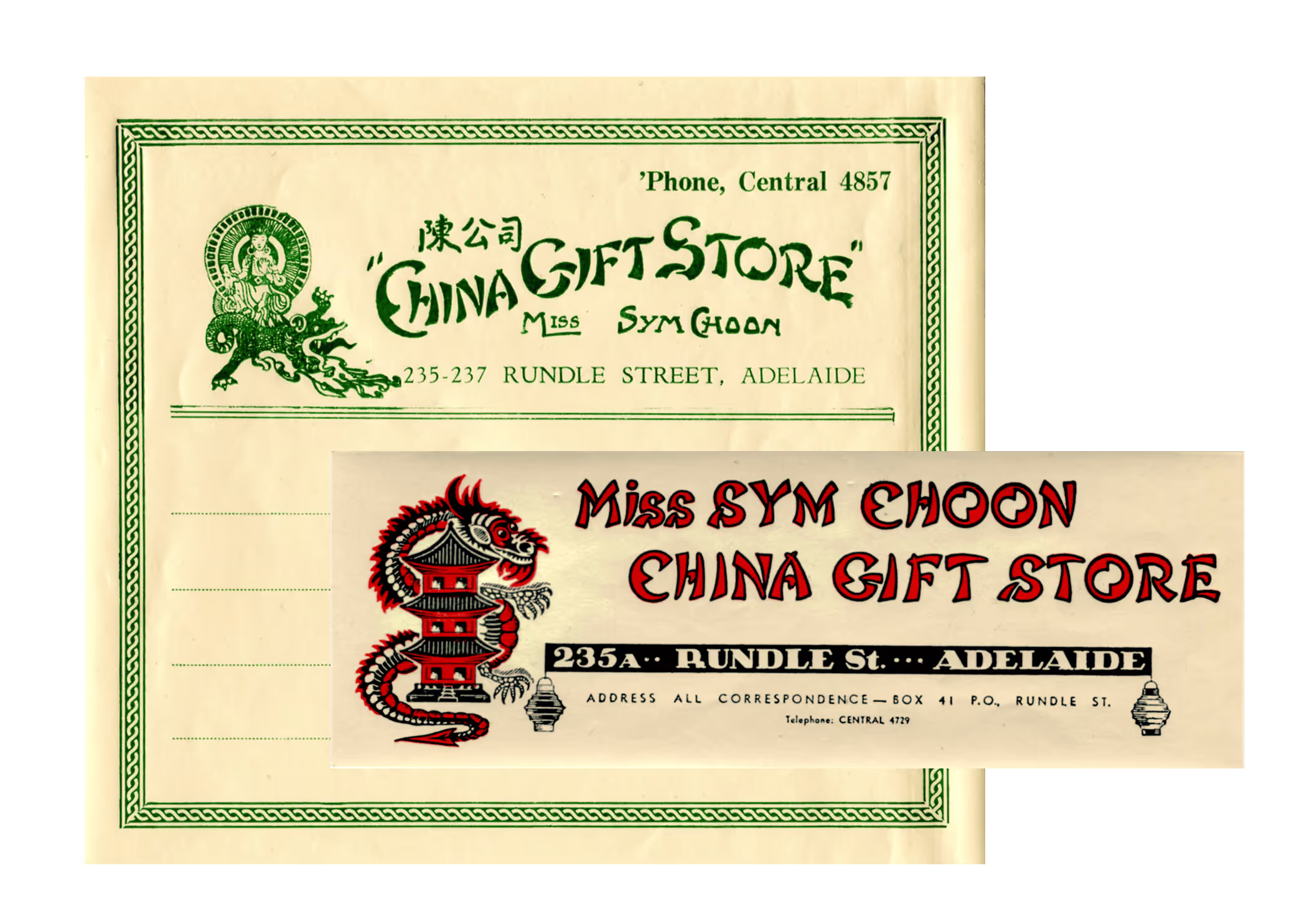
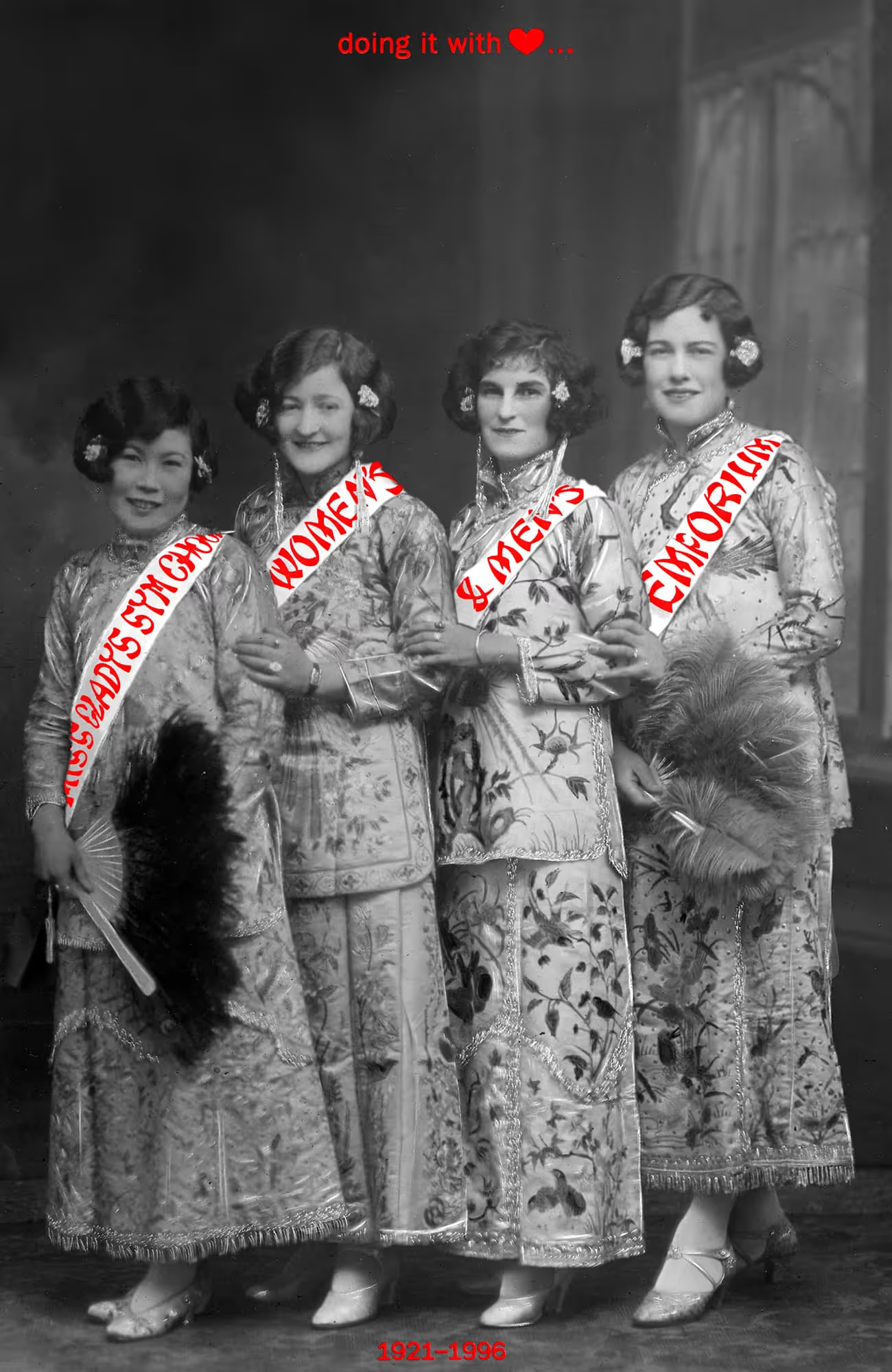
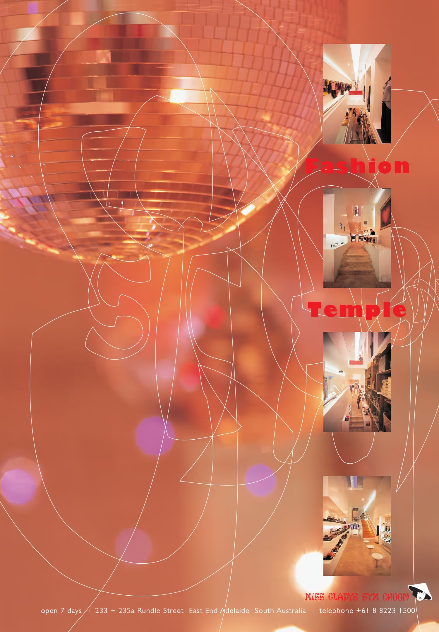
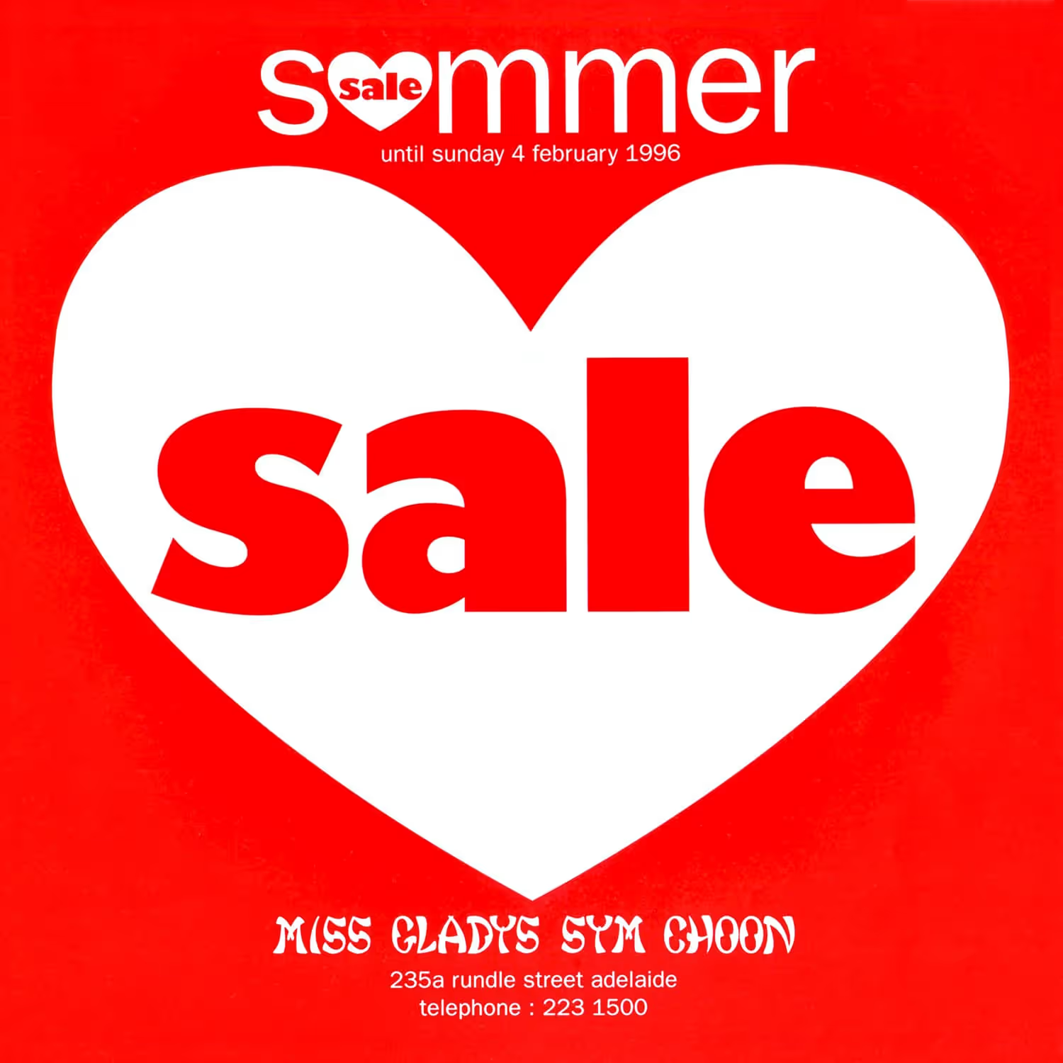
In an alternate universe, I designed all-purpose branding, marketing and merchandising for 'gorgeous-young-things’ fashion outlet, Miss Gladys Sym Choon. The owners had earned the respect of the pioneering Adelaide retailer Gladys Sym Choon with an expression of interest to take over her heritage listed store. She was impressed they would continue trading under her name and turn the long running gift store into a fashion house.
Accepting their proposal, Gladys granted the newcomers a cache of historical promotional materials. With tag lines like ‘prompt courteous service since 1923’ and photographs of the young and stylish Gladys and staff, the scene was set for an interesting and iconic fashion experience. The store continues to trade, having developed fashion labels and expanded retail opportunities.
Explore the Miss Gladys Sym Choon fashion catalogues.
· • · • ·
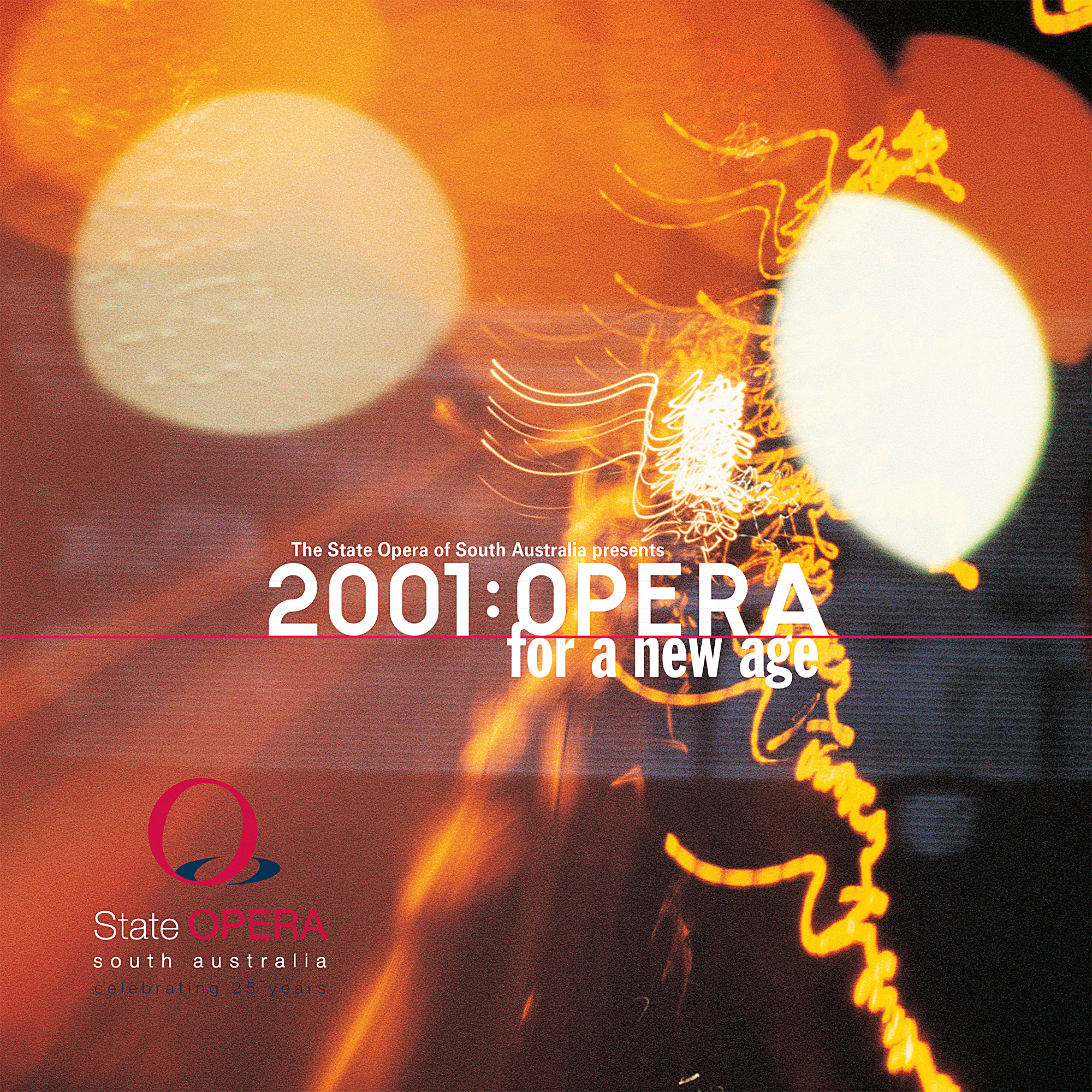
As far as promoting opera seasons, this one was different: A refresh to promote a contemporary and progressive opera season of new productions only. Usually an opera brief would come with existing production images to support the seasons’ promotion. But at the turn of a new millennium, the opera company wanted to lean forward, into the future. This brief therefore demanded campaign collateral to promote a directional change, to reposition the company for forthcoming seasons.
I answered the brief with a suite of multiple exposure images I'd created some years earlier. Marketing assets utilising my type design saw Opera for a new age suitably styled and emblazoned on subsequent opera promotions.
Explore the 2001 season brochure or discover more of my opera work on the poster and program pages.
· • · • ·
This identity brief asked that the three remote communities owning the company be represented by their local vegetation. I simply wanted to convey the sense of being among a grove of desert oaks, by combining computer skills with the traditional graphic arts techniques I had acquired studying printmaking.
Discover more of my logo designs on the identity and logo pages.
· • · • ·
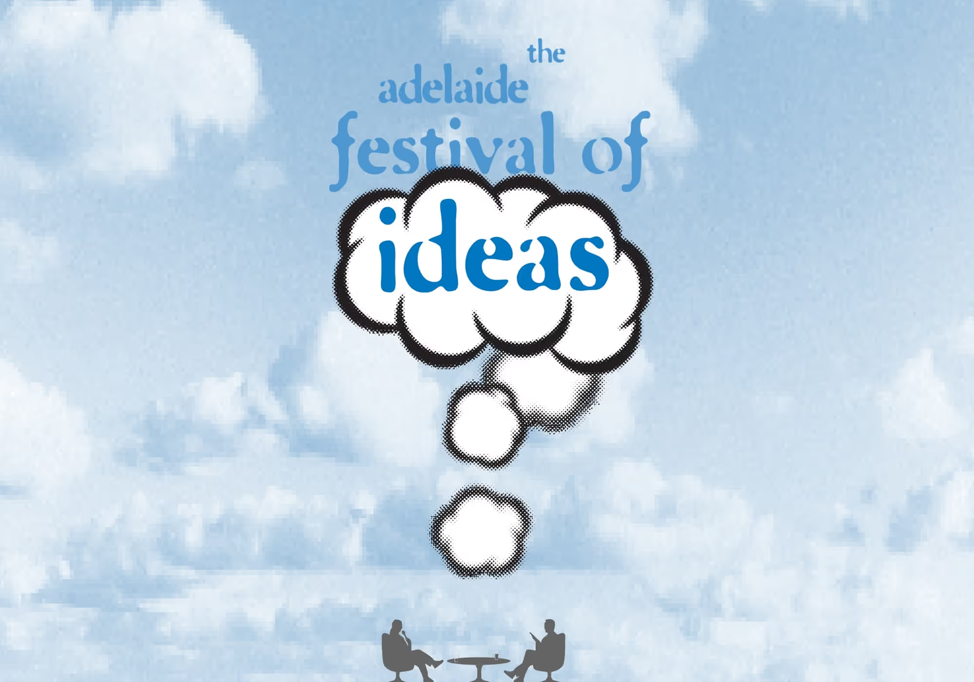
Before TED Talks, before the notion that every city should have an ideas festival, the Adelaide Festival pioneered a new concept. To be based on its highly successful Adelaide Writer’s Week, my brief was to develop iconage that would effectively introduce the concept of an ideas festival to the public.
There is a design convention, for clarity of communication, where one element features more prominently than others. As work on my design progressed, it became apparent the convention would simply not work. Elements of question mark, thought cloud, and brain would need to compete equally, in order to best convey the concept.
A sounding board for my Writers’ Week poster designs each season was a poet who had participated in the event. I realised my ideas icon was getting through when I bumped into him and he kept talking about the upcoming ‘festival of minds'—suitably on topic, I thought.
At events held in venues along Adelaide’s cultural boulevard, additional seating and sound systems had to be urgently sourced on the day to accommodate the audiences that began overflowing from auditoriums and university halls.
Discover more of my work for these and similar events by browsing the cover, display and program pages.
· • · • ·
more favourites
more favourites
Other design examples I recall fondly tend to feature poster, cover, logo and ephemera design…but hey, getting a single surface to do the talking is a favourite communication design challenge!
· • · • ·
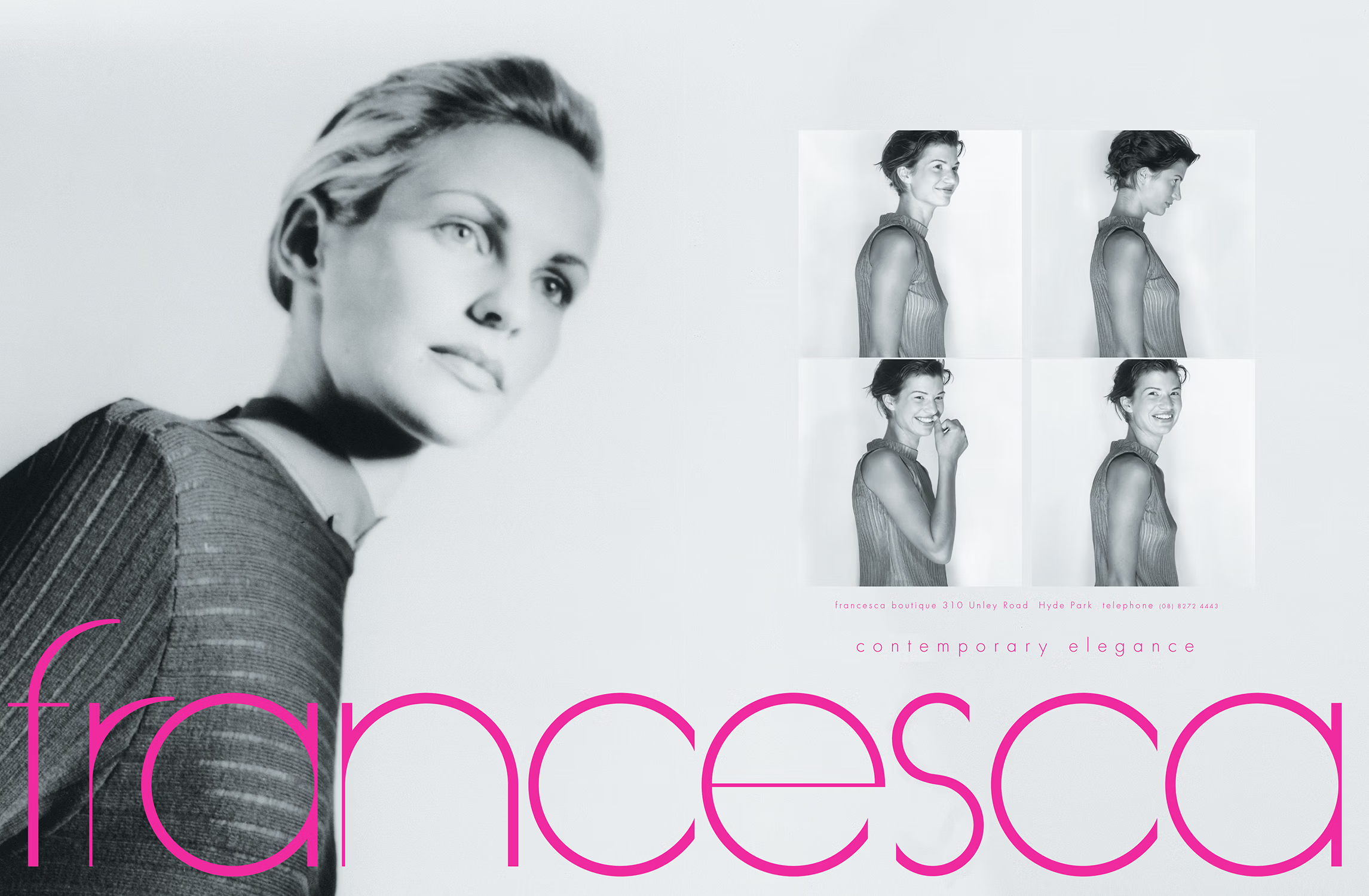
My longest continuous client, Francesca boutique appreciated my creativity and finesse every time. Along with insights arising out of the many European and Australian designers she sourced, Francesca’s owner taught me a great deal about design by illuminating the tireless elegance in a Giorgio Armani garment, or the irreverent wit Franco Moschino conveyed within his designs.
I began designing for Francesca after the 80s recession when we developed the taglines 'style never goes out of fashion' followed with ‘have Francesca fashion your style’. The advice spoke to clients wanting to keep their wardrobe fresh in tough times. From there, we continued making elegant communications together over the years, for the boutique’s newsletters, magazine and newspaper advertisements, direct mail, and window displays promoting pre-season launches, workshops, parades and post-season sales.
· • · • ·
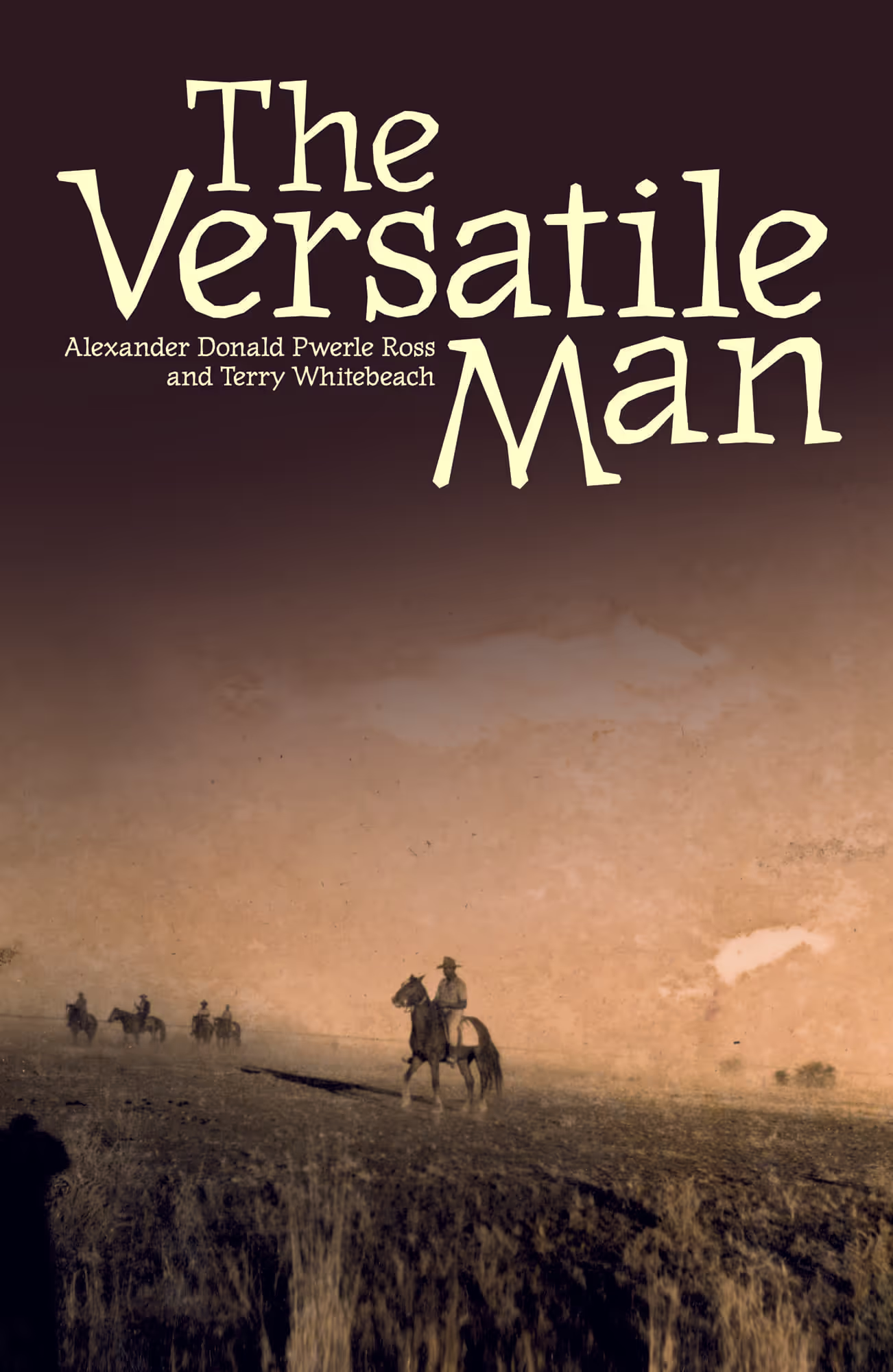
Learning first-hand about Aboriginal culture was my primary motivation to live in central Australia. My journey began while designing and producing books at IAD Press, a leading Aboriginal publisher of language and culture books. The role was an opportunity to learn from Aboriginal people who were living their culture and from some of the leading linguists, academics, and authors working in the field, all while sharing my skill set. Along with managing the production schedule for the publisher, I directed contributing designers, photographers and illustrators, while also designing their major publications, selected covers and marketing collateral.
My time at the small publishing house spanned its period of highest output, and represented some of my favourite moments in book design and cultural exchange.
Explore backstories of my design development for Listen deeply, let these stories in and Lives of the Papunya Tula Artists or visit the publication page to discover more book and related designs.
· • · • ·
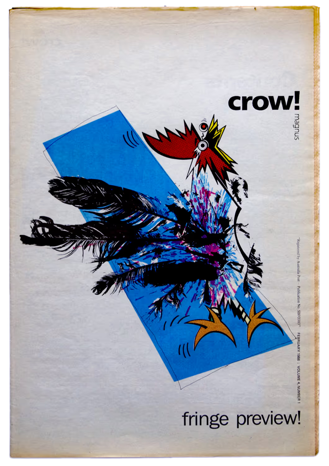
Back at the start of my final year in design school I was recruited by the student union president as their official ‘Propagandarist’. I seized the opportunity by reinventing the magazine’s persona, moving things forward from their gun-toting macho revolutionary raven called Crow Magnus, toward less discriminatory opportunities. By exploring the possibilities of bird metaphors, crow!magnus was hatched, granting new meaning and a purpose to ‘make some noise and be heard’.
Armed with an electric golfball typewriter, Letraset in varying states of decay, a new photocopier, and a humble honourarium for recruiting fellow students, I explored my newly forming graphic design knowledge by experimenting with a range of techniques, including hand separated full colour printing, page and advertisement design, and publication composition. It was the mid-80s and this was my precursor to desktop publishing.
Get the full crow!magnus story on the periodical page.
· • · • ·
This was my best design brief. Ever.
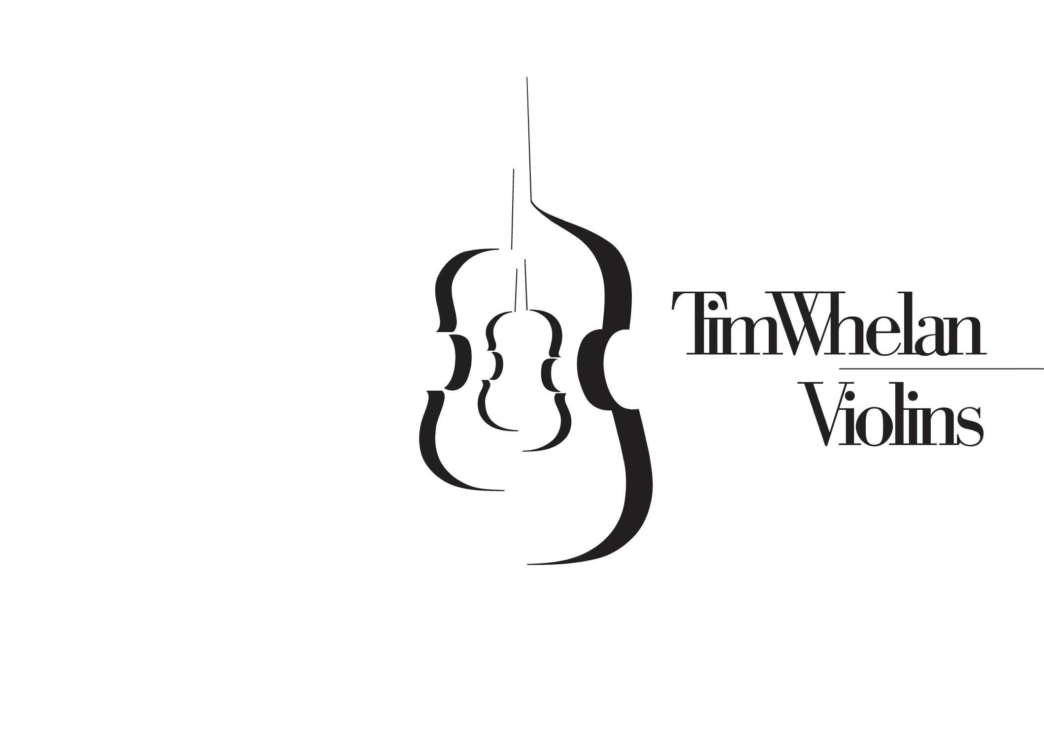
In appreciation of branding I'd developed for my design practice A4Art, I was engaged to develop an original identifying design for a specialised business. Tim Whelan made and repaired violins and other antique stringed instruments. His workshop was located upstairs in the heritage laden Adelaide Arcade where he and his staff worked among new and old instruments in differing states of repair.
The design needed to reach across time to sit comfortably within a musical tradition and with the industry and the arcade's heritage, while also leaning into the new millennium. In asking me to avoid visual clichés, he shared with me some of his trade magazines—among the longest continuously published periodicals on the planet—as an indication of the many designs that had been made over the centuries, featuring the instruments and particularly their f-holes, stereotypically representing his trade. He was asking for something truly unique and that was entirely fine by me.
To the best of all assessments, I achieved this. Beautifully.
heritage listed
heritage listed
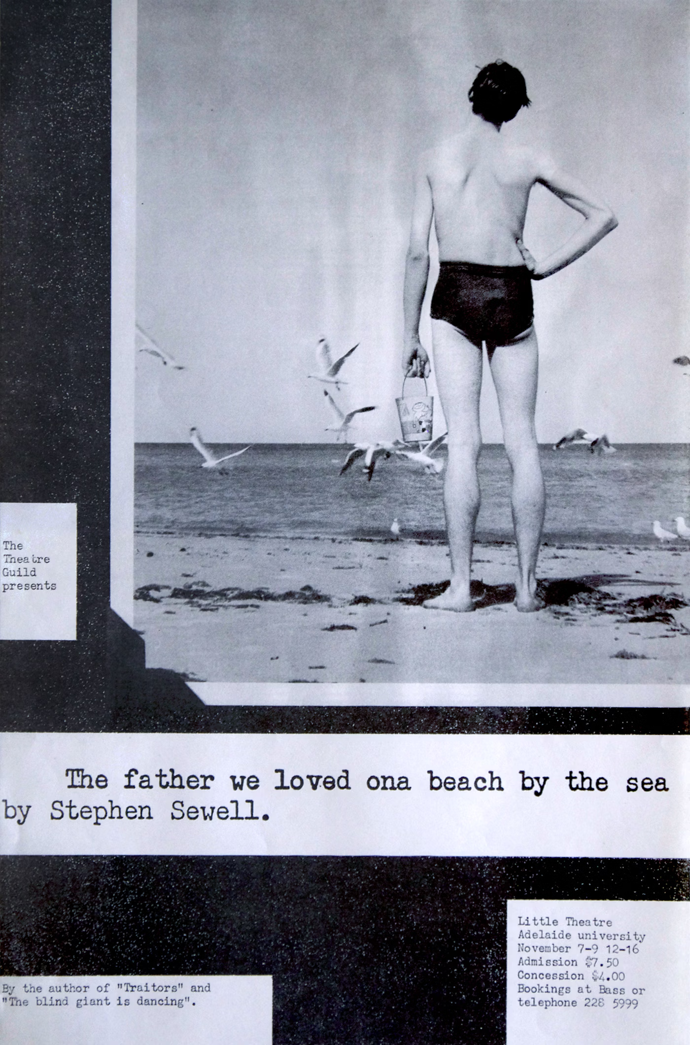
OK. One encore and that's it. This one reaches further back, deep into the nostalgia files to one of my earliest commissions and an original favourite. I produced it not long after arriving at design school and it was shot with the assistance of a friend wrangling the seagulls and firing the shutter on cue while I directed and modelled by looking out to sea. Typography was inspired by an auntie's captioning technique in her photo albums. The swimming costume was courtesy of my father’s 'rarely-ever-worn' drawer. I created the bucket from a piece of cardboard and painted it to depict the play’s scenario. While the paint dried, a wire coat hanger became the handle.
