art
art
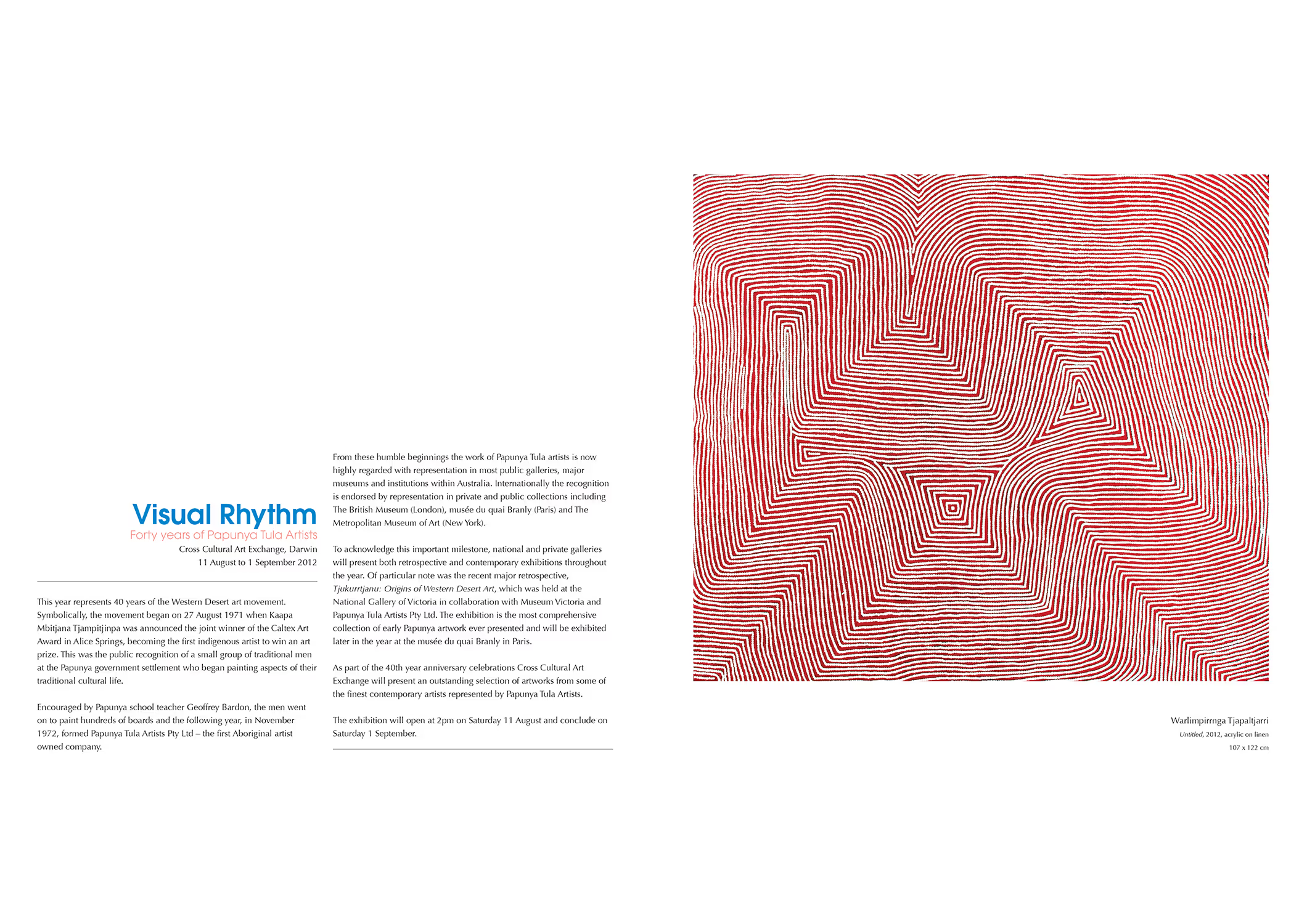
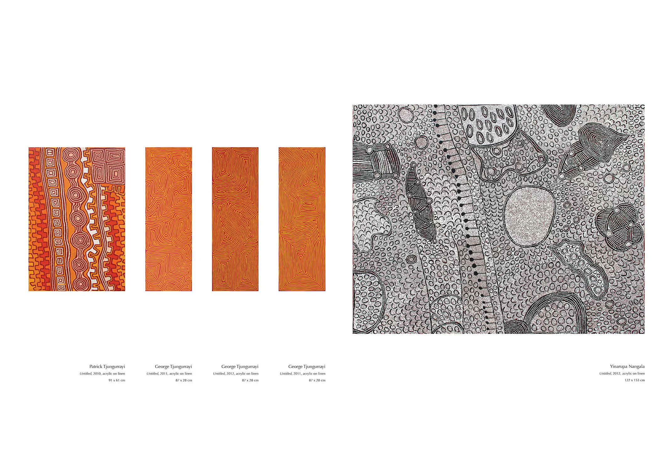
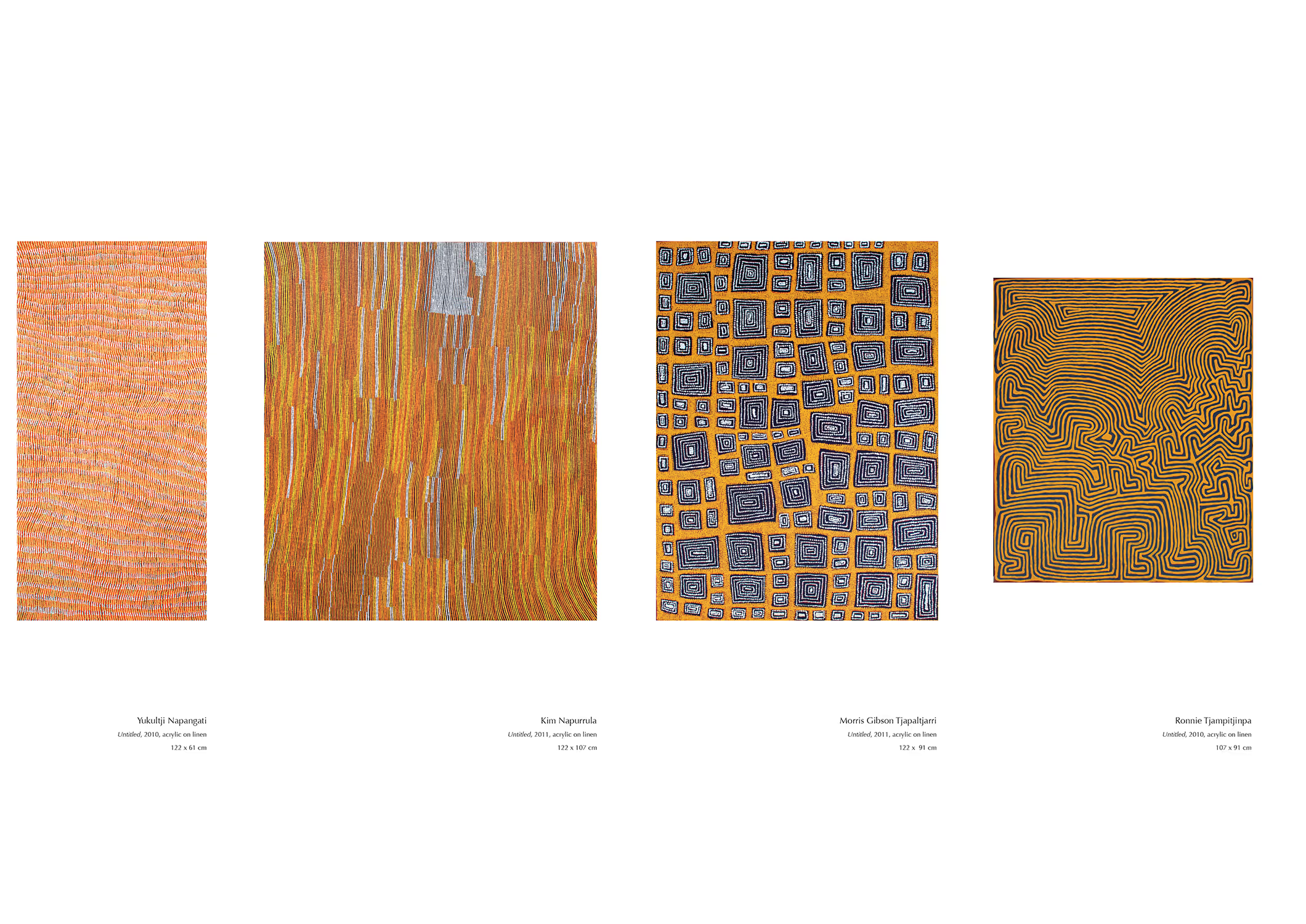
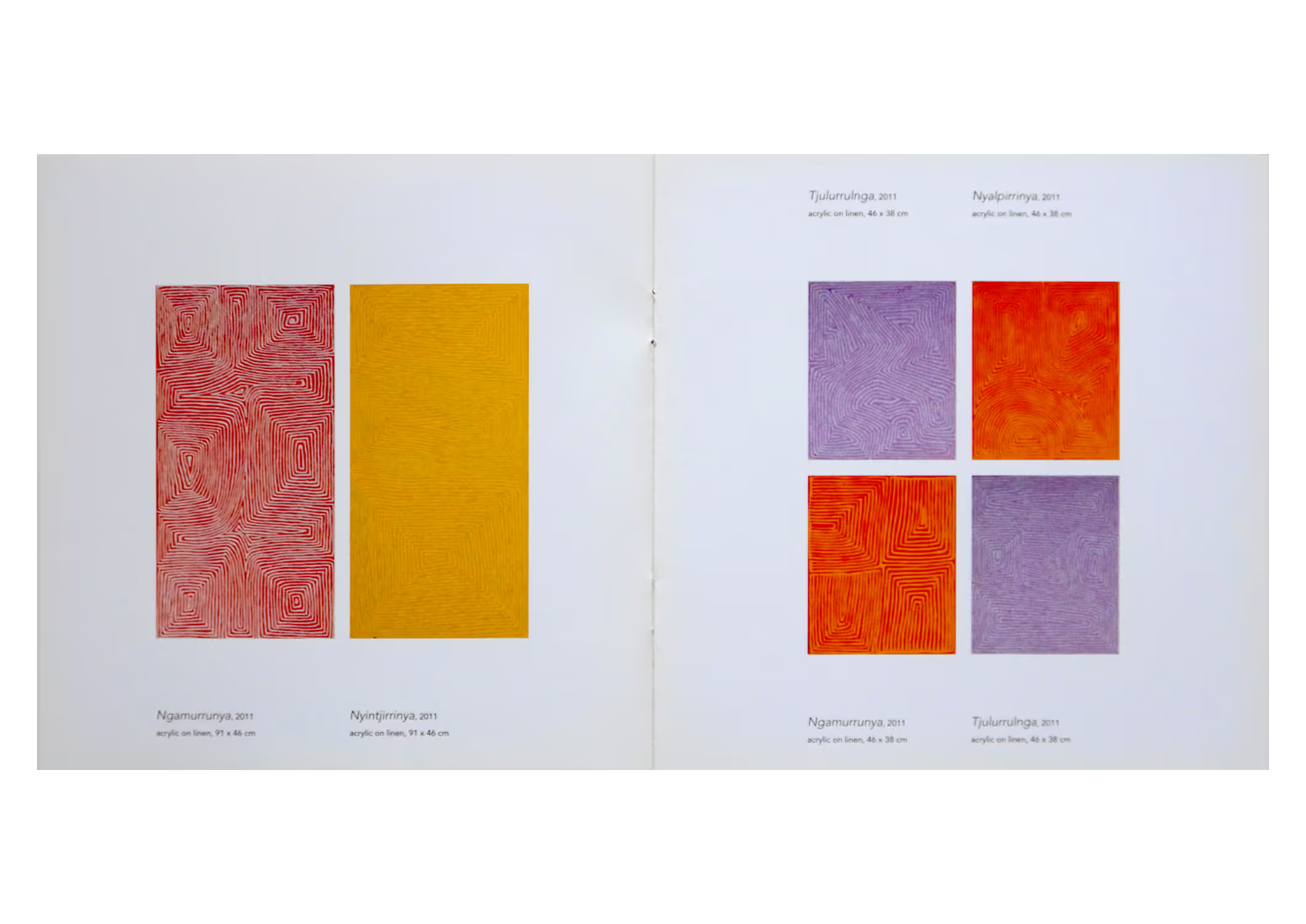
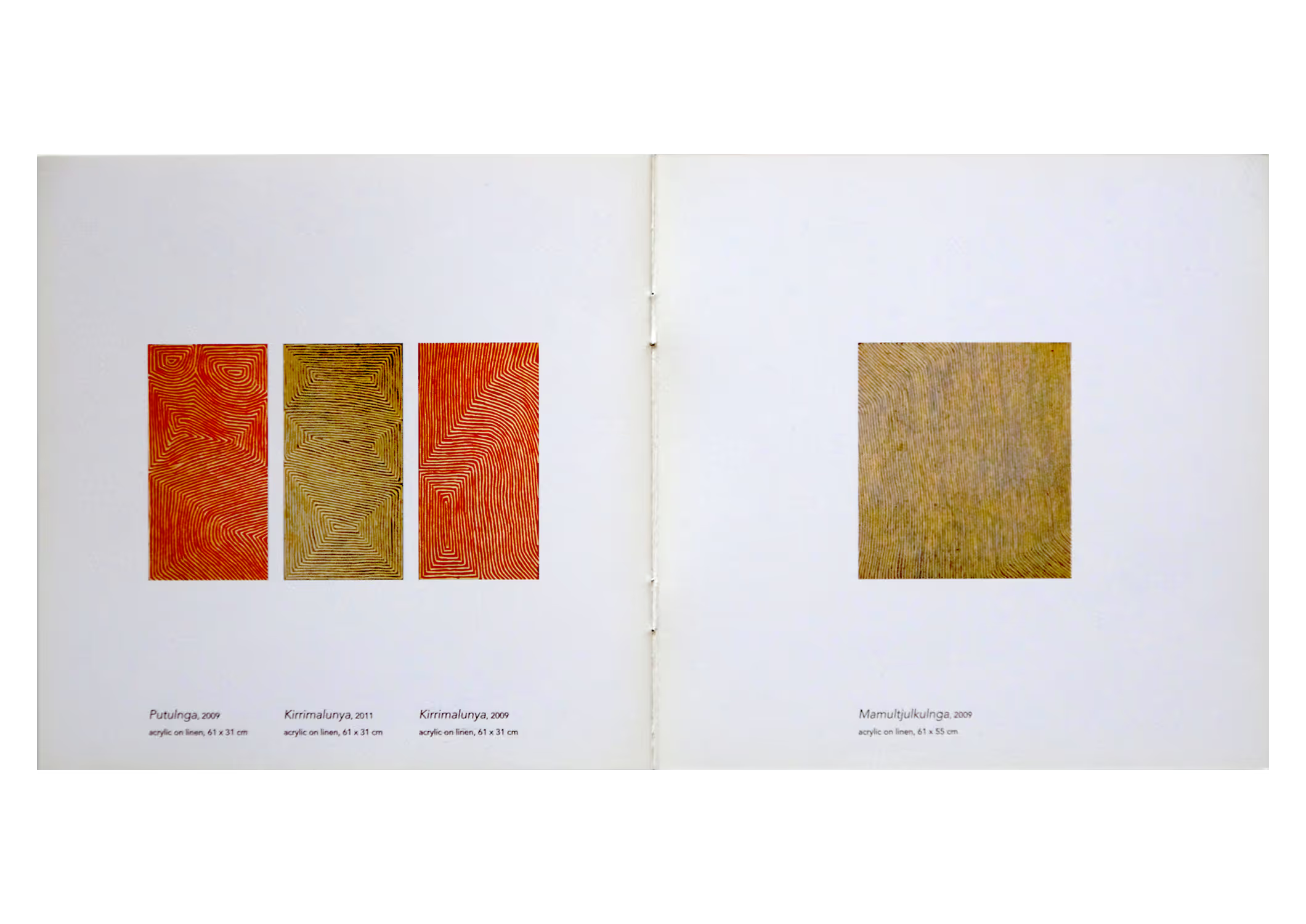
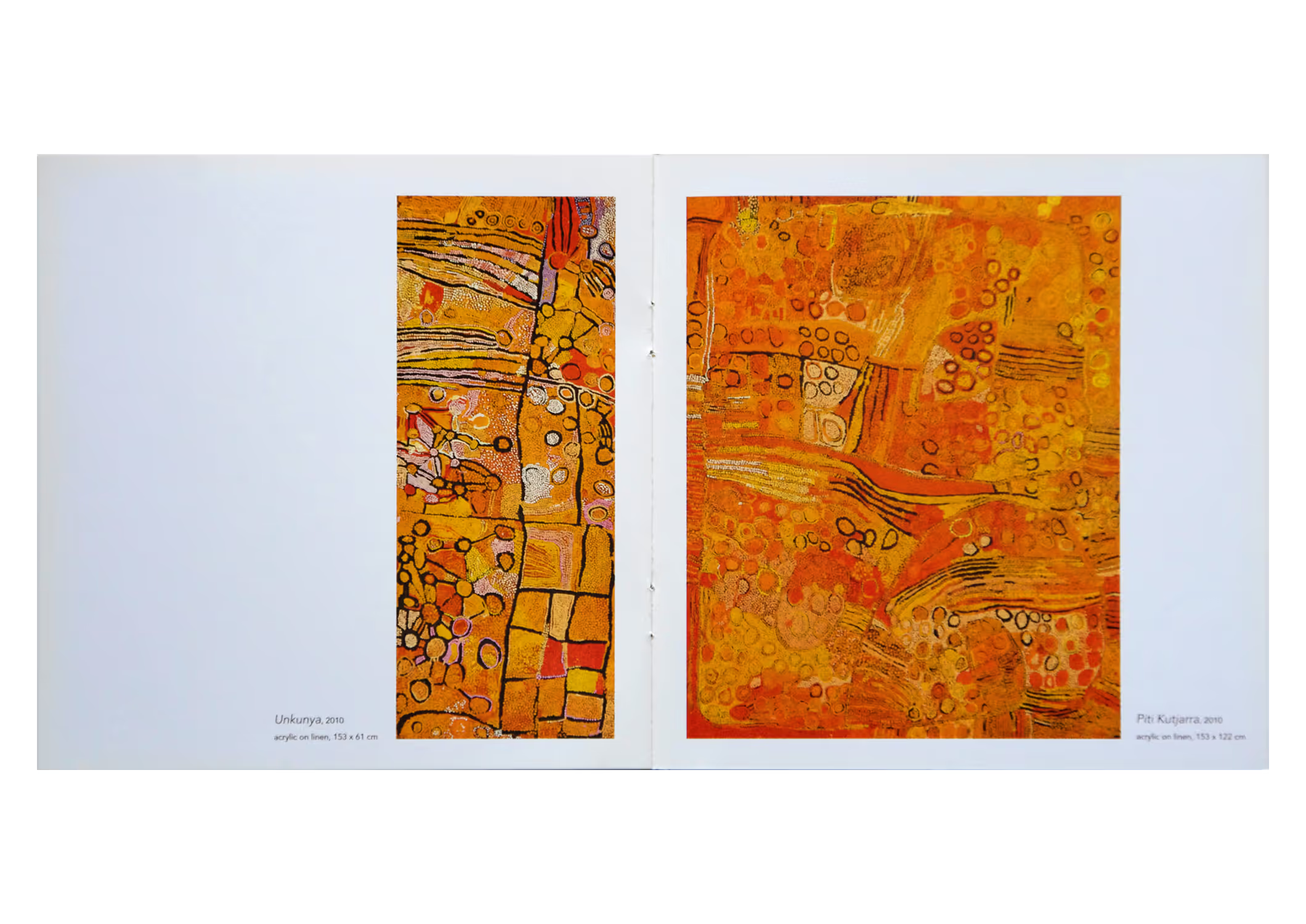
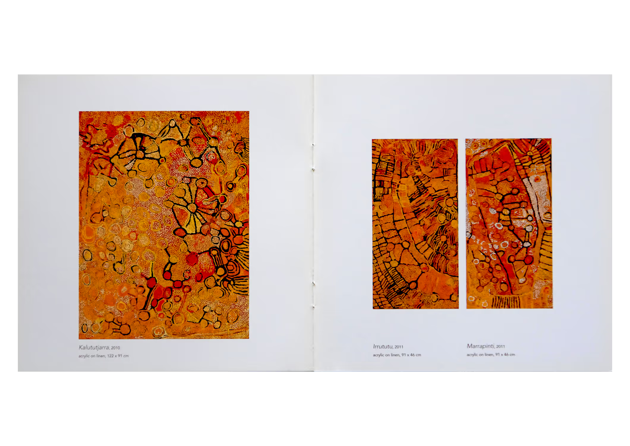
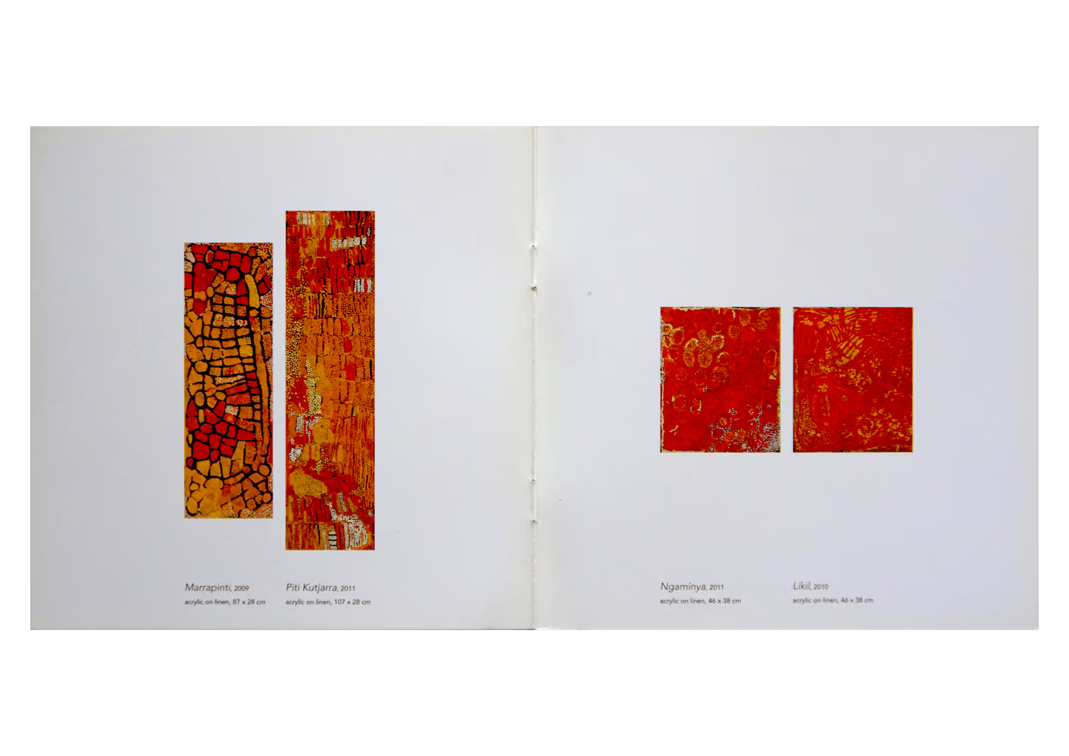
The Visual Rhythm catalogue for Cross Cultural Art Exchange (CCAE) offered selected paintings and some painting details from which I was briefed to create a fresh catalogue style as the gallery prepared to transition its legacy of printed catalogues online and change trading name to Paul Johnstone Gallery.
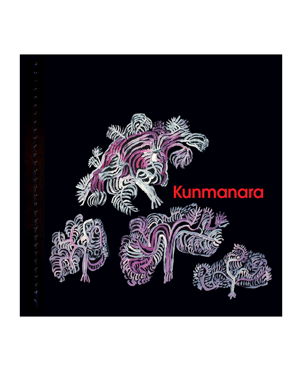
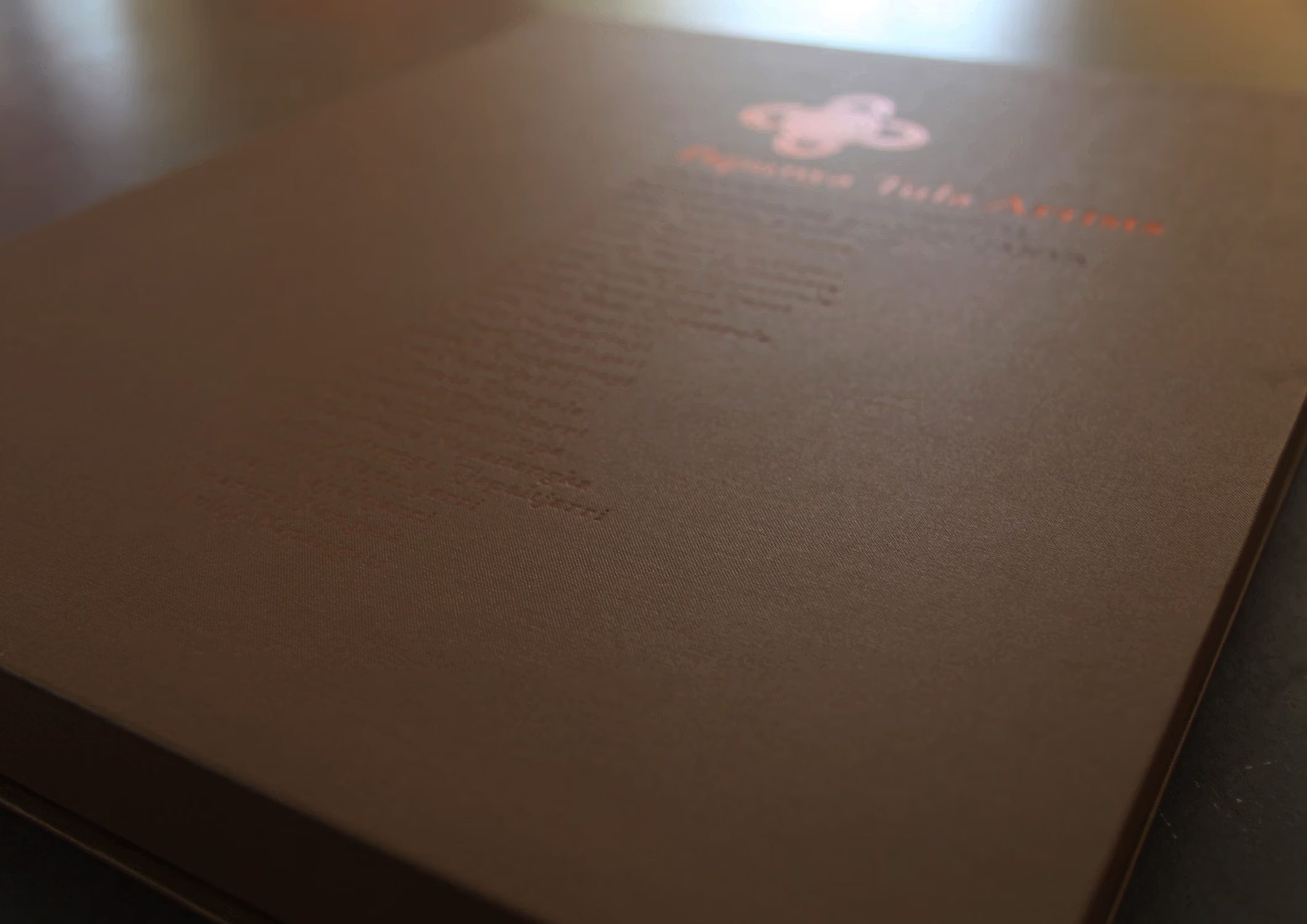
Kunmanara was the final printed catalogue for the gallery. The paired back production values I brought to this publication—two pieces of printed and scored card boldly stitched together—made for a sophisticated swansong to their printed catalogue legacy.
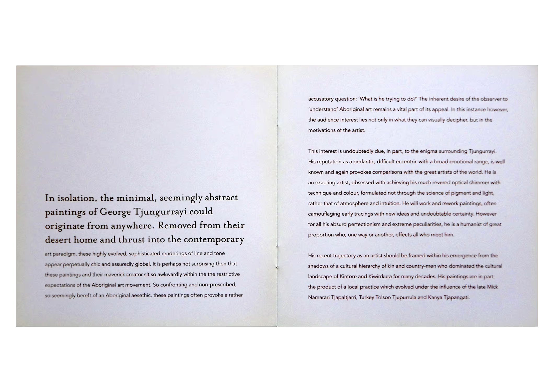
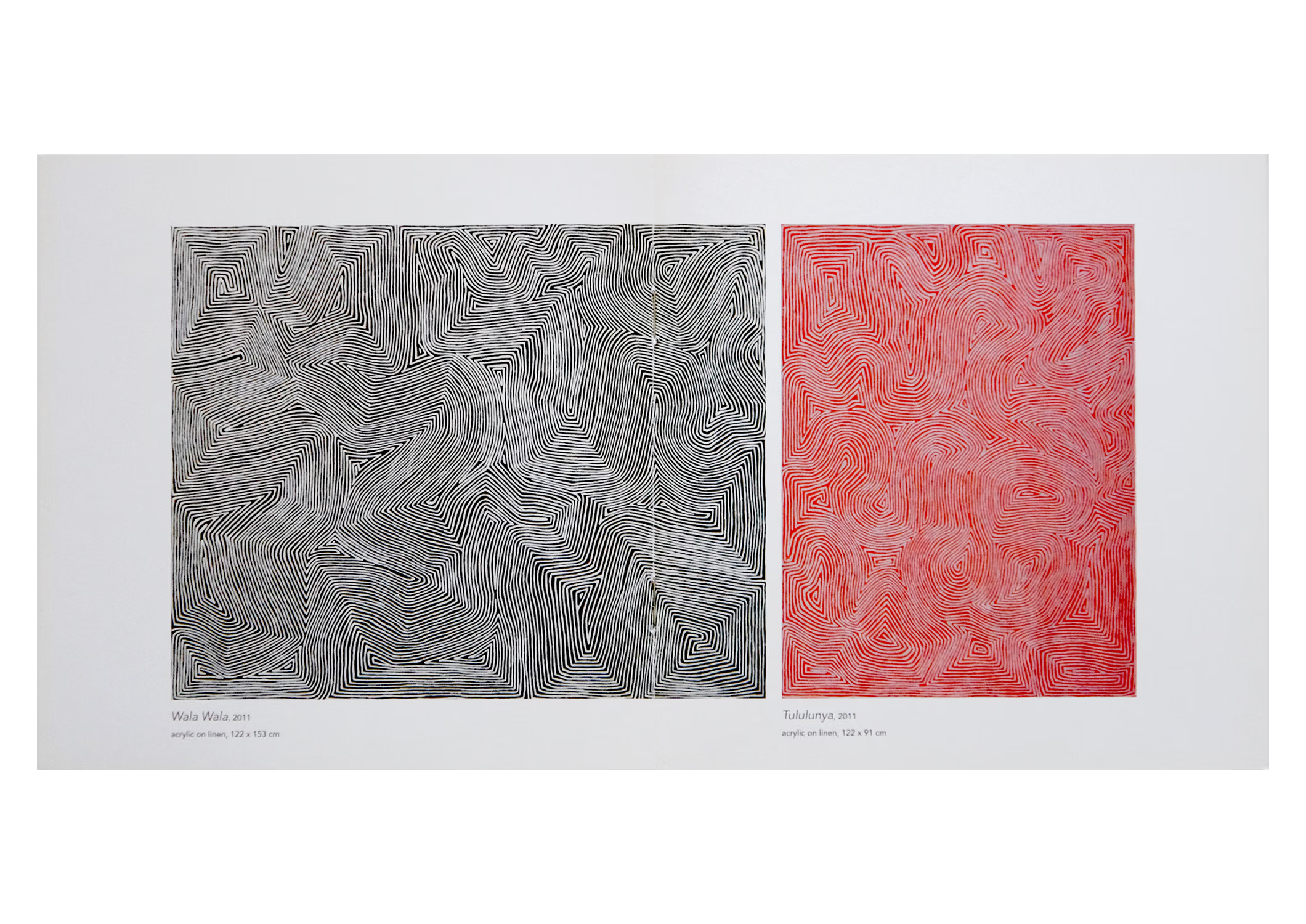
A quirk of the Nyarrumparra (Sister Brother) exhibition catalogue was reproducing the paintings relative to their actual scale and in arrangements similar to how they appeared on the gallery walls. Designing for this exhibition also included producing wall labels featuring a built-in purchasing function, signage and other exhibition collateral.
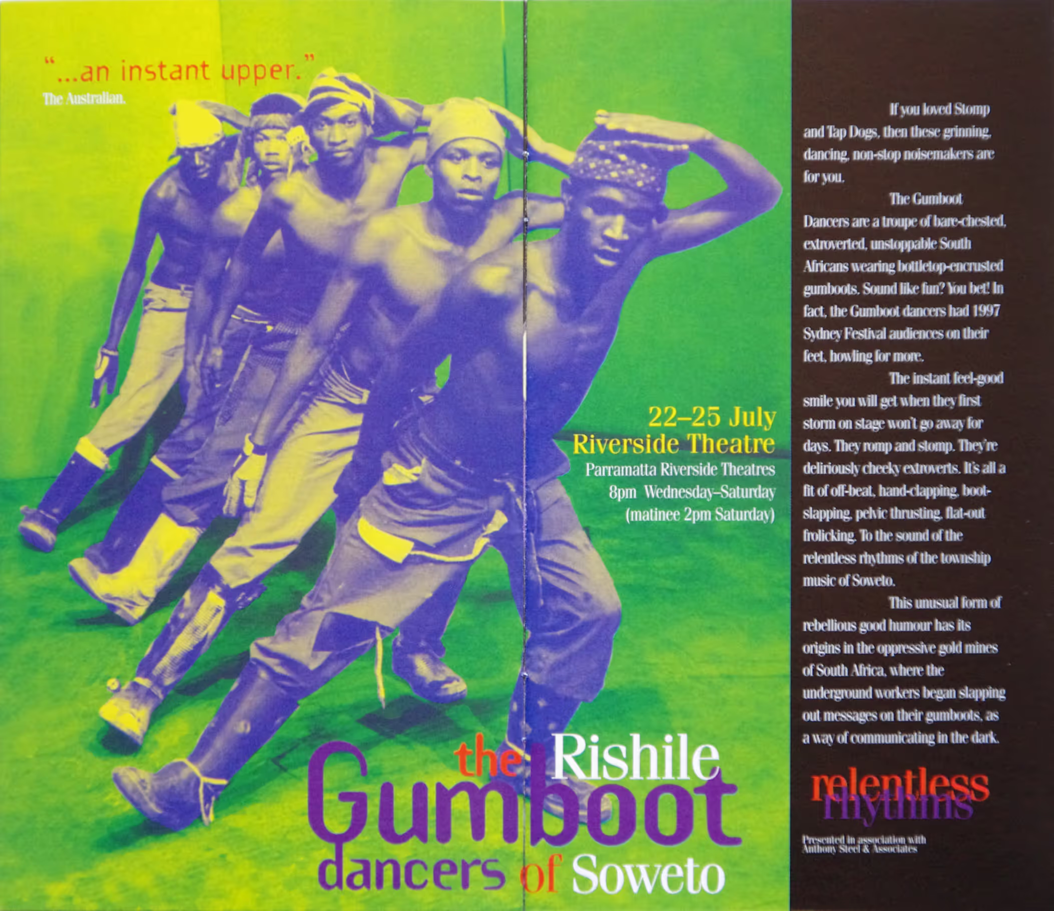
dance
dance
I loved these projects. They both called for beauty by different means.
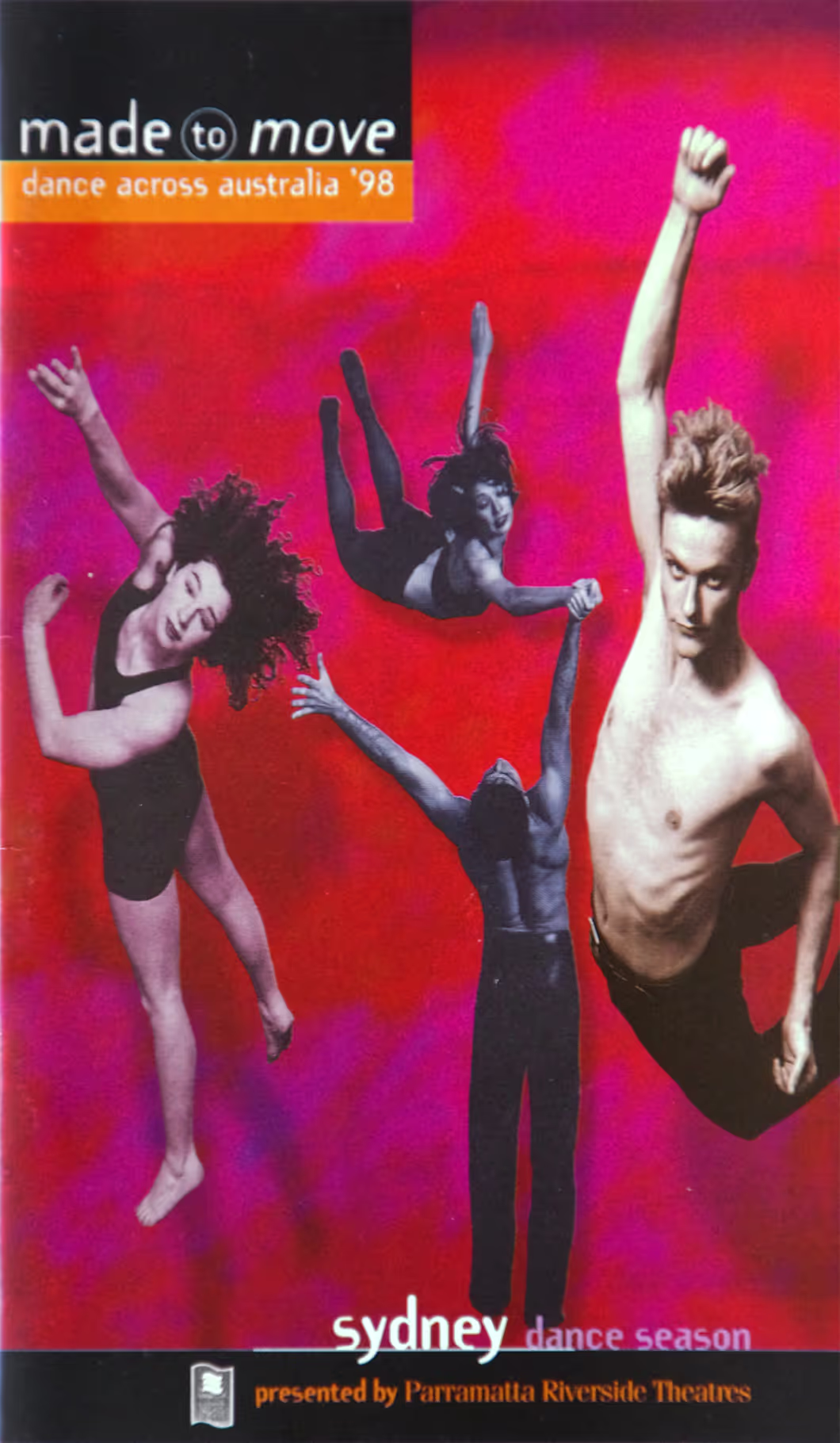
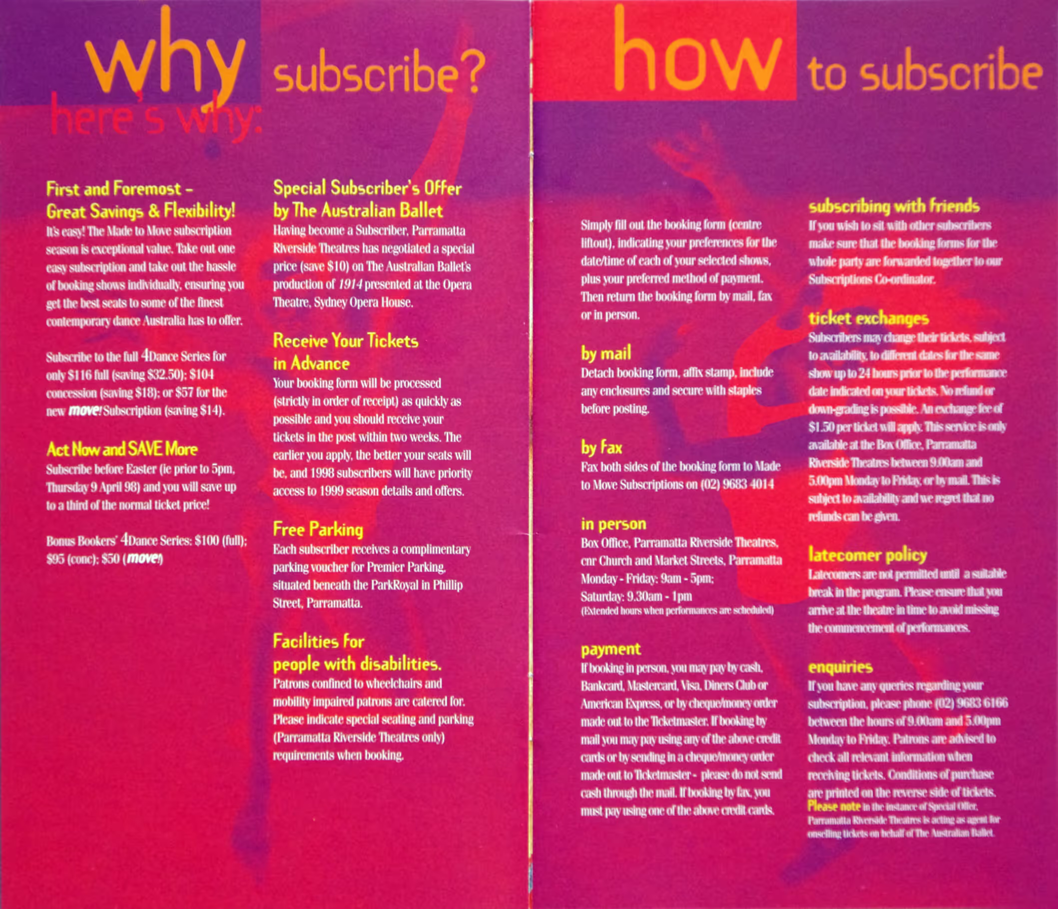
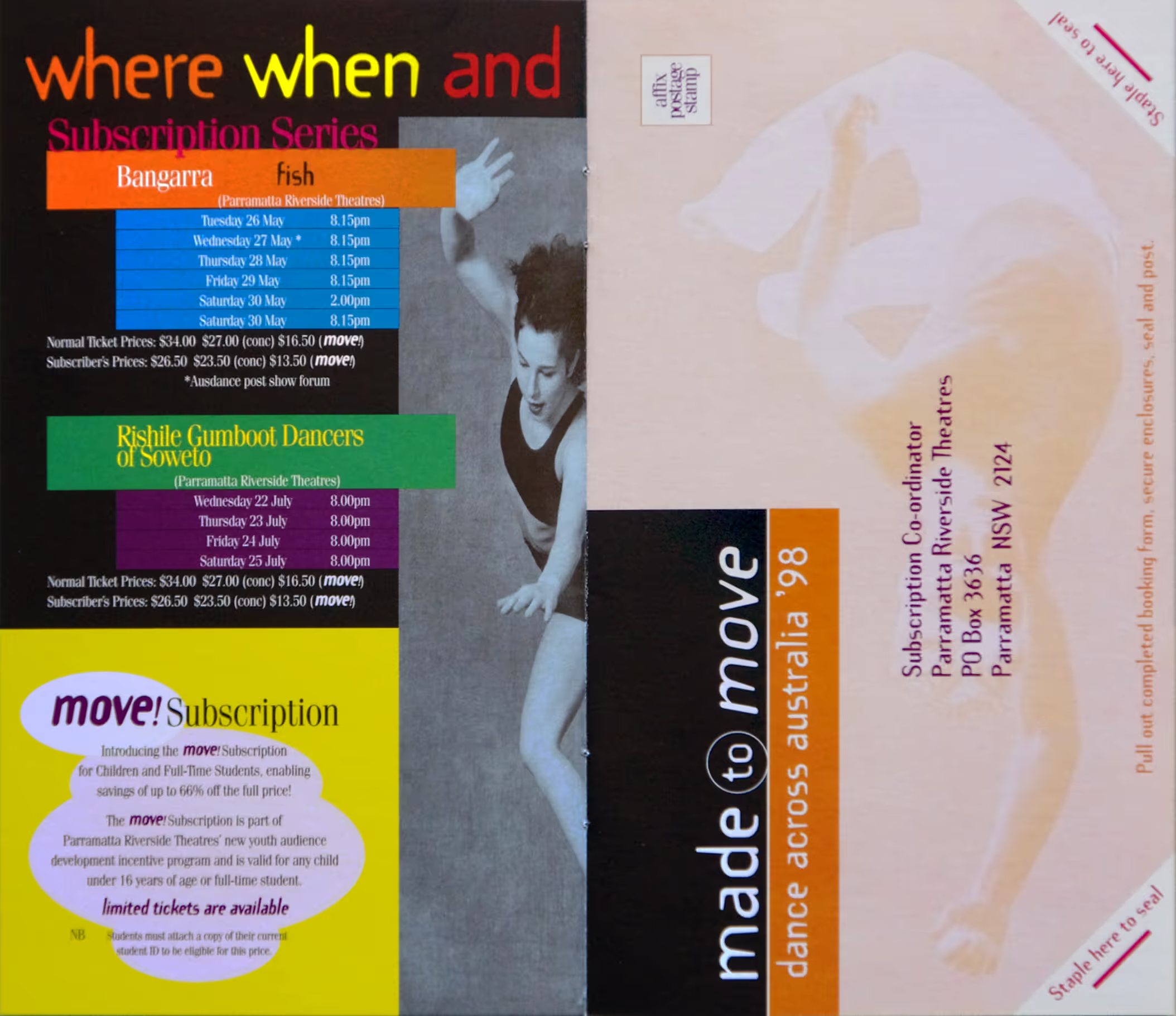
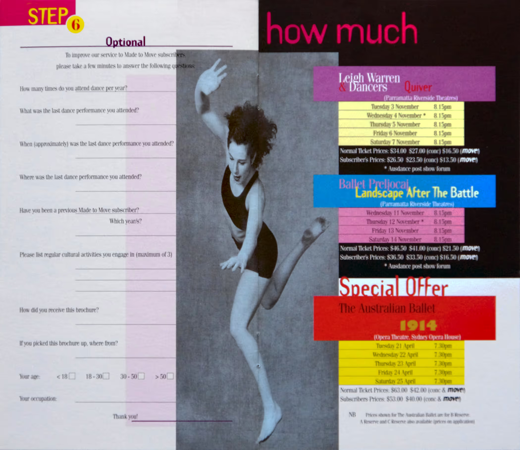
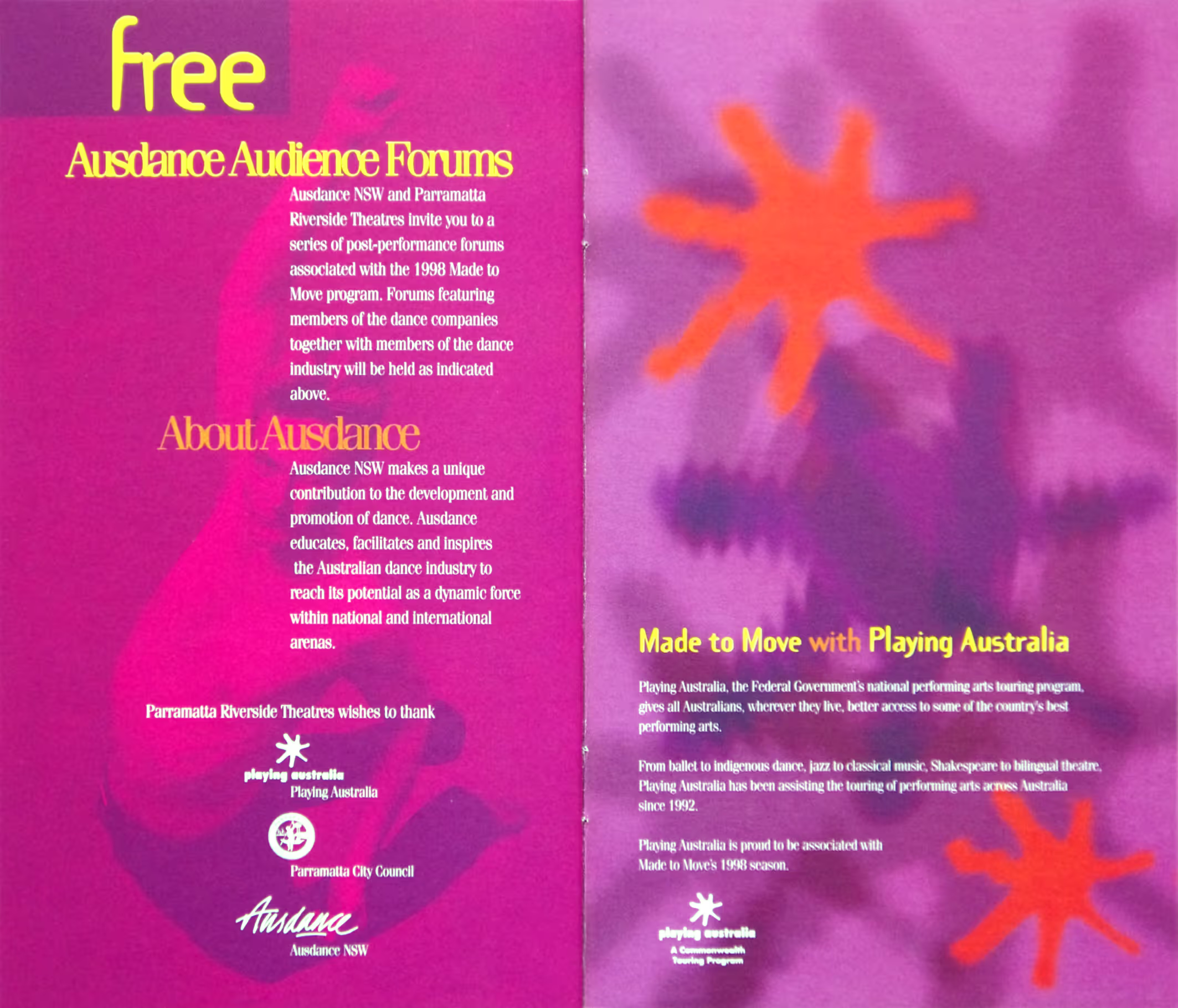
The dance performance season Made to move showcased a national touring program of leading Australian companies. Its marketing assets were supplied by each contributing company with the producer bringing a unifying colour palette and type selection. The catalogues, printed in full colour and produced in large quantities, promoted each state season as part of a national touring program.
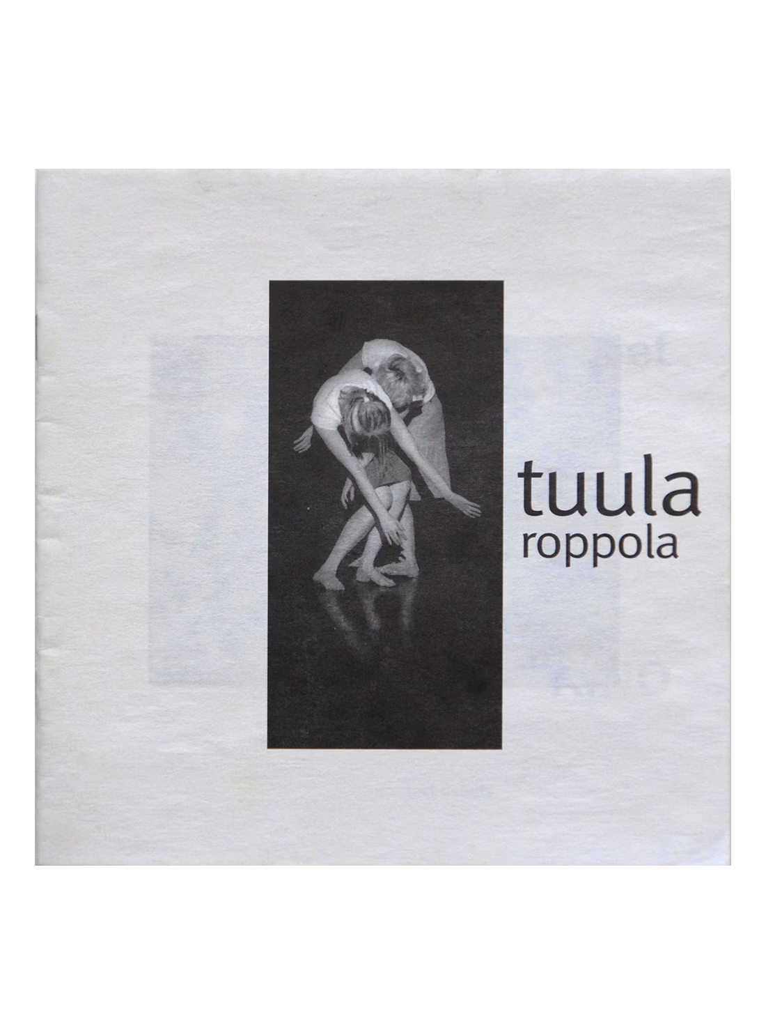
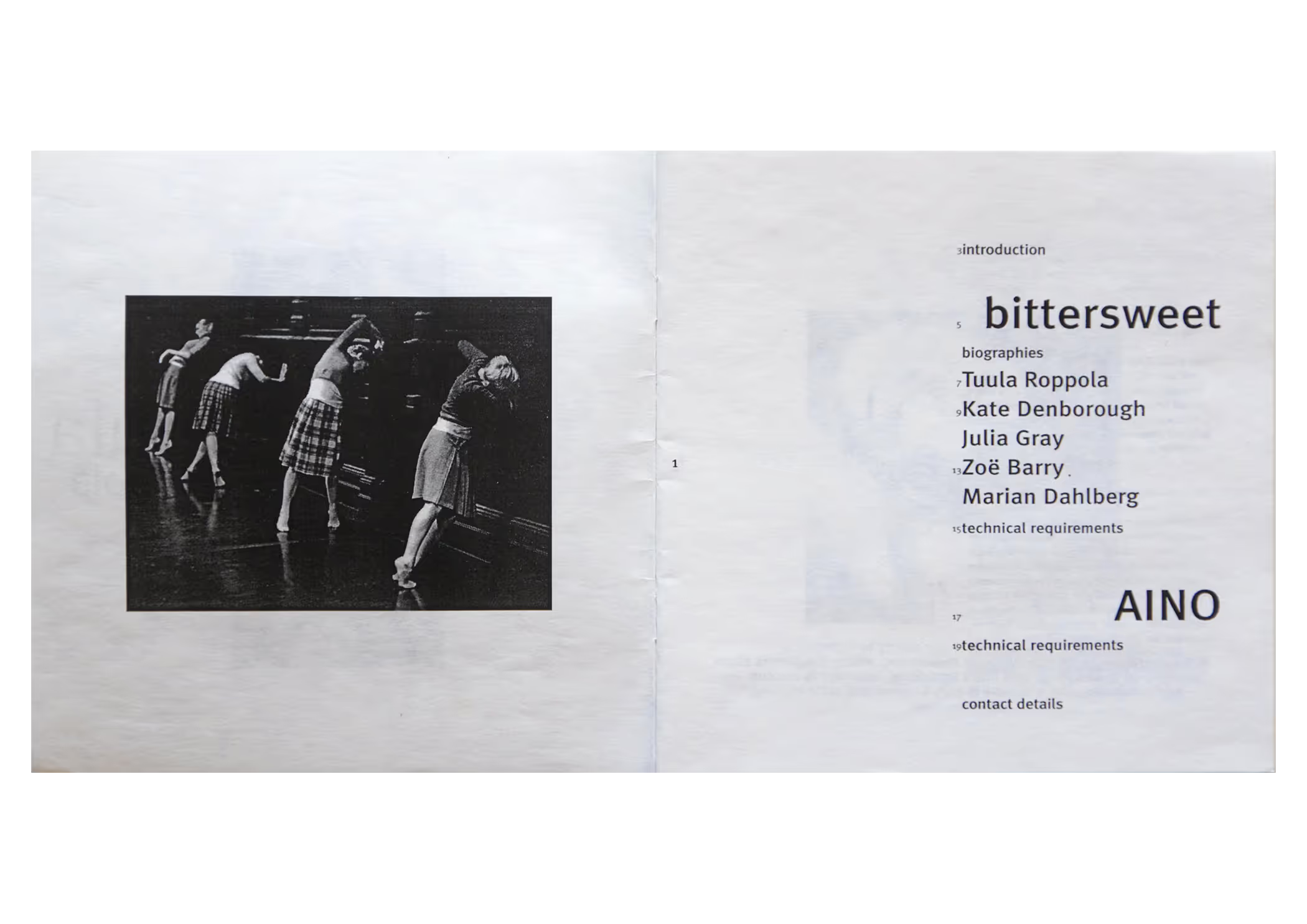
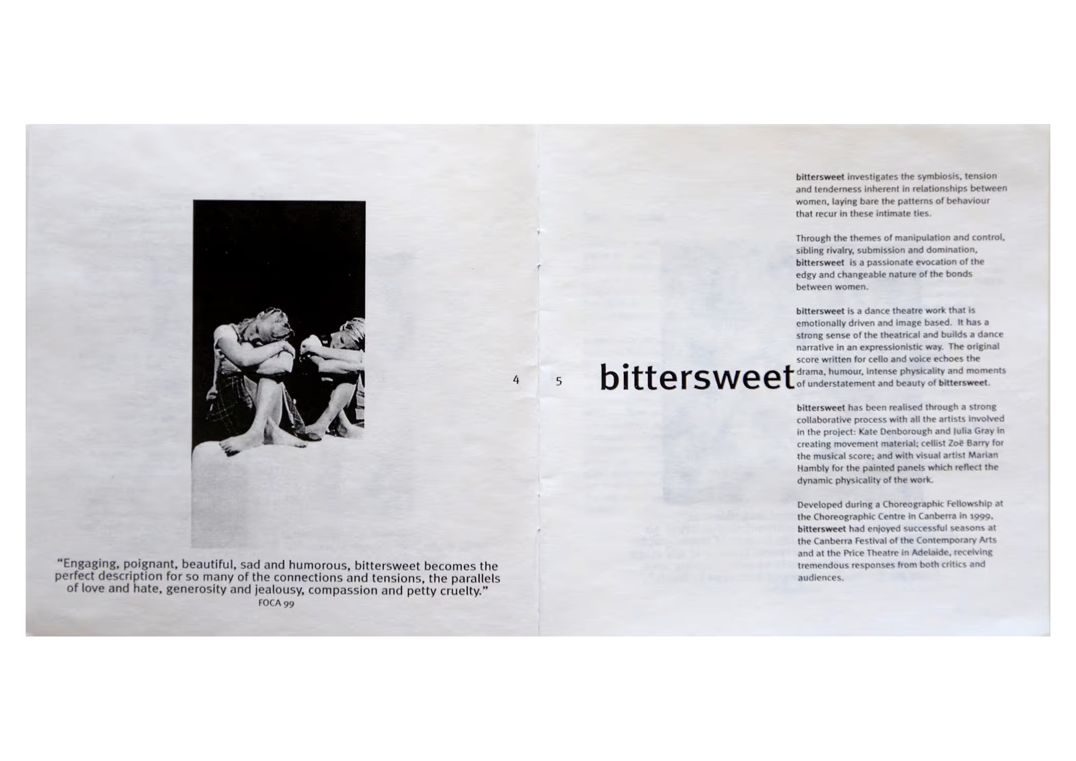
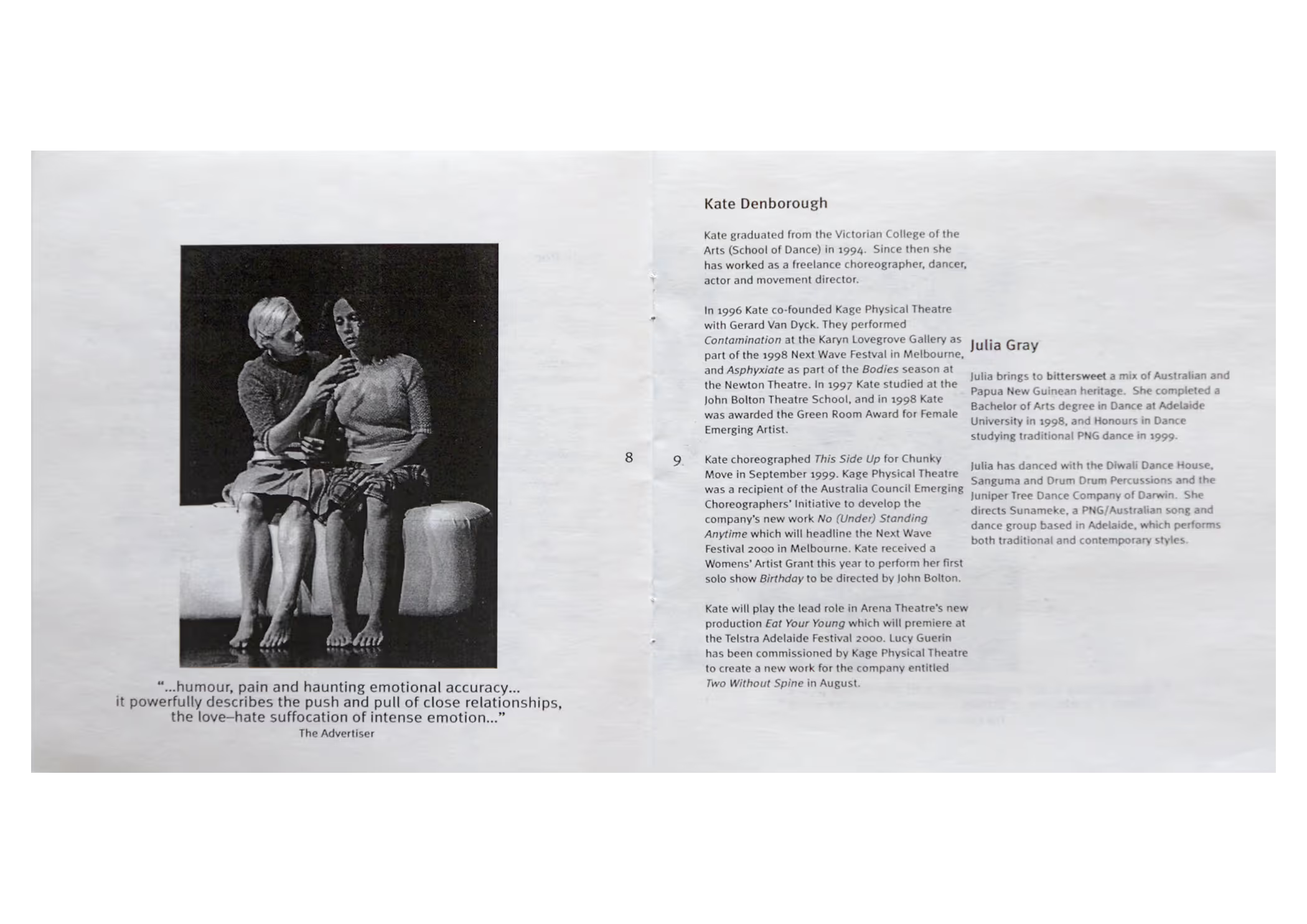
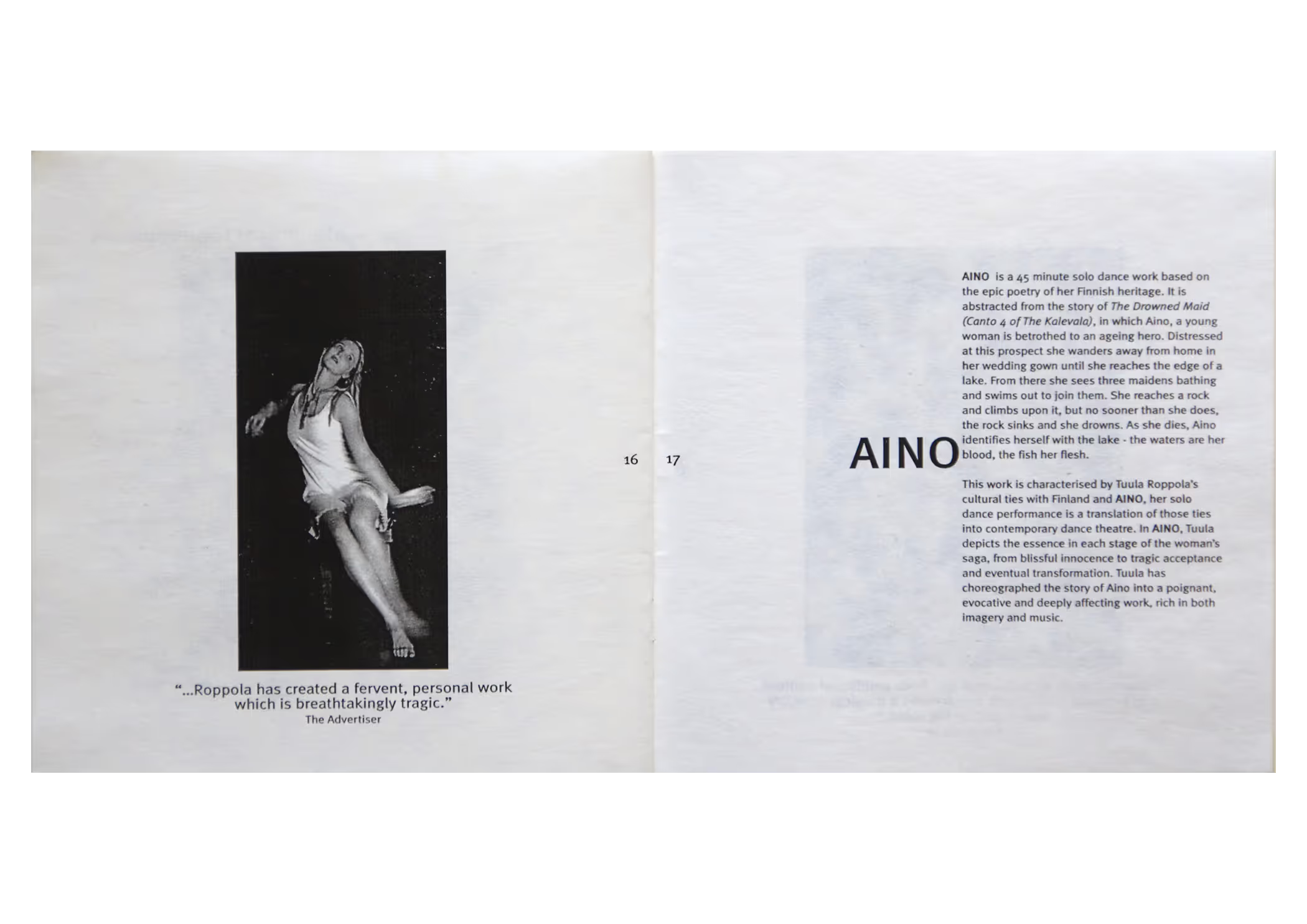
Tuula Roppola’s show specifications represented a more intimate engagement, as they were distributed in person from her booth at a performing arts market. Utilising black and white photography from previous seasons her catalogues were produced with simple production values; presented on ultra white tactile stock with a printed cover, hand bound to laser-printed pages. The presentation was elegant and clear with typographic treatment giving the envelope a quiet little push.
ephemera
ephemera
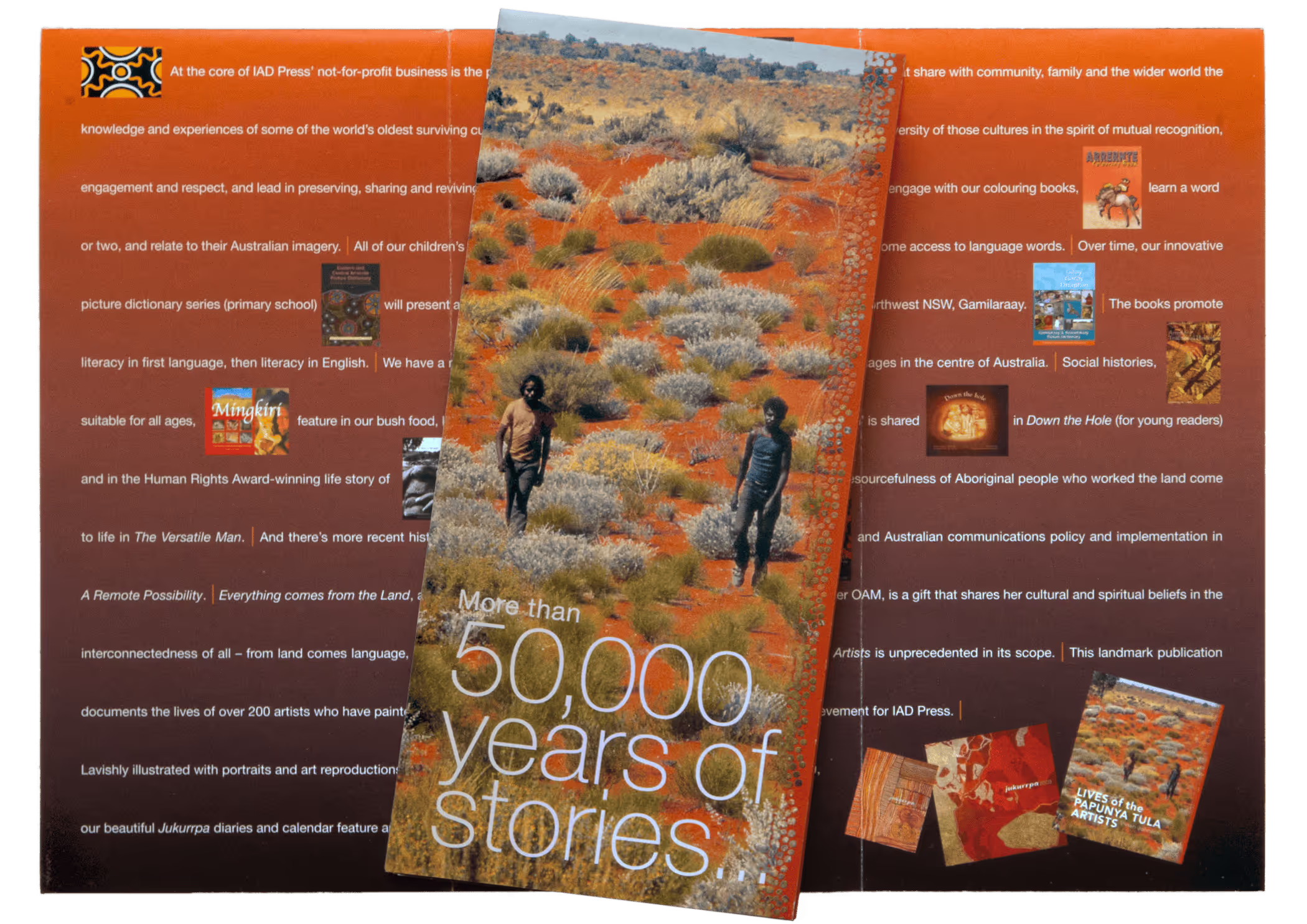
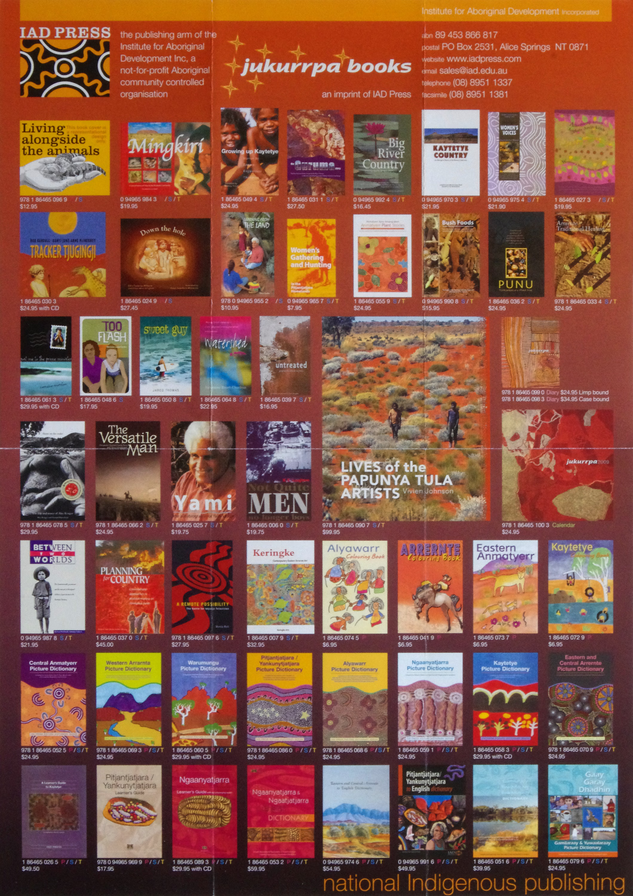
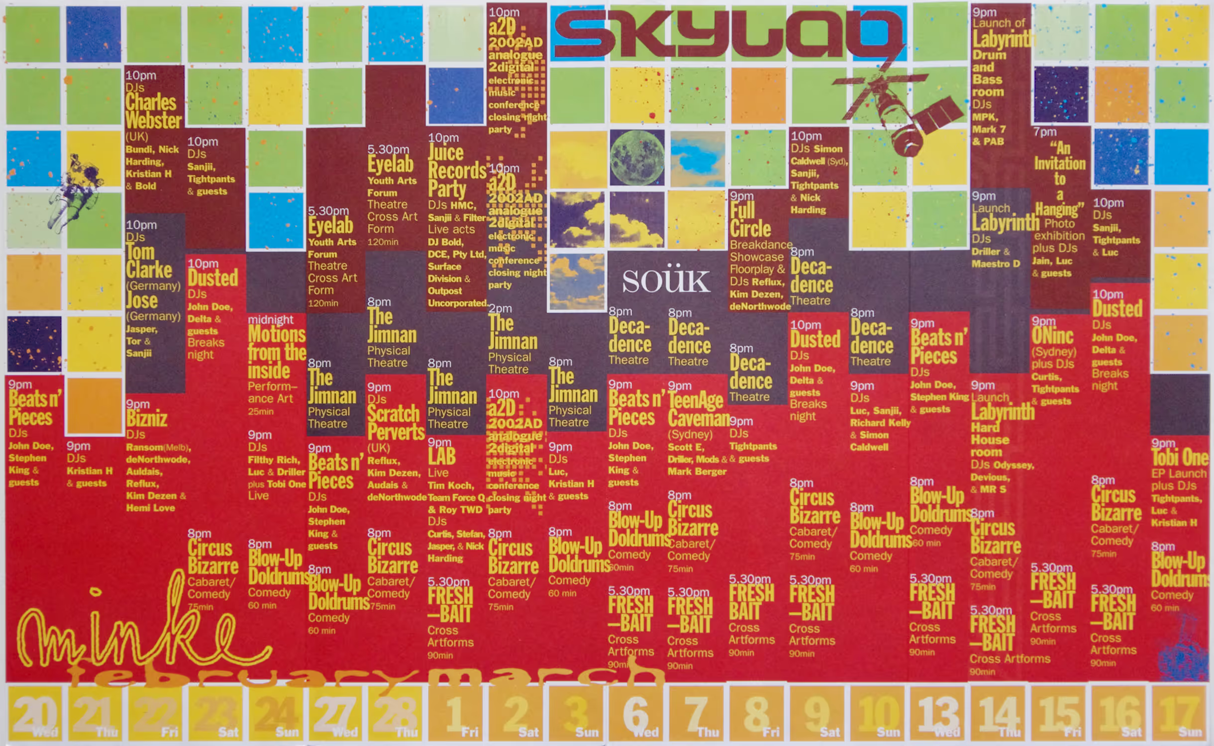
They may look like simple brochures, but I like to think of them as a piece of A3 paper performing to the max. The DL cover opens to a flap that opens out to an A4 spread before the A3 catalogue is revealed. While folded for distribution, most recipients stored their DL brochures on the wall as an A3 poster.
fashion
fashion
Seasonal fashion catalogues were produced for favourite client Miss Gladys Sym Choon’s participation in Sydney Fashion Week over successive years. The catalogues featured awarded photographers and won a National Print Award.
Discover more. Take a deeper dive into these fashion catalogues.
opera
opera
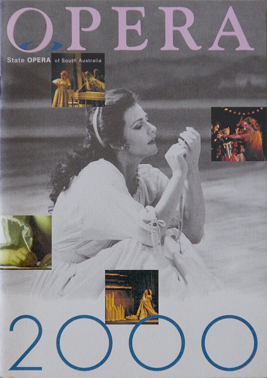
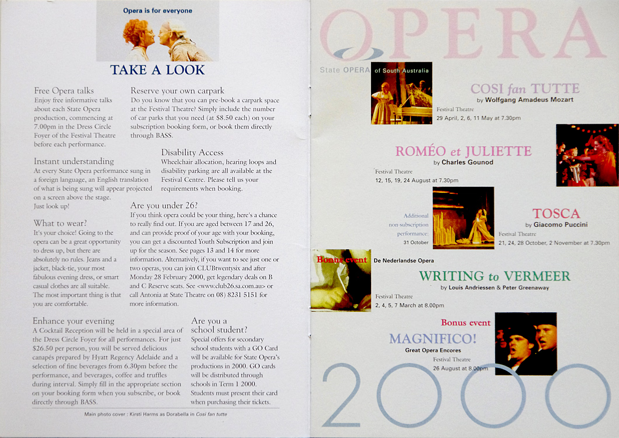
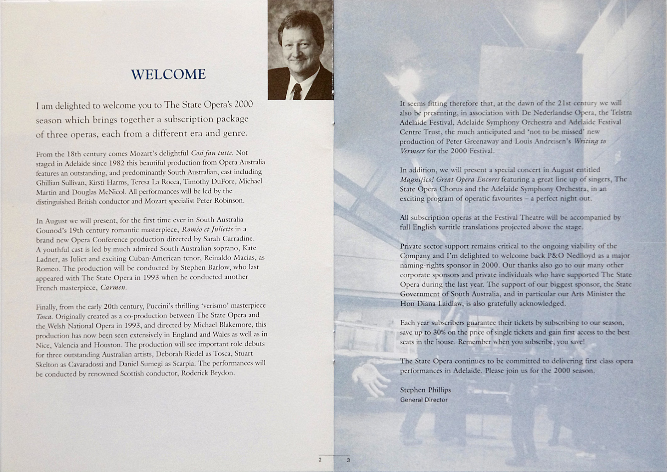
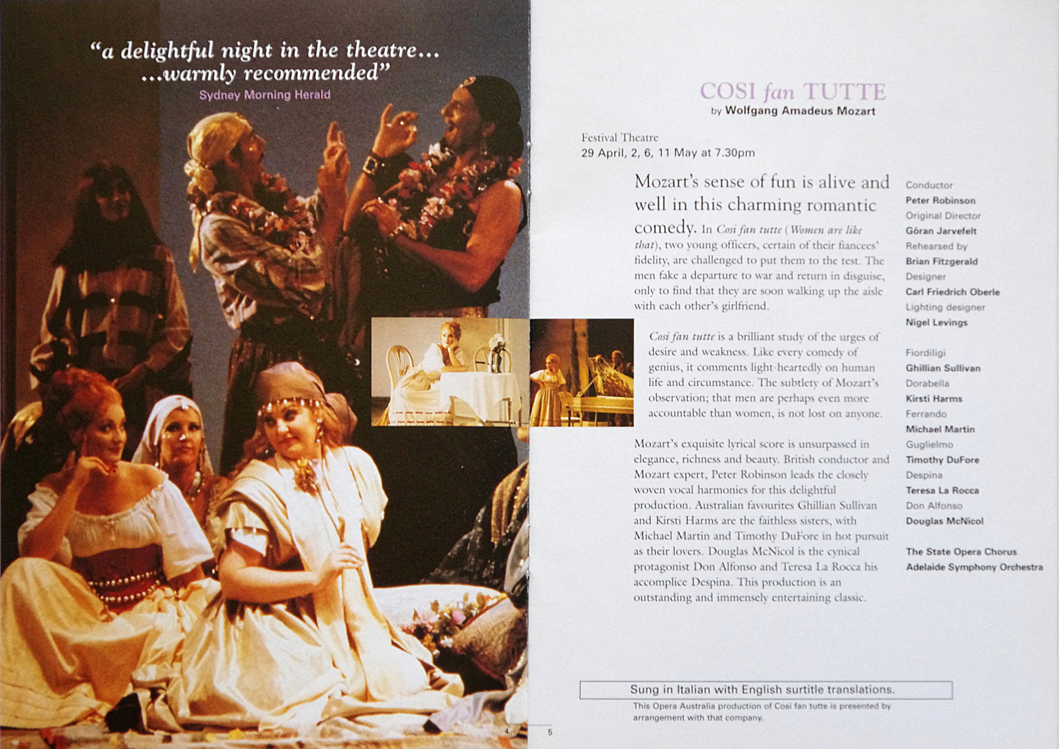
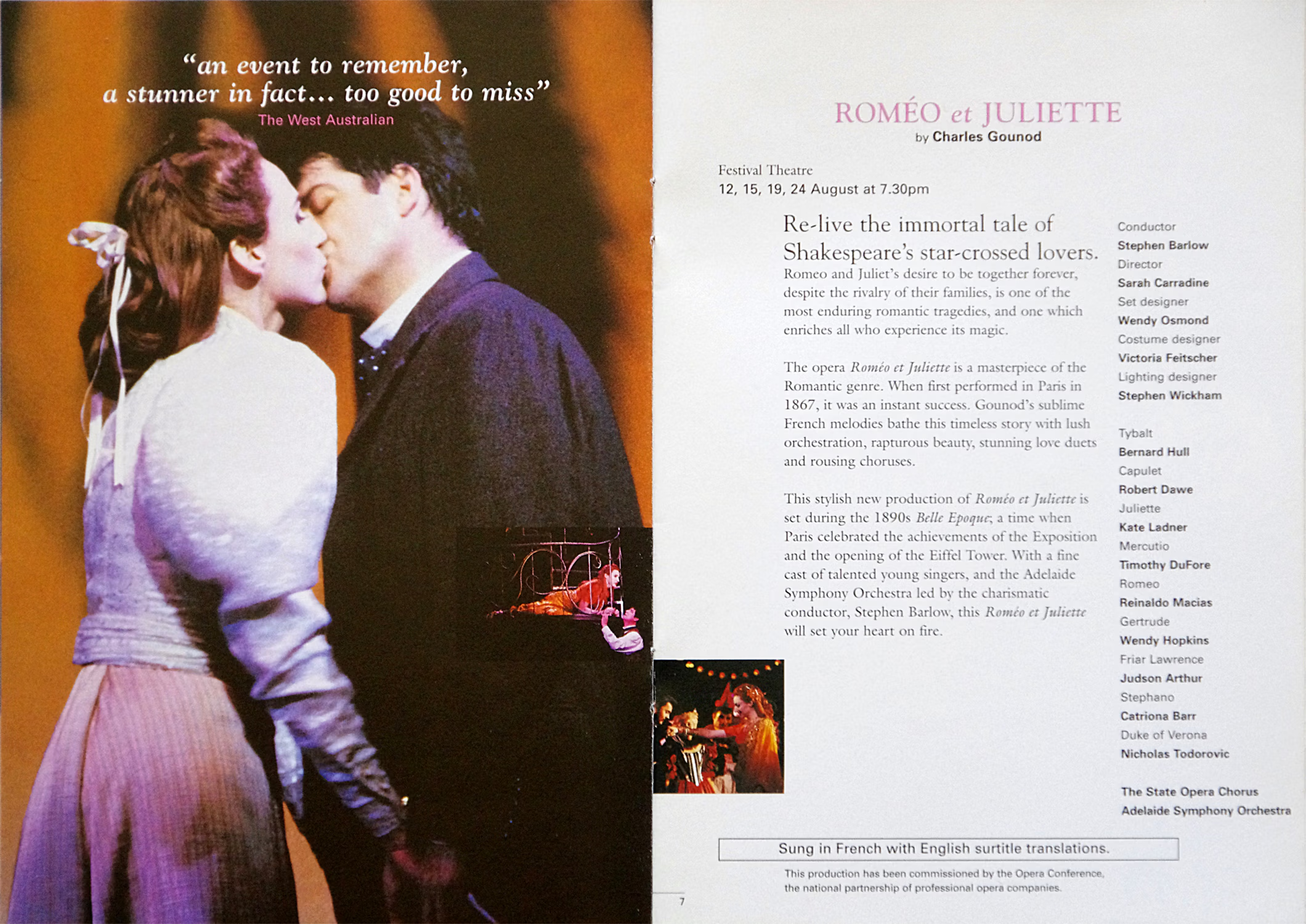
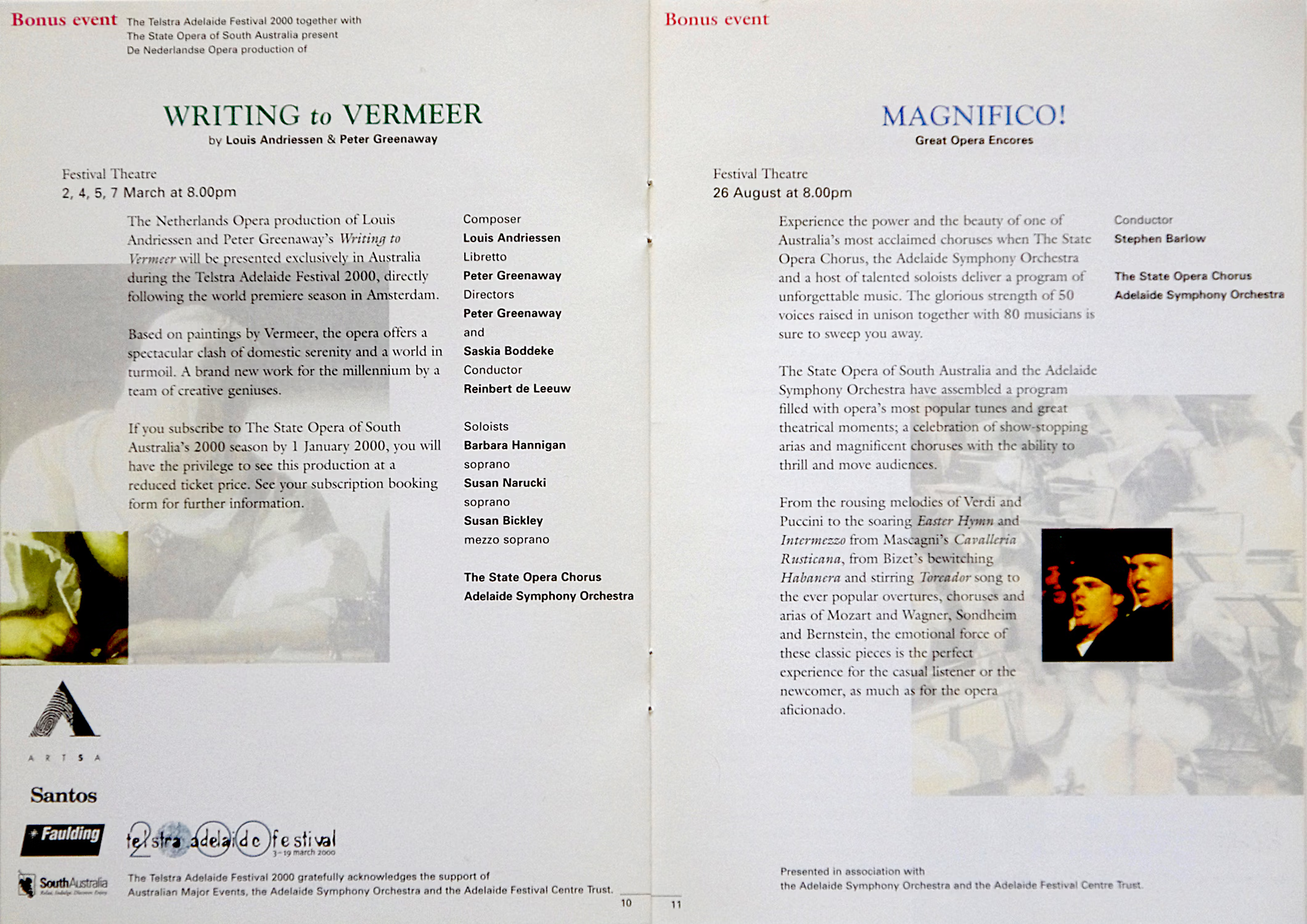
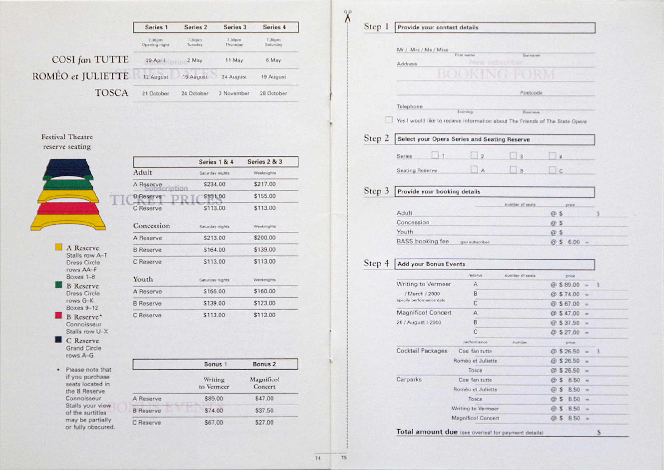
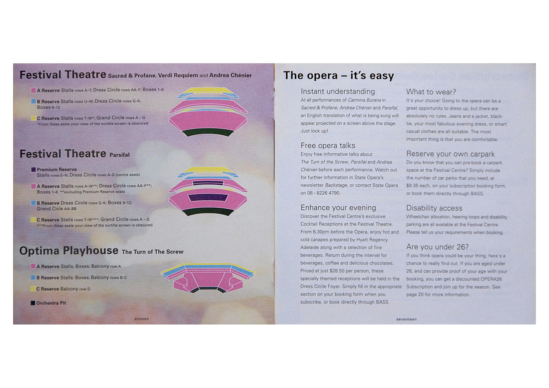
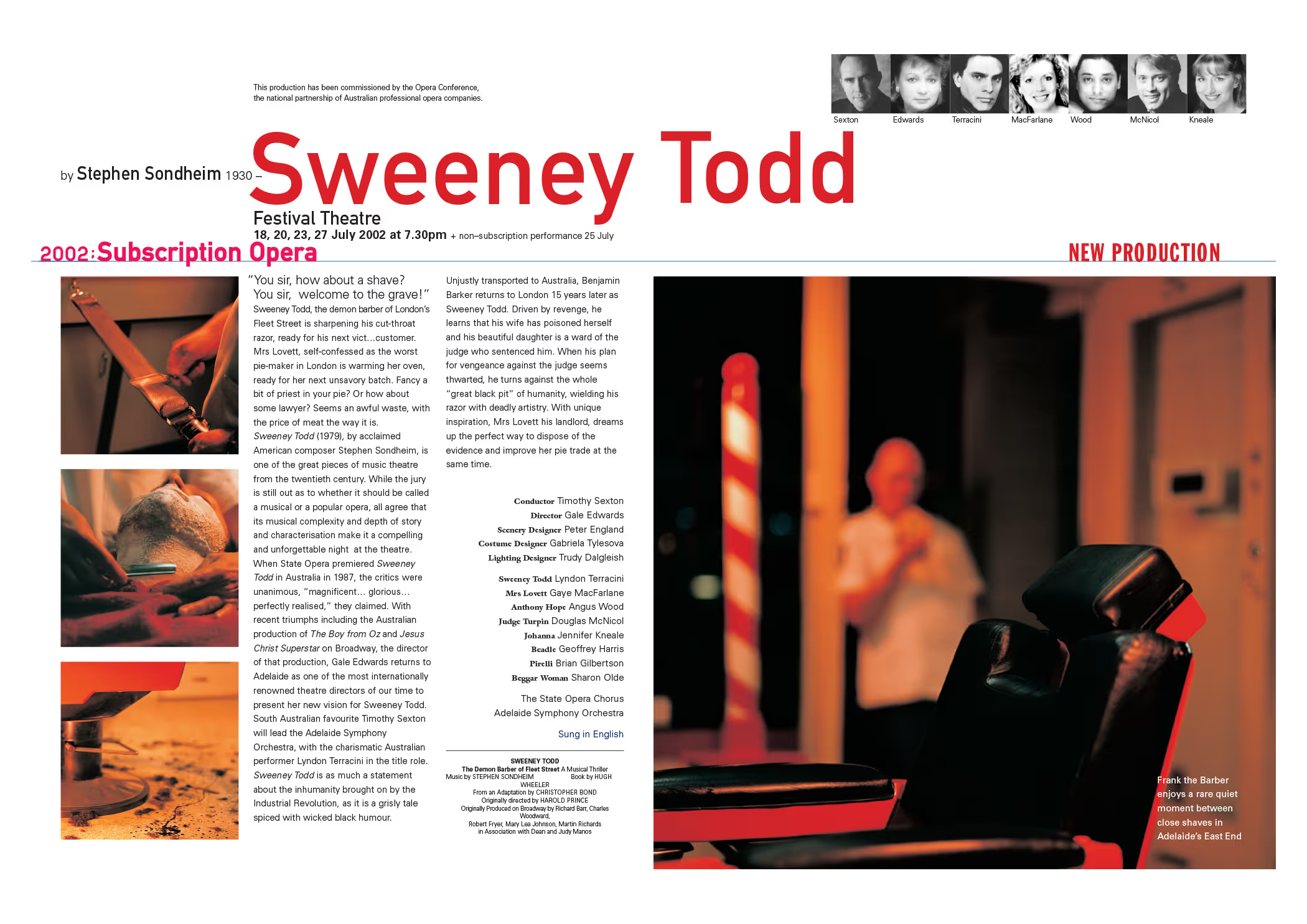
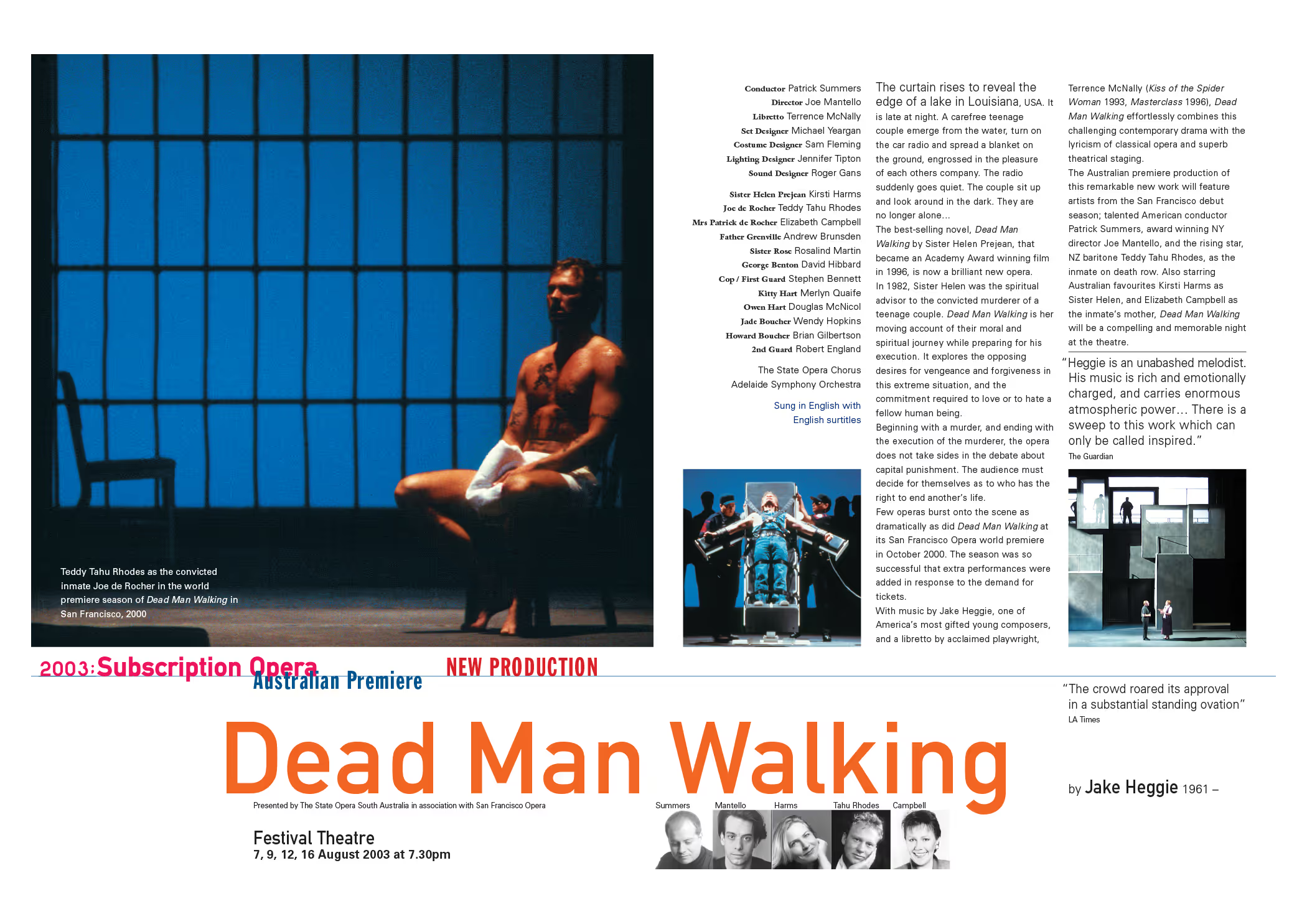
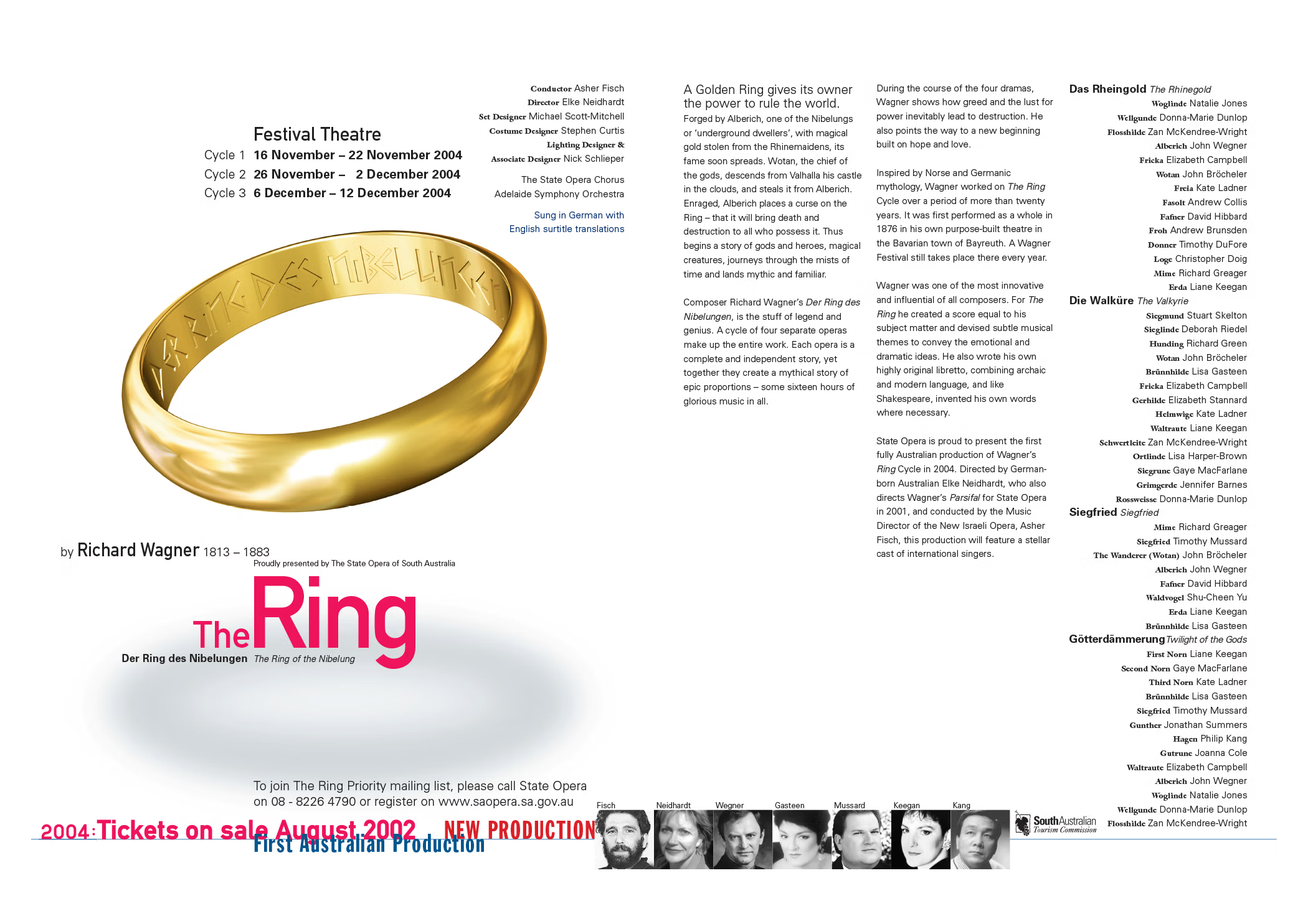
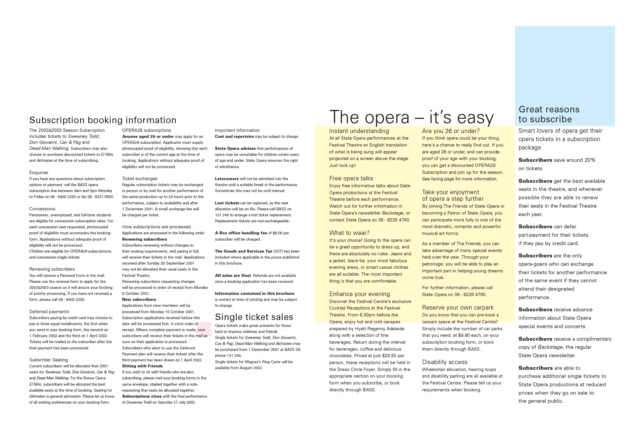
My return to designing State Opera marketing collateral coincided with the company changing direction. From regularly staging traditional opera performances as they passed through on national tours, State Opera would become a specialist producer of unique and contemporary opera. This was certainly exciting times. But first we had an existing season from the old strategic plan to sell.
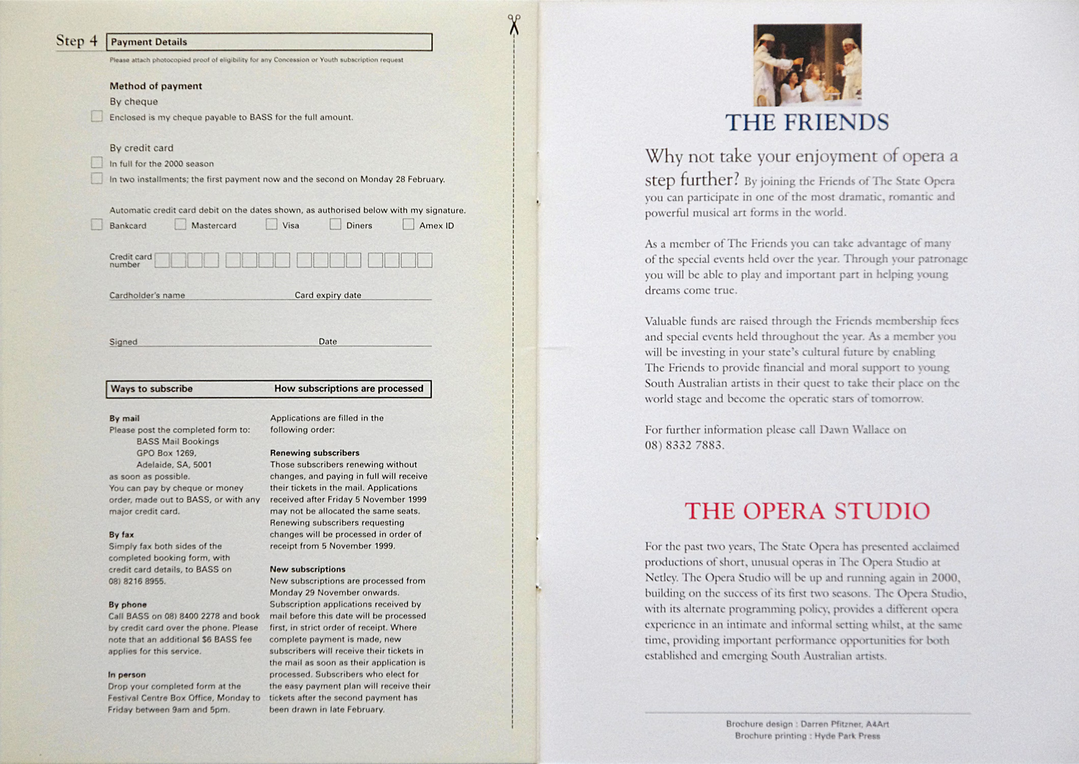
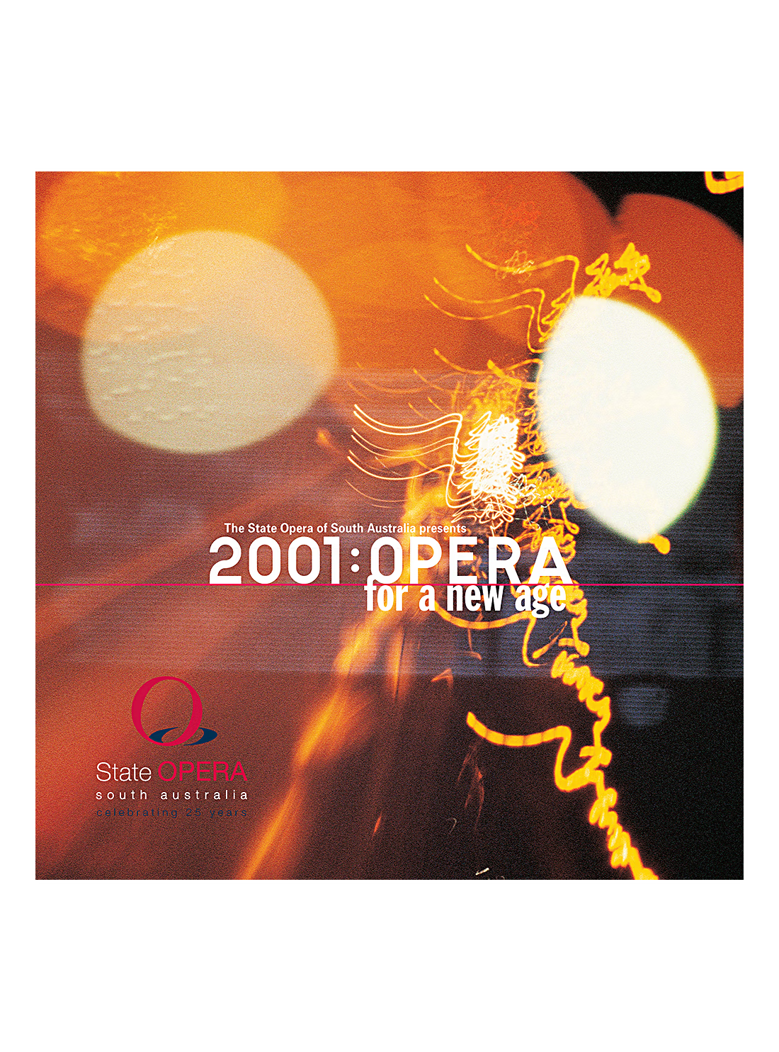
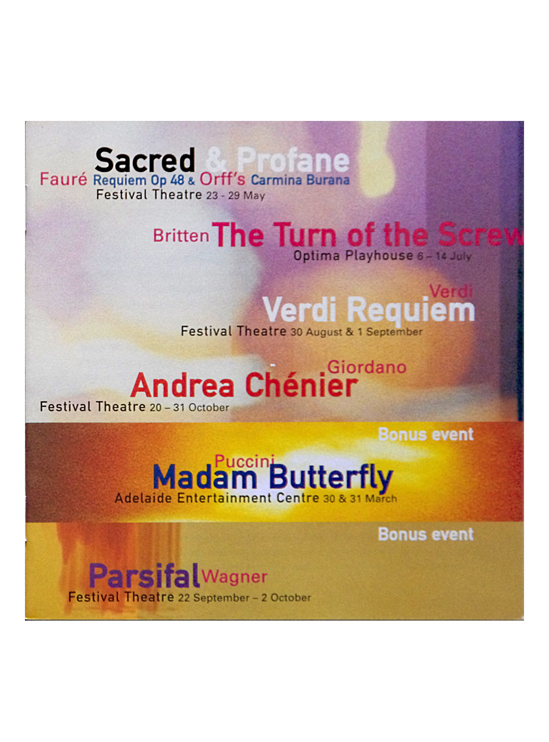
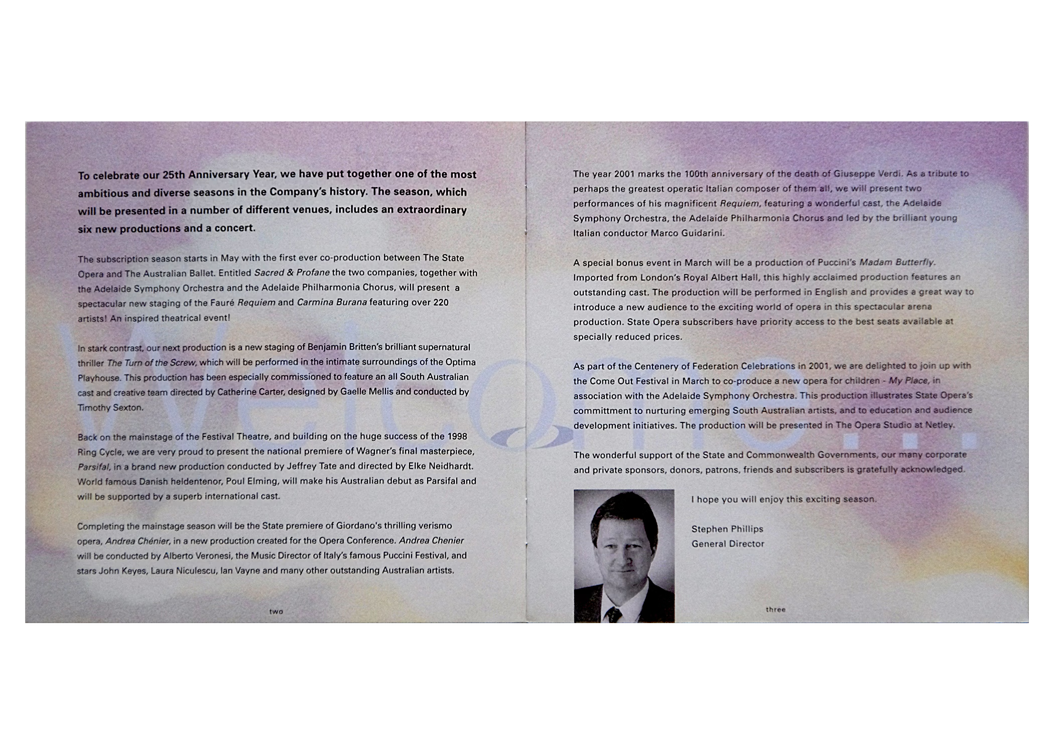
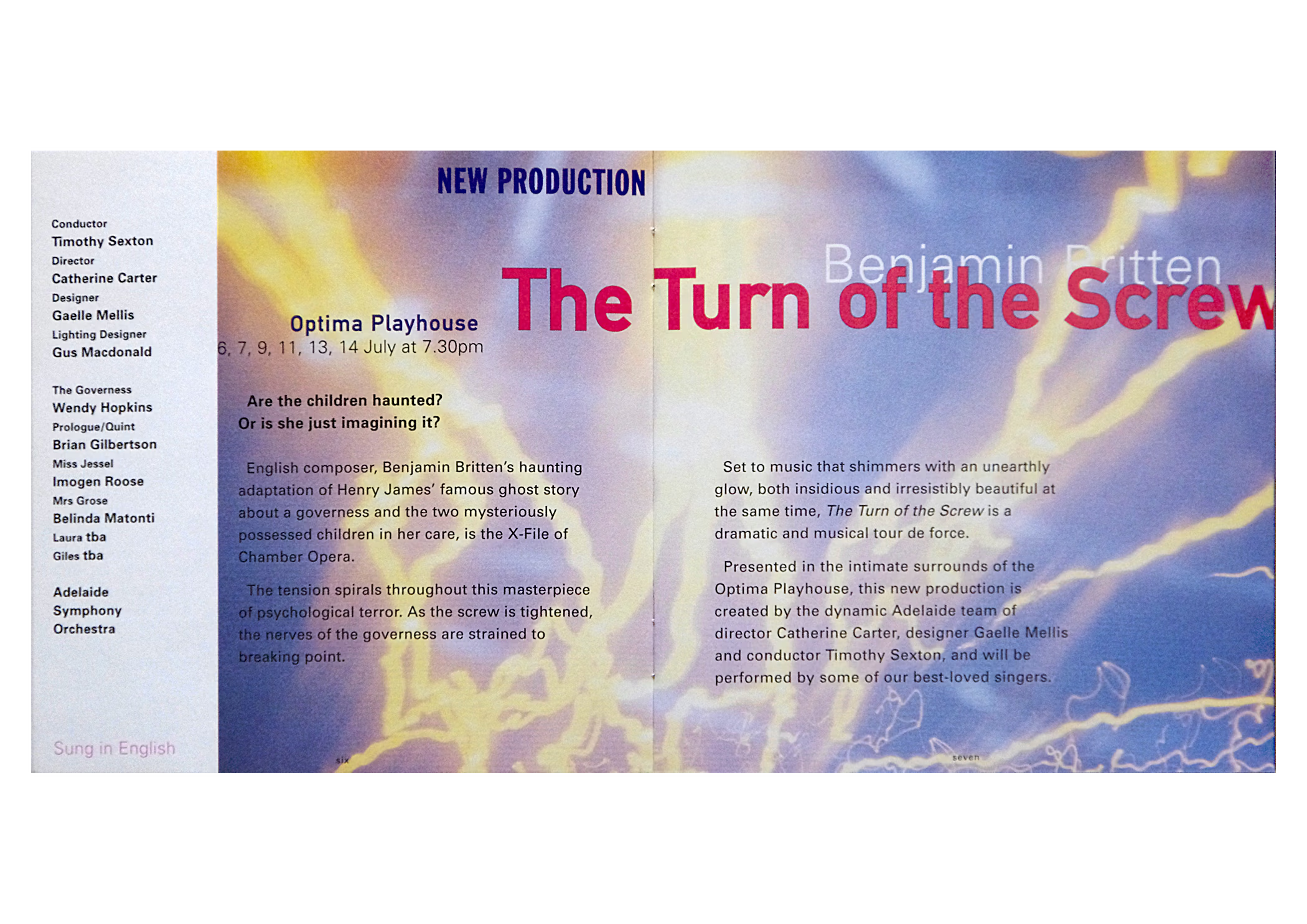
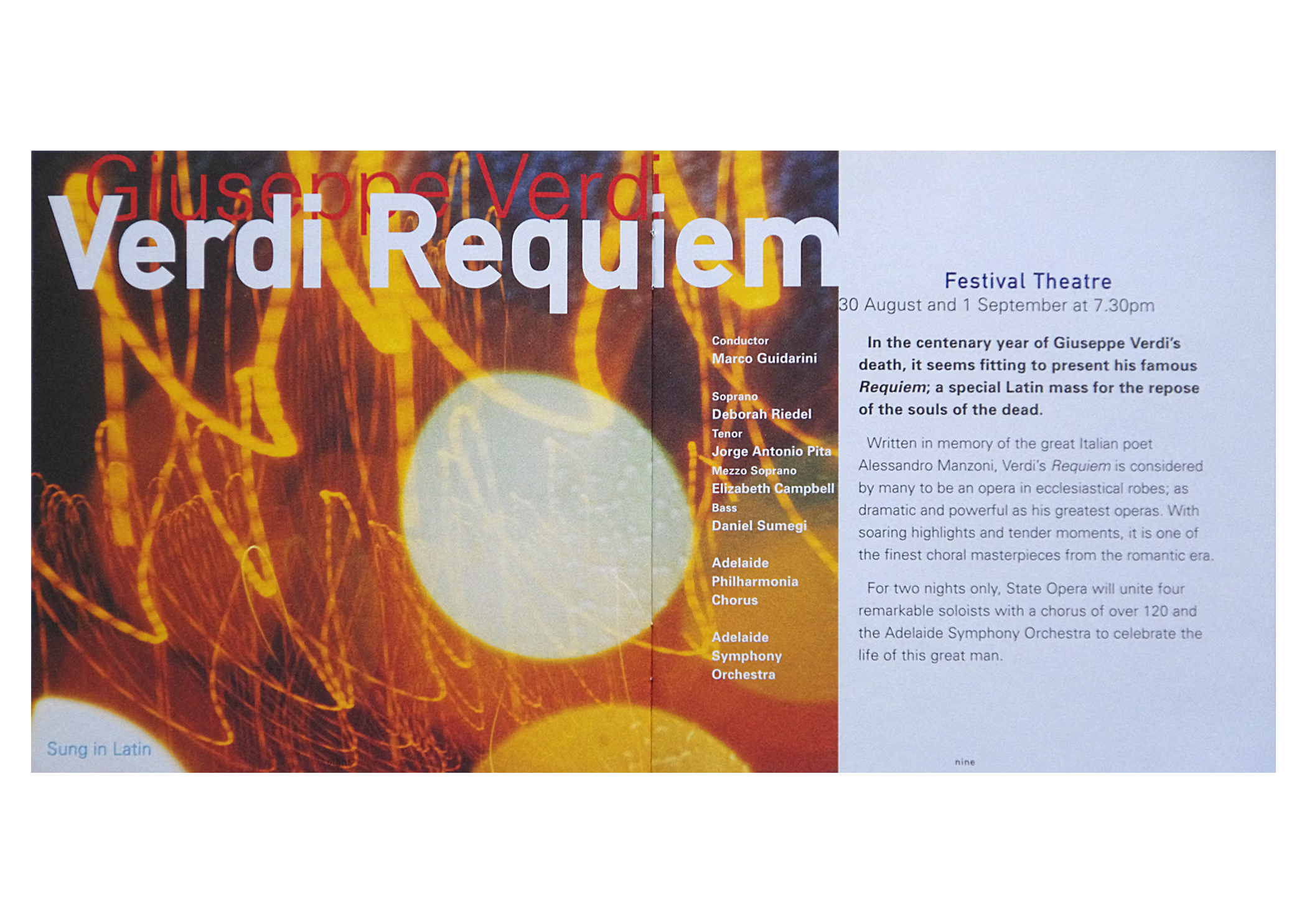
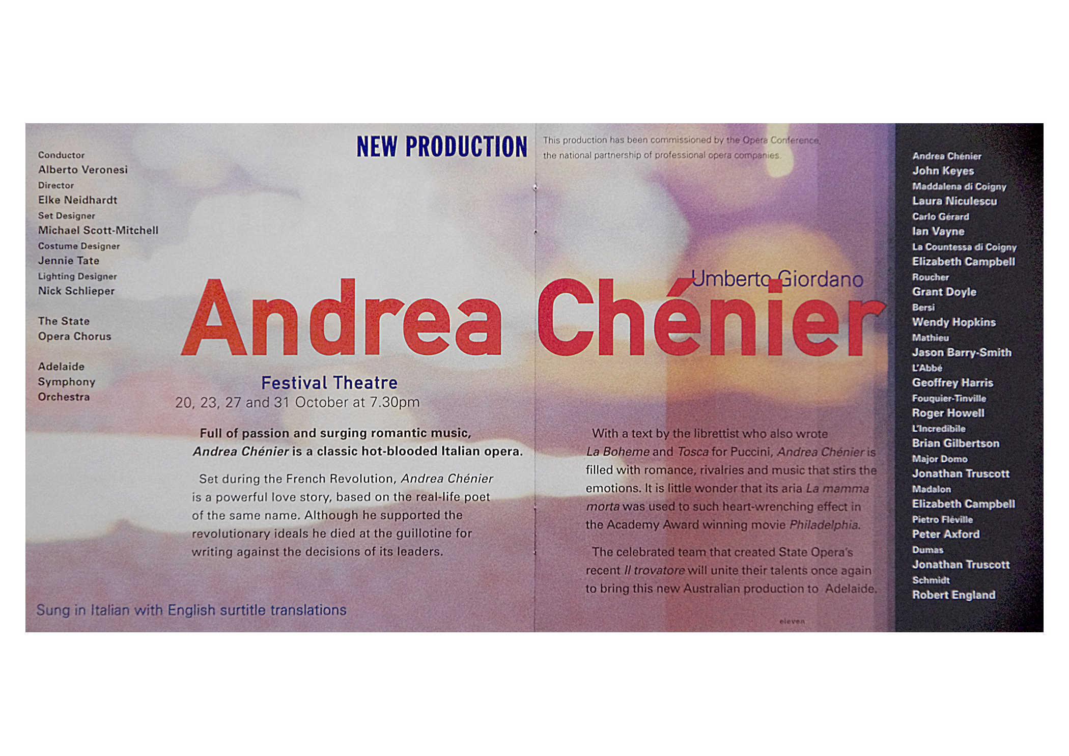
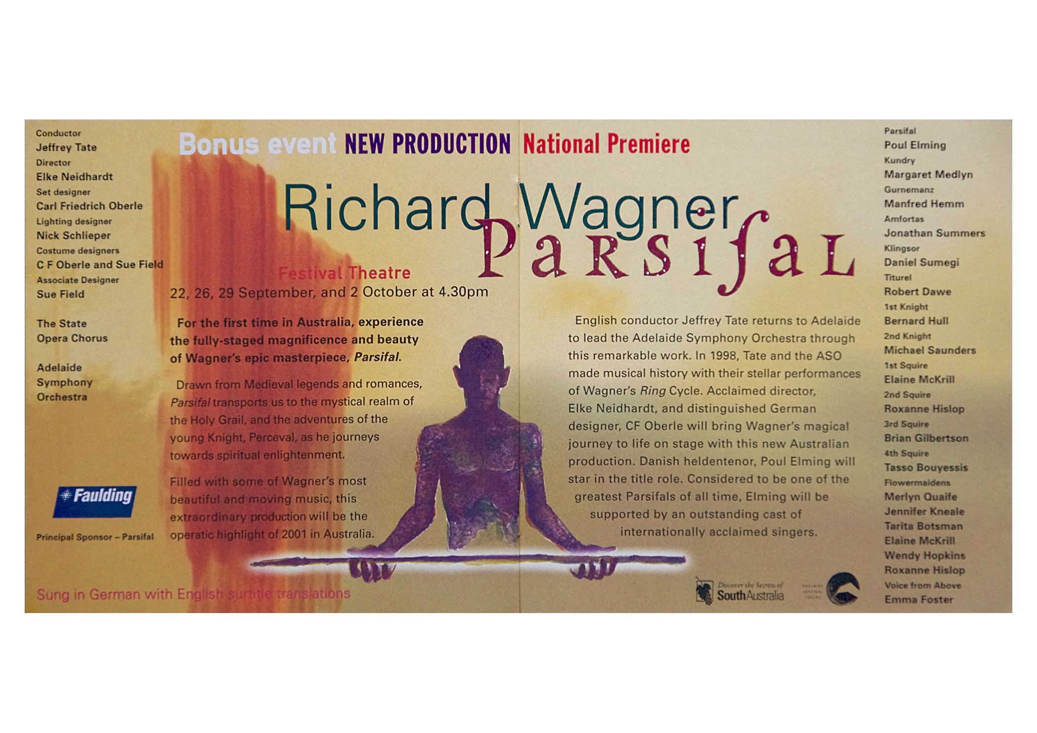
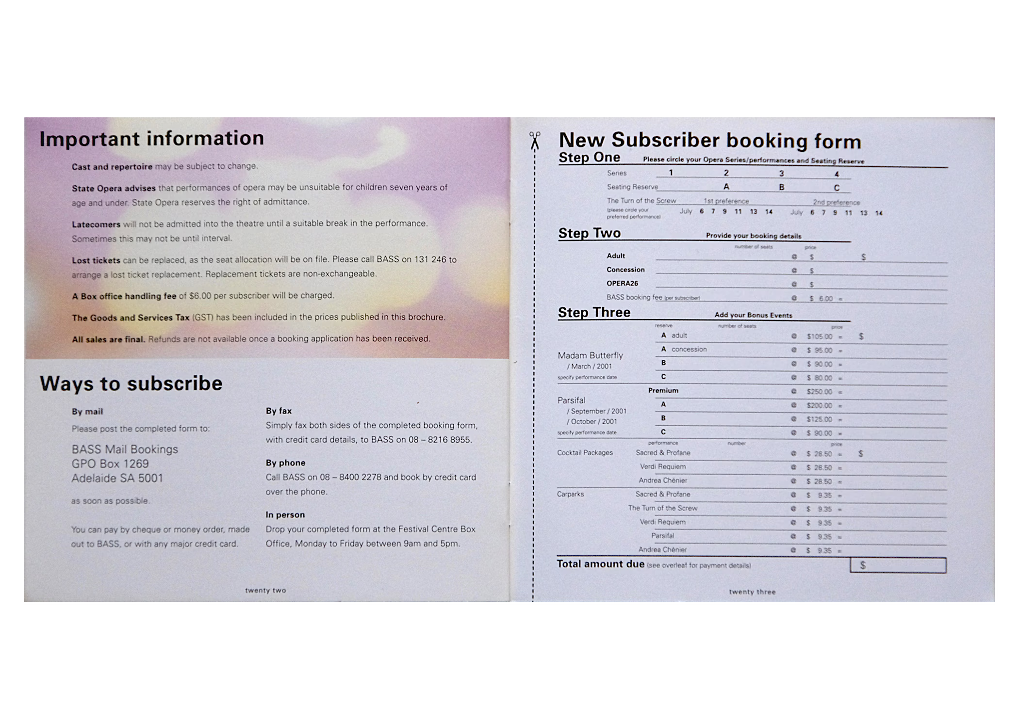
2001 introduced an opera subscription season brochure like no other, promoting a progressive season featuring new productions of contemporary opera ‘for a new age’. The productions were so new that visual assets to promote them did not exist. My solution used a suite of multiple exposure images I had created some years earlier that emotively suggested each opera. Fittingly, a leading arts writer termed the season an ‘opera odyssey’.
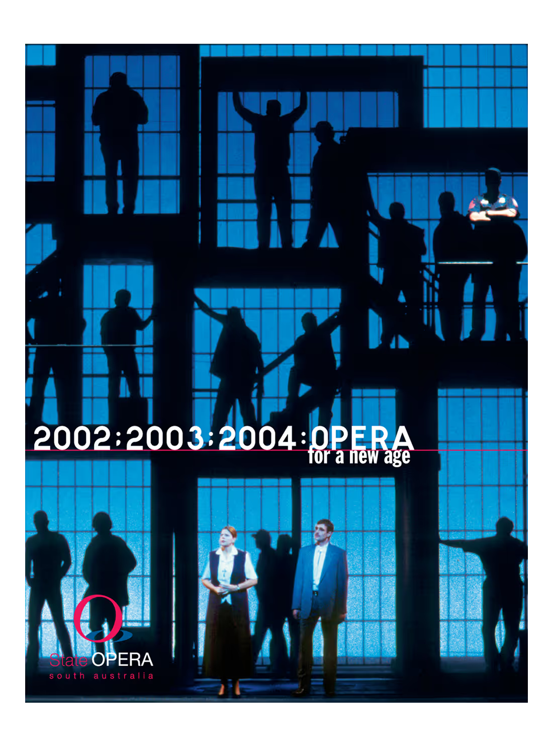
The next subscription catalogue stepped things up again. To best sell the company’s second production of Wagner’s Ring cycle they were packaging three seasons for sale in one offering. Consequently, this subscription catalogue promoted performances of opera from the 18th, 19th, 20th and 21st centuries.
